My personal project-abstraction
Definition : Abstract photography, sometimes called non-objective, experimental, conceptual or concrete photography, is a means of depicting a visual image that does not have an immediate association with the object world and that has been created through the use of photographic equipment, processes or materials.
My thoughts : In my opinion, abstraction means simplifying things down into their essential parts (like shapes, colours, lines etc). In photography this usually involves taking images at interesting angles and close ups.
My thoughts : In my opinion, abstraction means simplifying things down into their essential parts (like shapes, colours, lines etc). In photography this usually involves taking images at interesting angles and close ups.
Formal elements
Formal element:
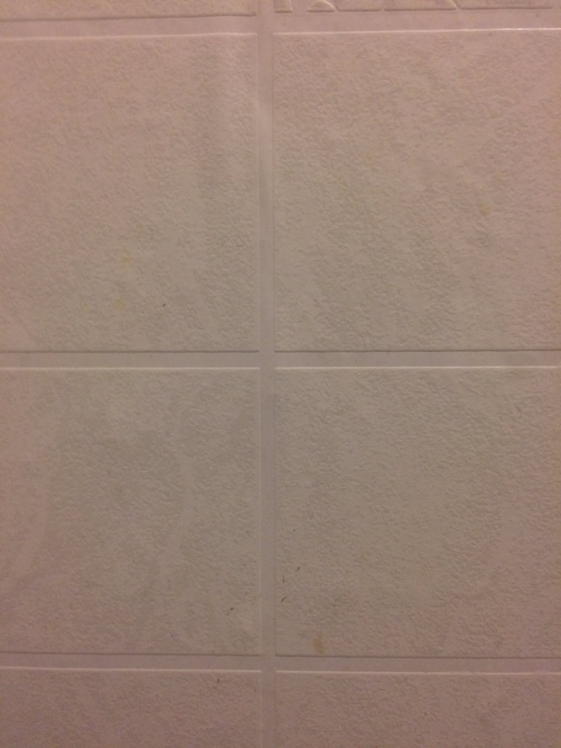
Focus: Which areas appear clearest or sharpest in the photograph? Which do not?
Light: Which areas of the photograph are brightest? Are there any shadows? Does the photograph allow you to guess the time of day? Is the light natural or artificial? Harsh or soft? Reflected or direct?
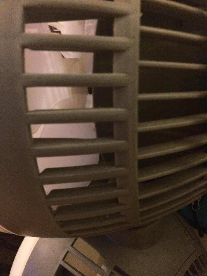
Line: Are there objects in the photograph that act as lines? Are they straight, curvy, thin, thick? Do the lines create direction in the photograph? Do they outline? Do the lines show movement or energy?
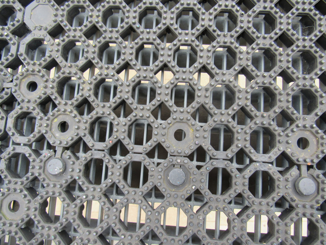
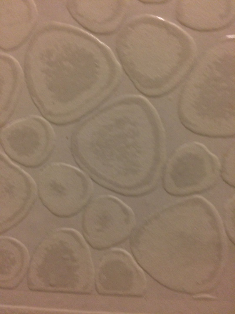
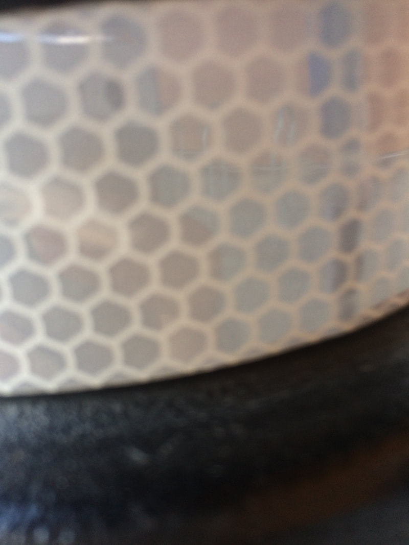
Repetition: Are there any objects, shapes or lines which repeat and create a pattern?
Shape: Do you see geometric (straight edged) or organic (curvy) shapes? Which are they?
Space: Is there depth to the photograph or does it seem shallow? What creates this appearance? Are there important negative (empty) spaces in addition to positive (solid) spaces? Is there depth created by spatial illusions i.e. perspective?
Texture: If you could touch the surface of the photograph how would it feel? How do the objects in the picture look like they would feel?
Value/Tone: Is there a range of tones from dark to light? Where is the darkest value? Where is the lightest?
Focus: Which areas appear clearest or sharpest in the photograph? Which do not?
Light: Which areas of the photograph are brightest? Are there any shadows? Does the photograph allow you to guess the time of day? Is the light natural or artificial? Harsh or soft? Reflected or direct?
Line: Are there objects in the photograph that act as lines? Are they straight, curvy, thin, thick? Do the lines create direction in the photograph? Do they outline? Do the lines show movement or energy?
Repetition: Are there any objects, shapes or lines which repeat and create a pattern?
Shape: Do you see geometric (straight edged) or organic (curvy) shapes? Which are they?
Space: Is there depth to the photograph or does it seem shallow? What creates this appearance? Are there important negative (empty) spaces in addition to positive (solid) spaces? Is there depth created by spatial illusions i.e. perspective?
Texture: If you could touch the surface of the photograph how would it feel? How do the objects in the picture look like they would feel?
Value/Tone: Is there a range of tones from dark to light? Where is the darkest value? Where is the lightest?
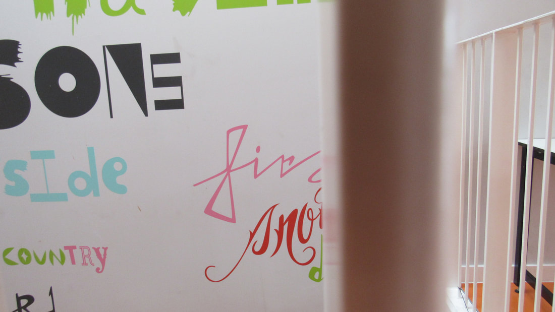
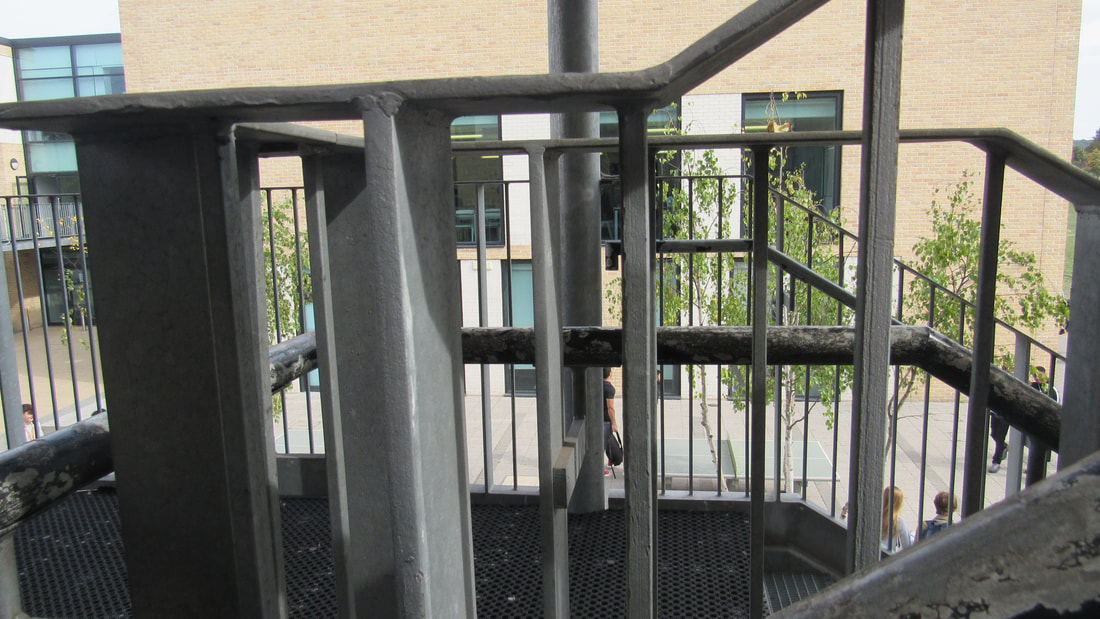
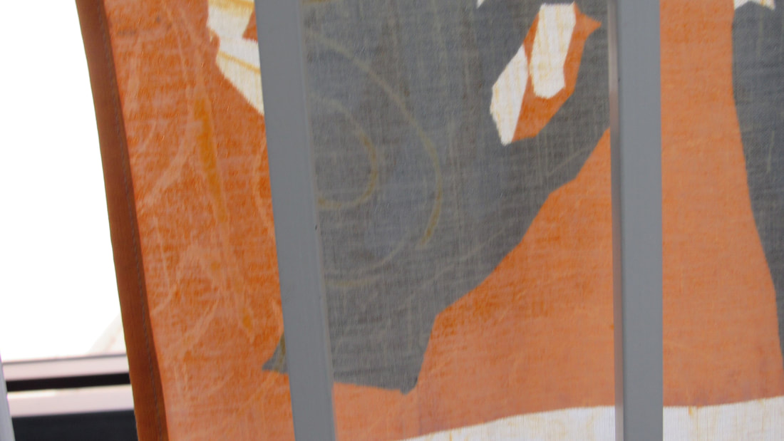
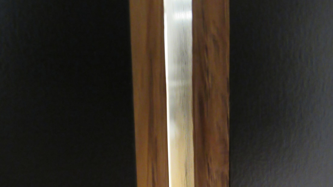
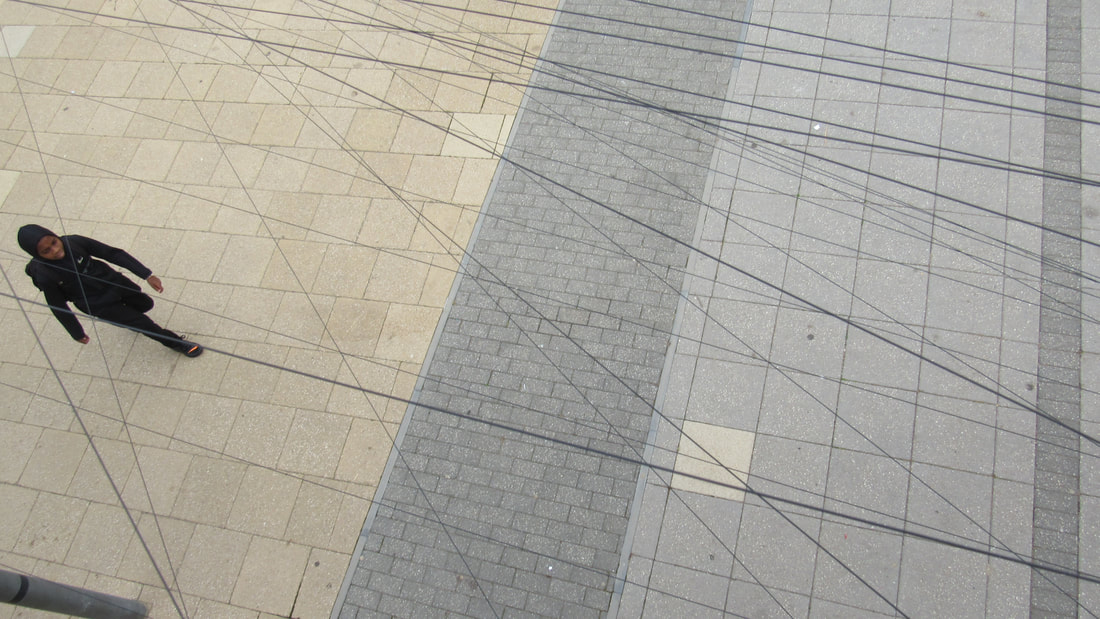
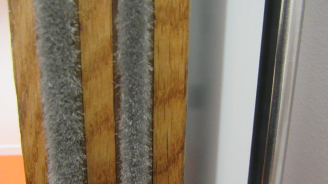
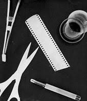
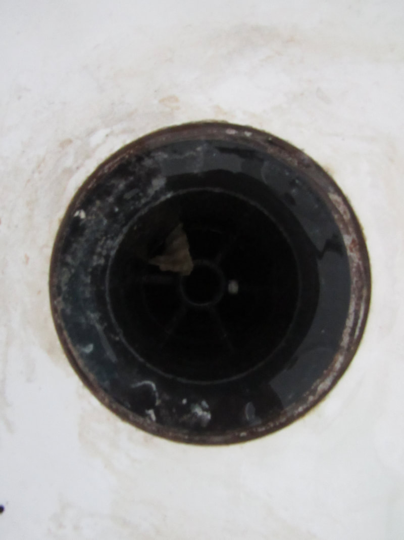
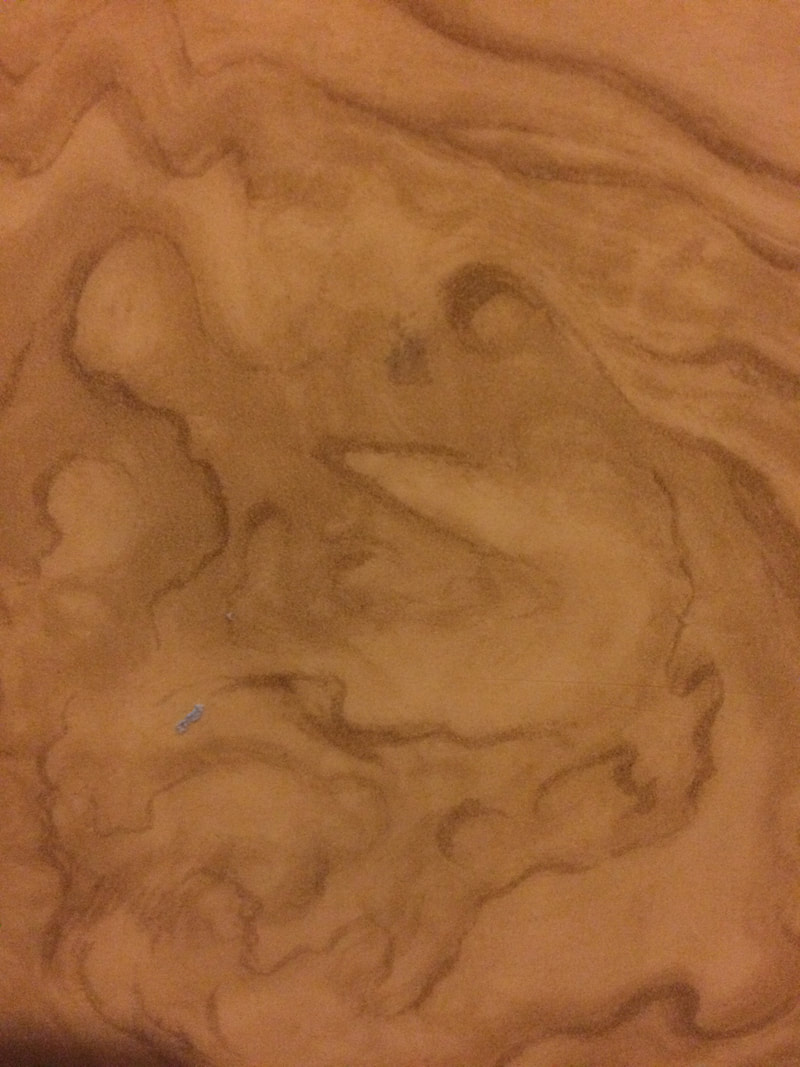
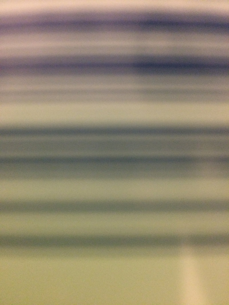
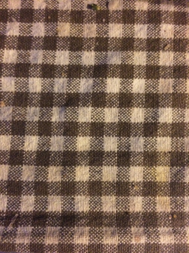
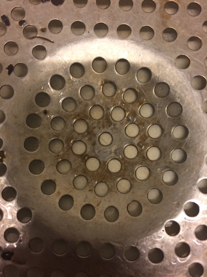
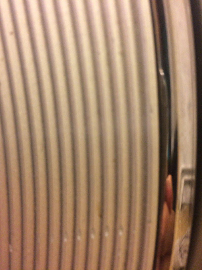
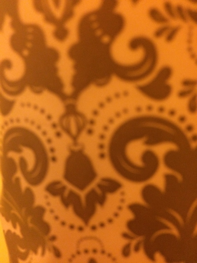
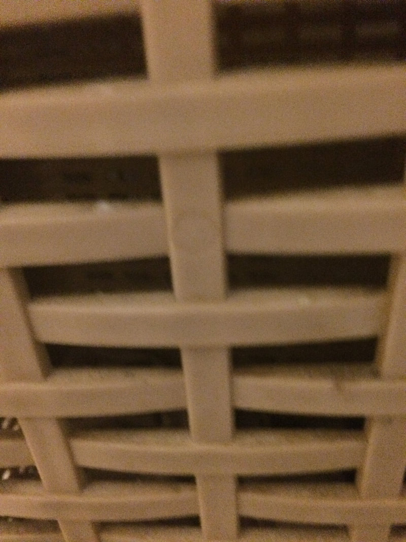
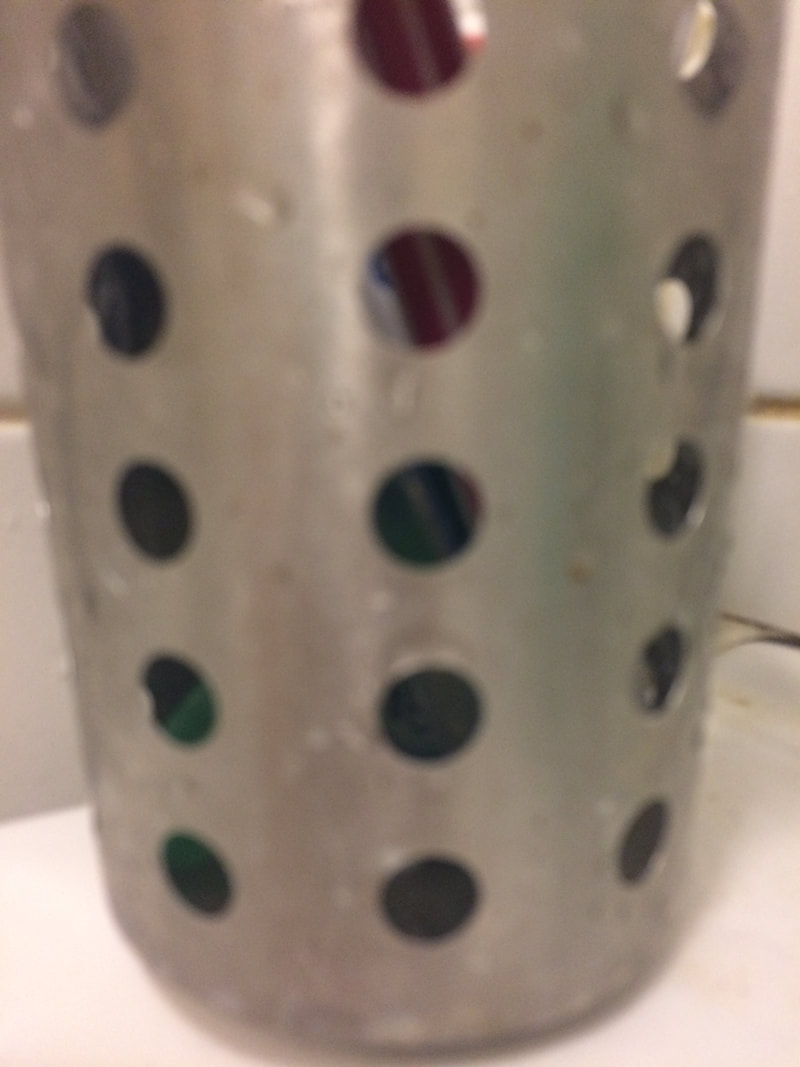
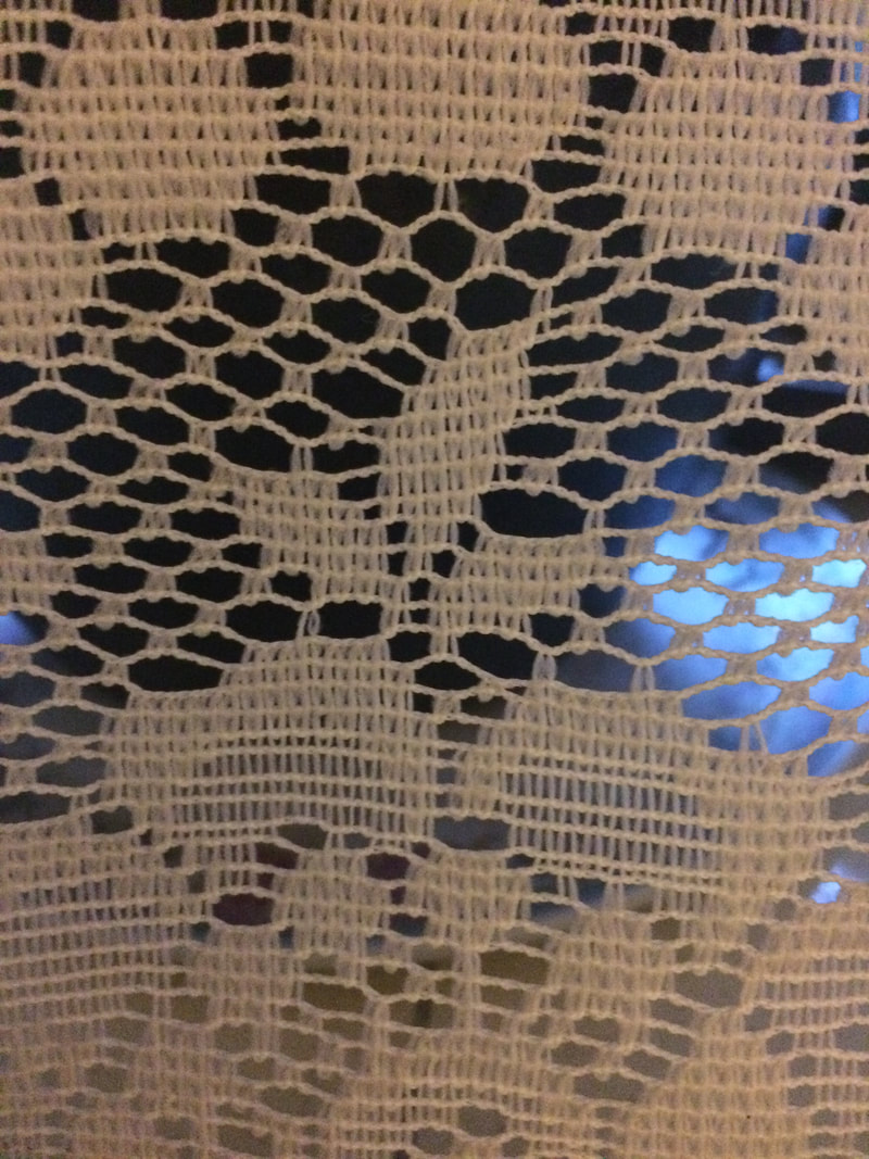
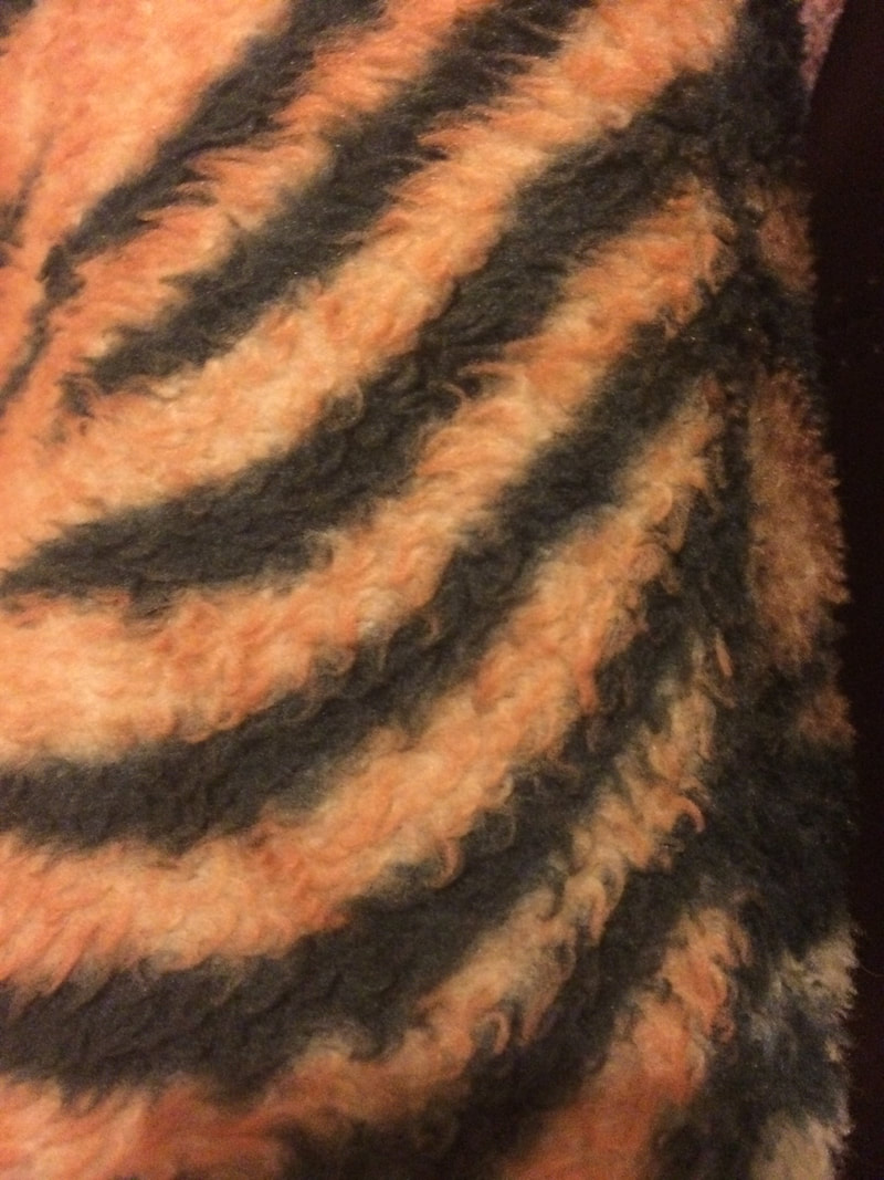
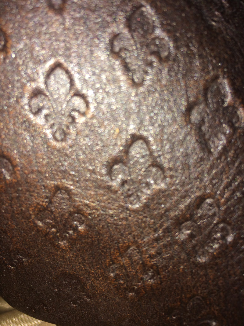
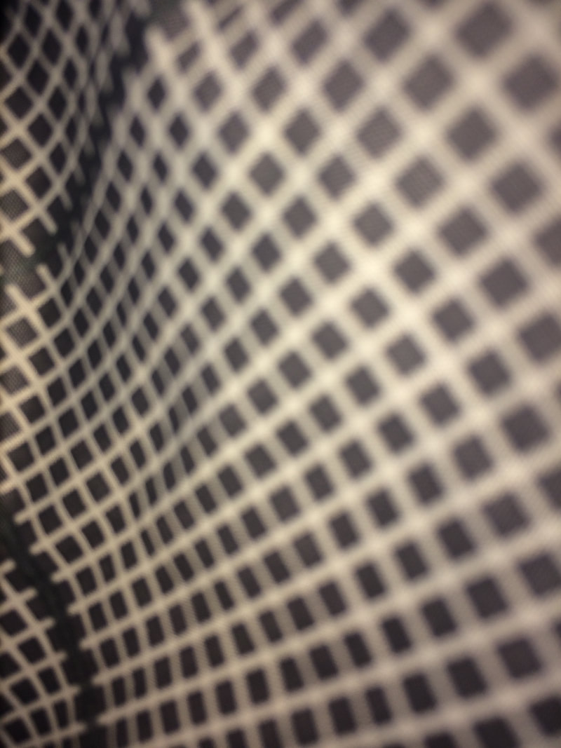
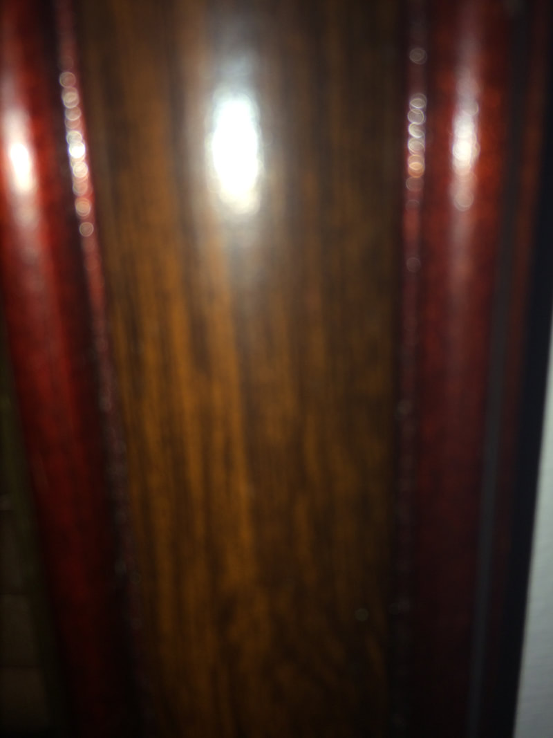
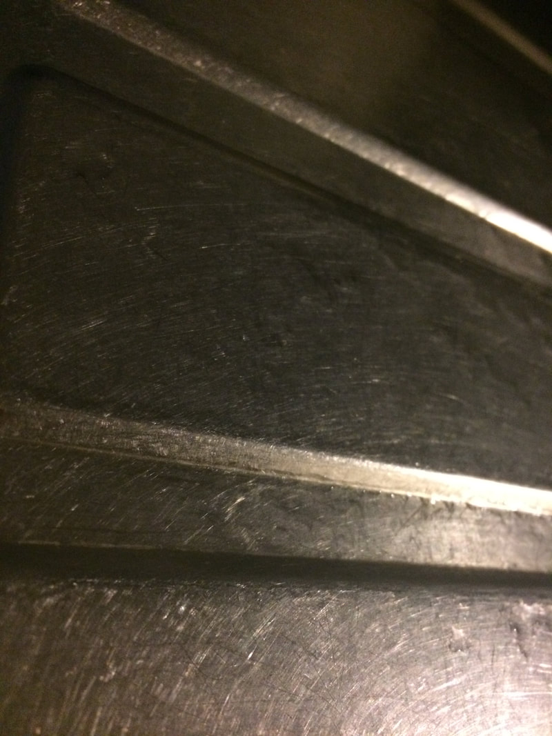
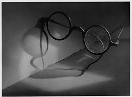
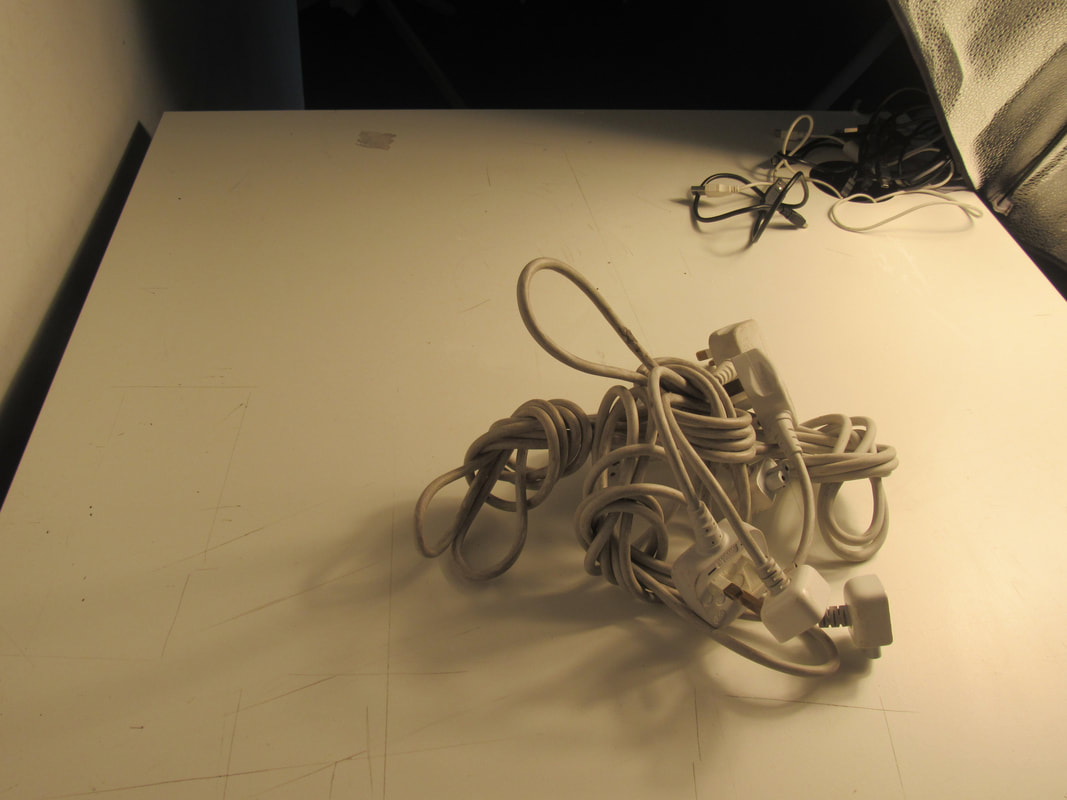
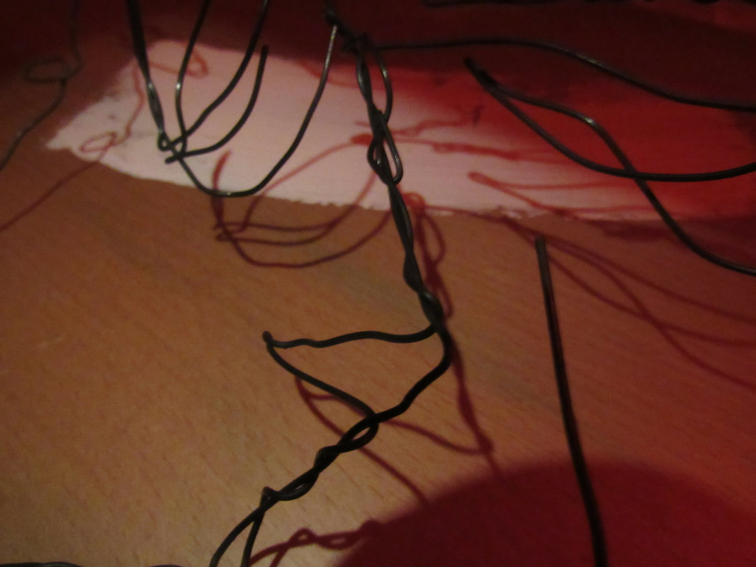
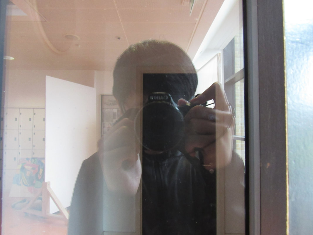
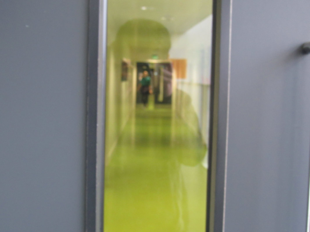
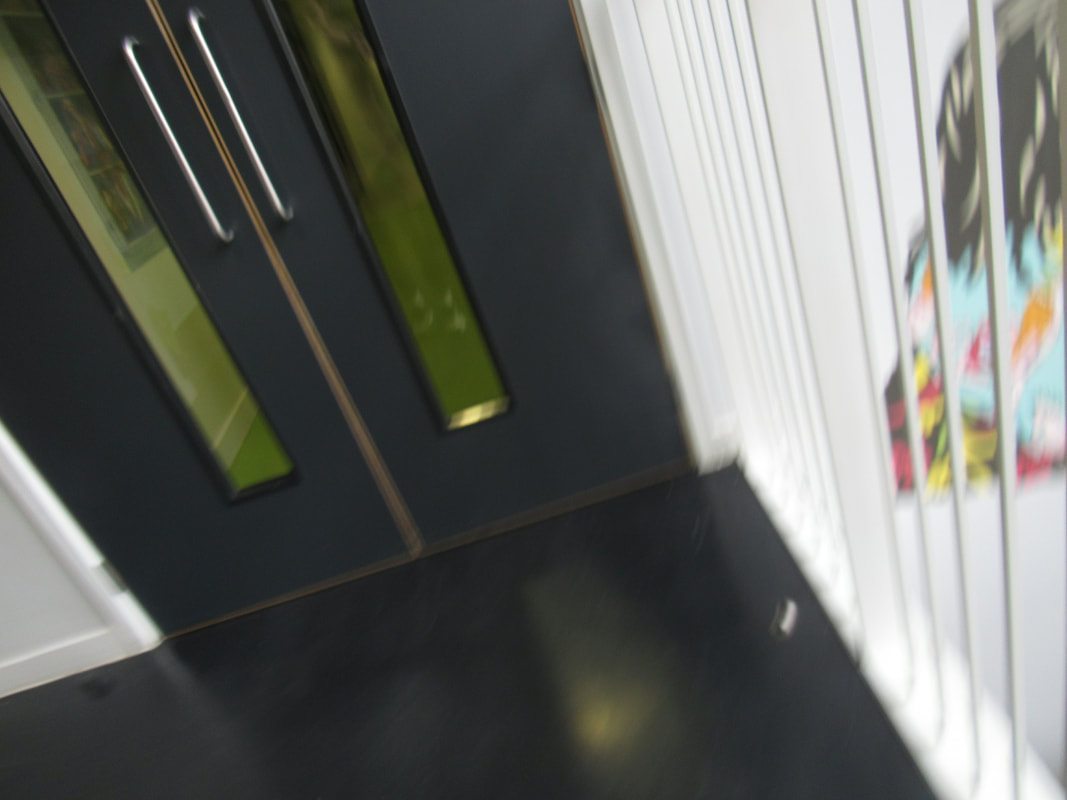
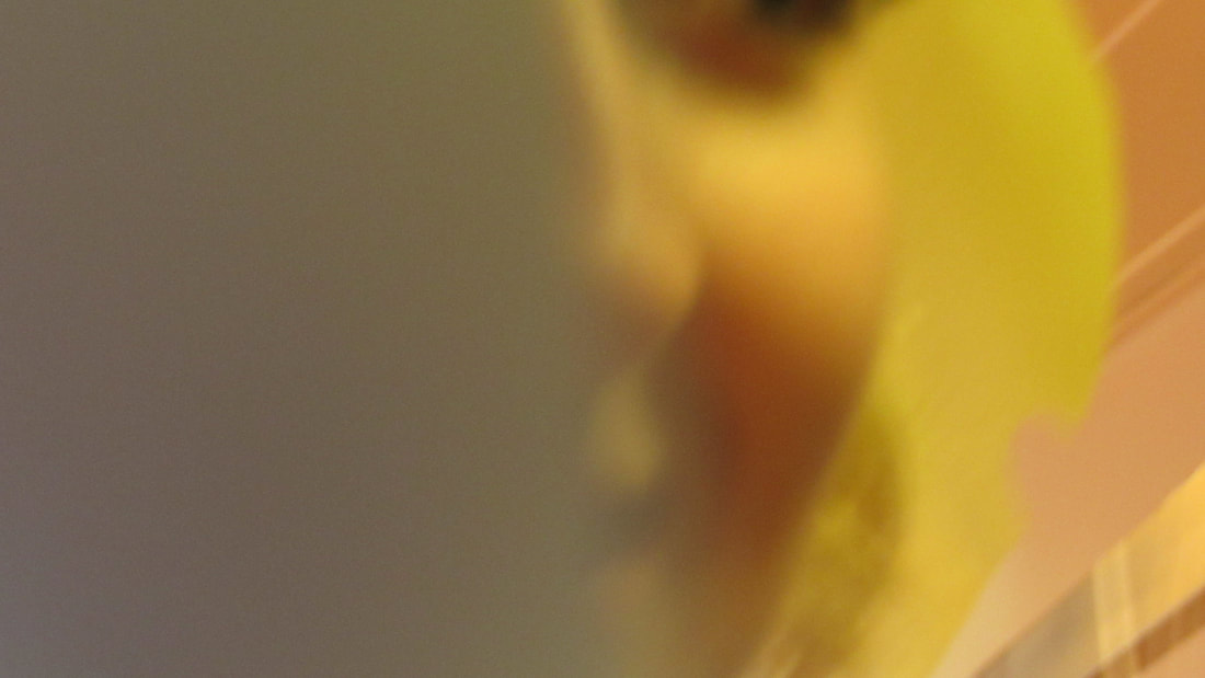
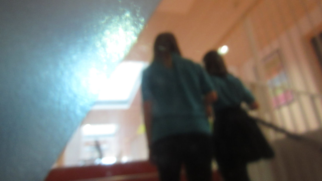
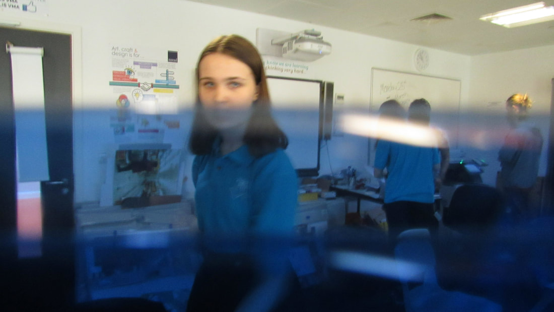
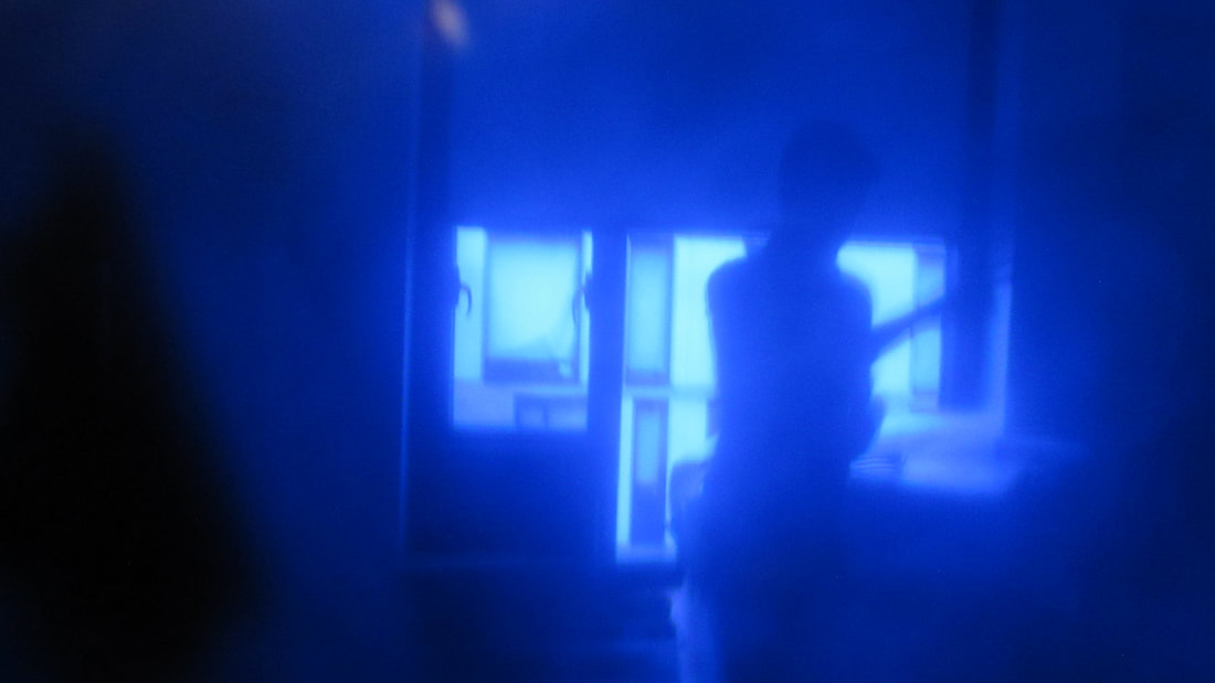
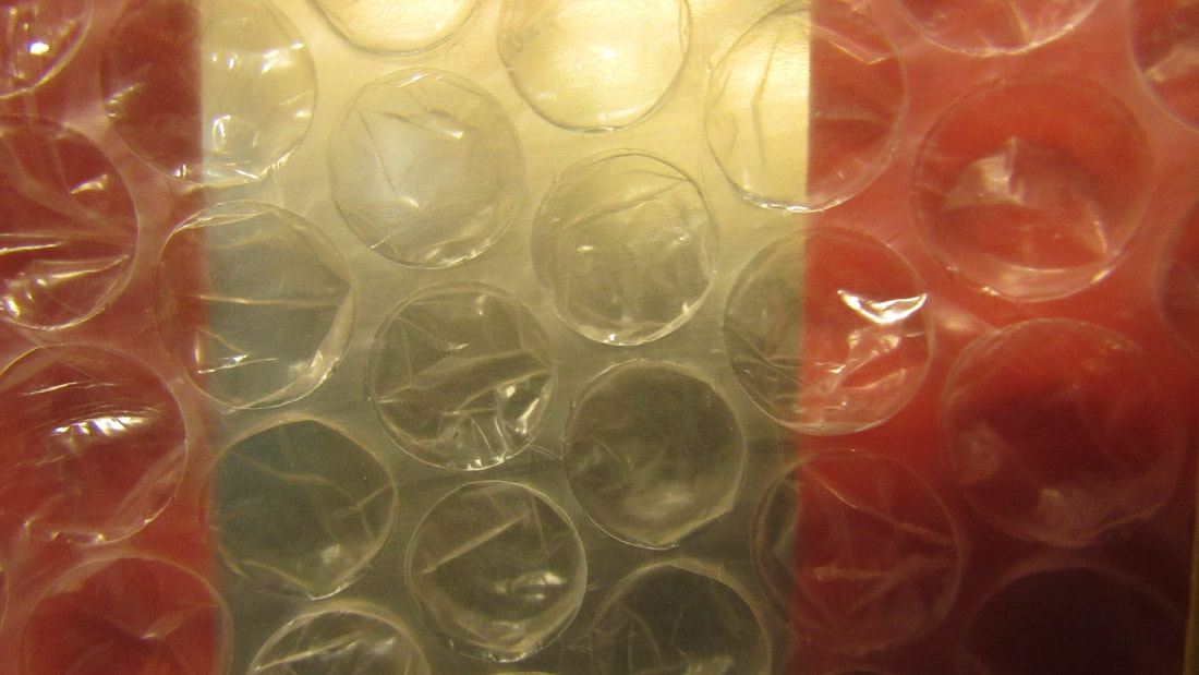
My Example Abstract photos
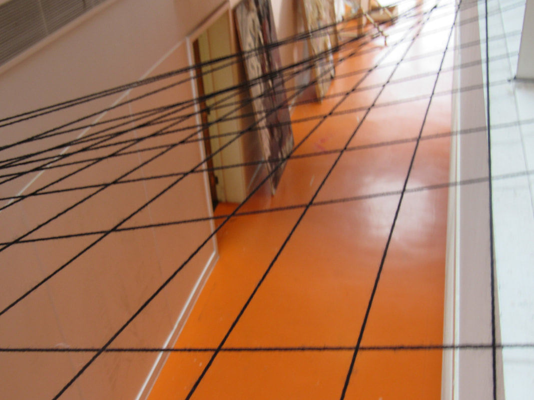
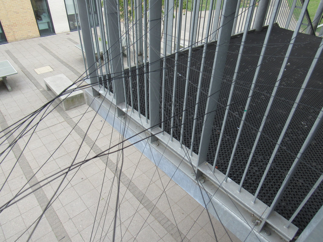
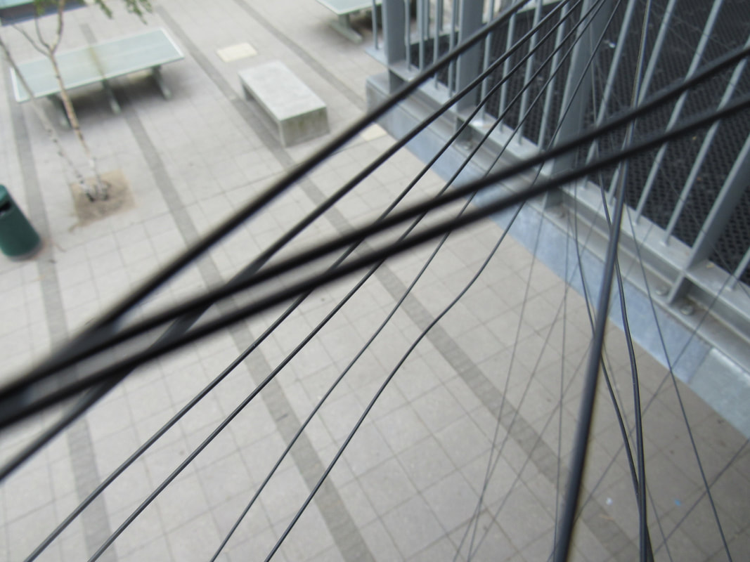
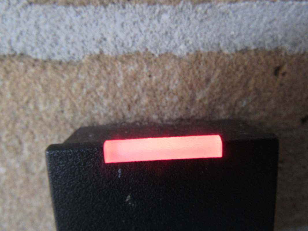
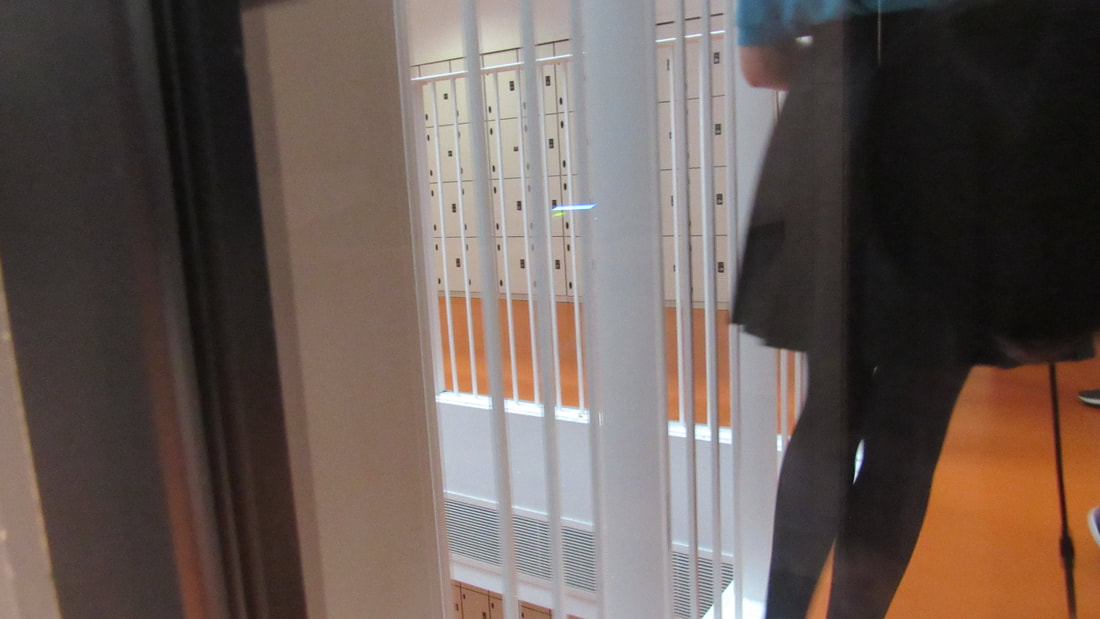
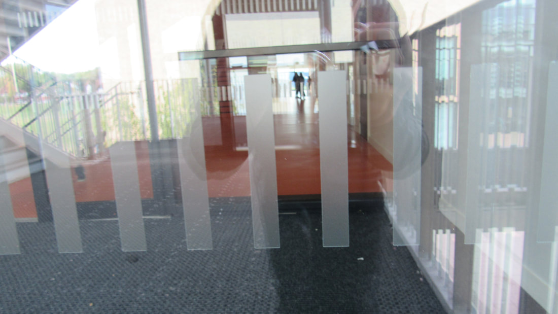
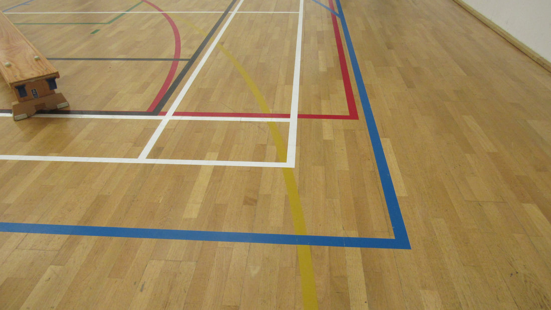
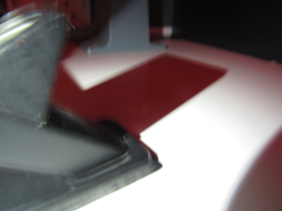
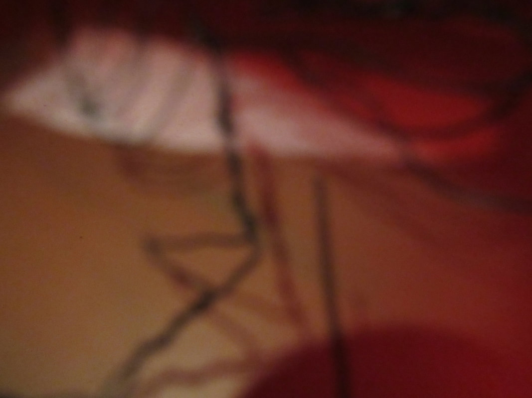
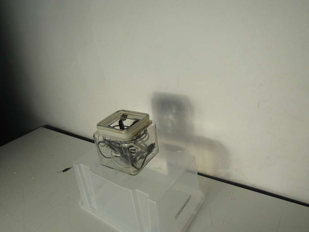
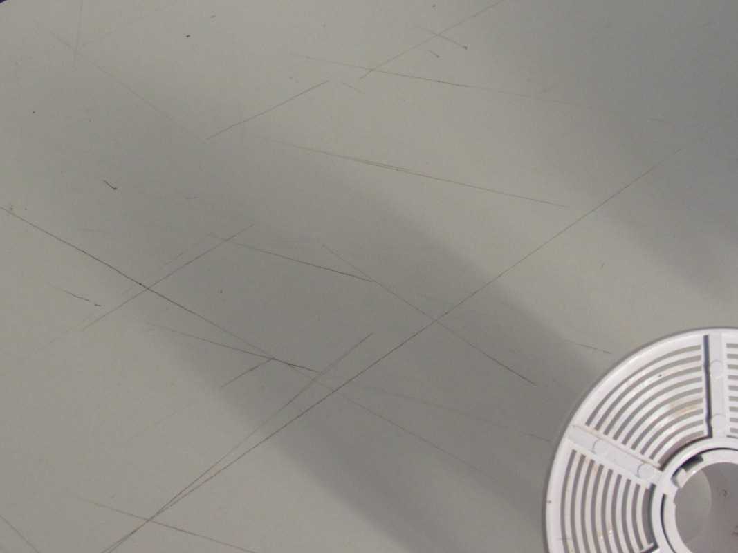
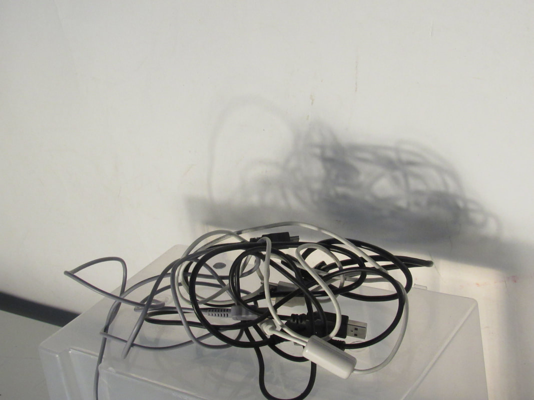
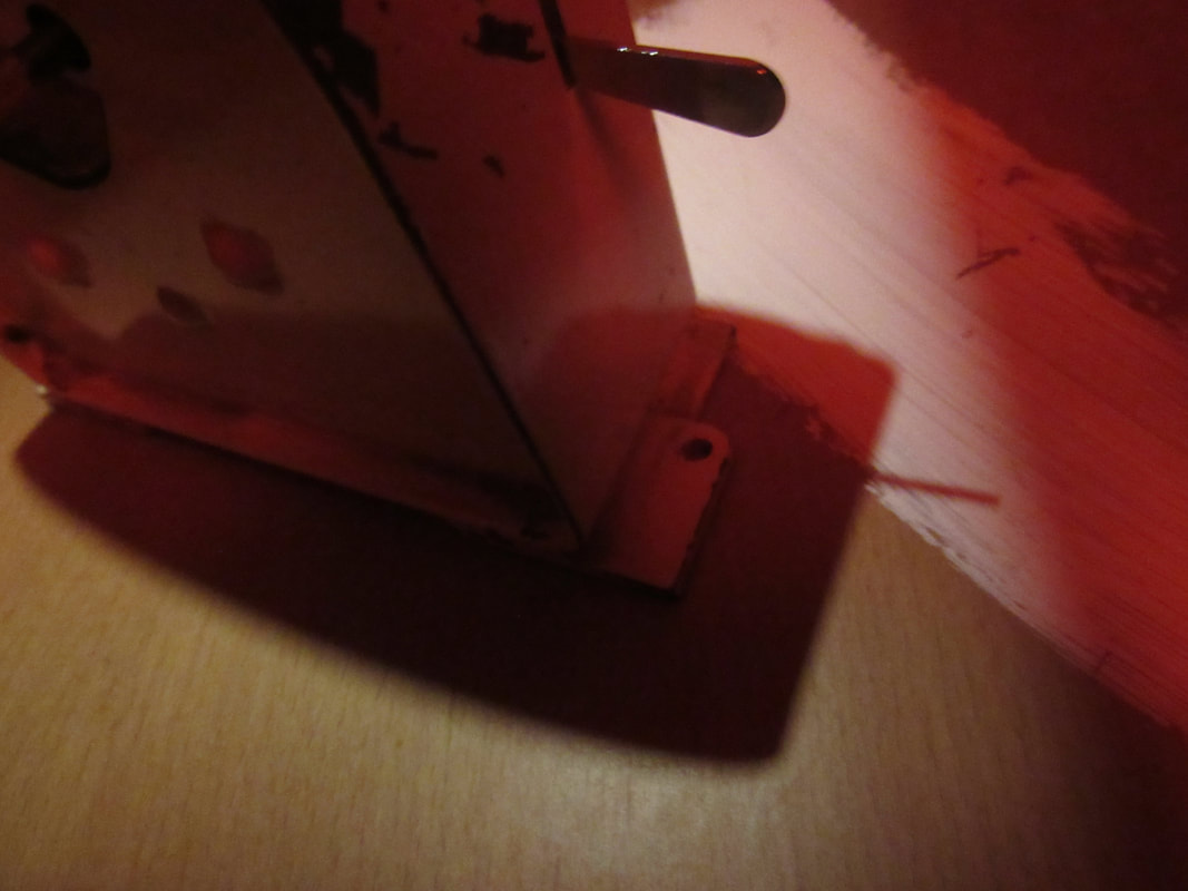
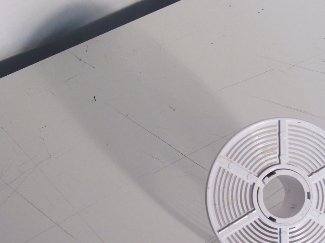
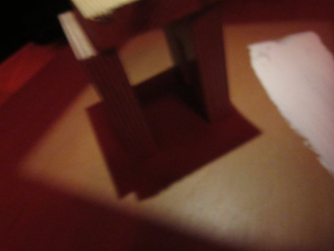
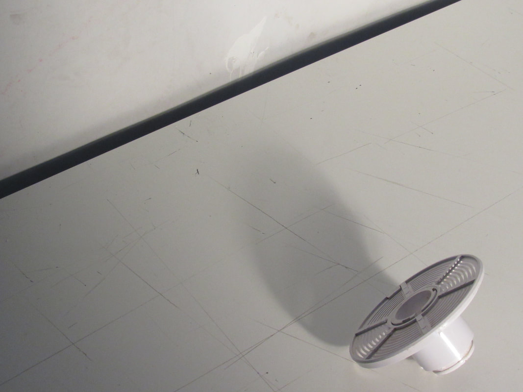
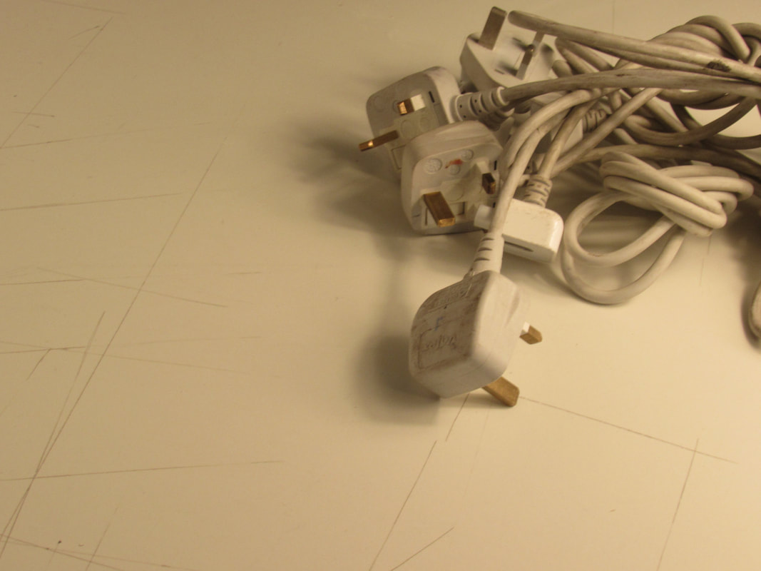
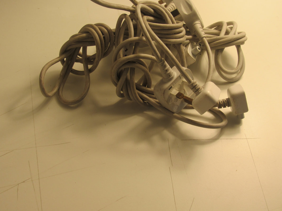
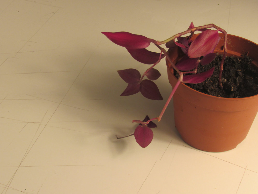
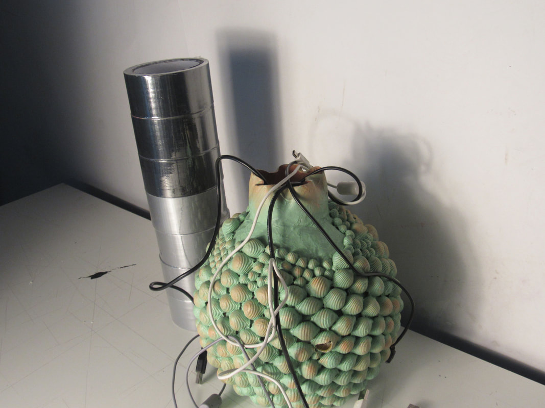
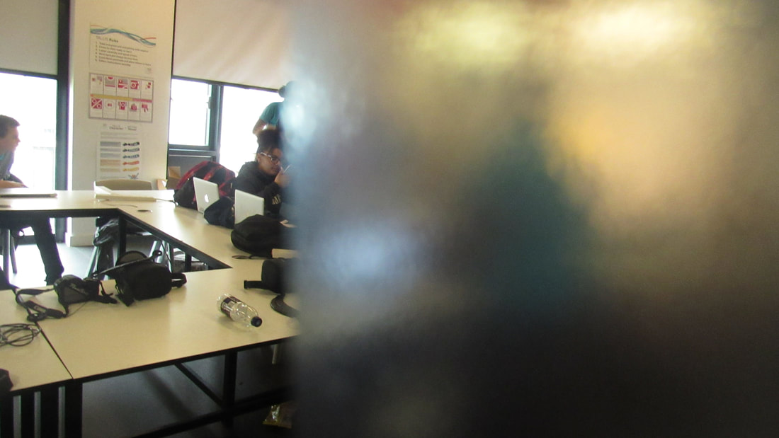
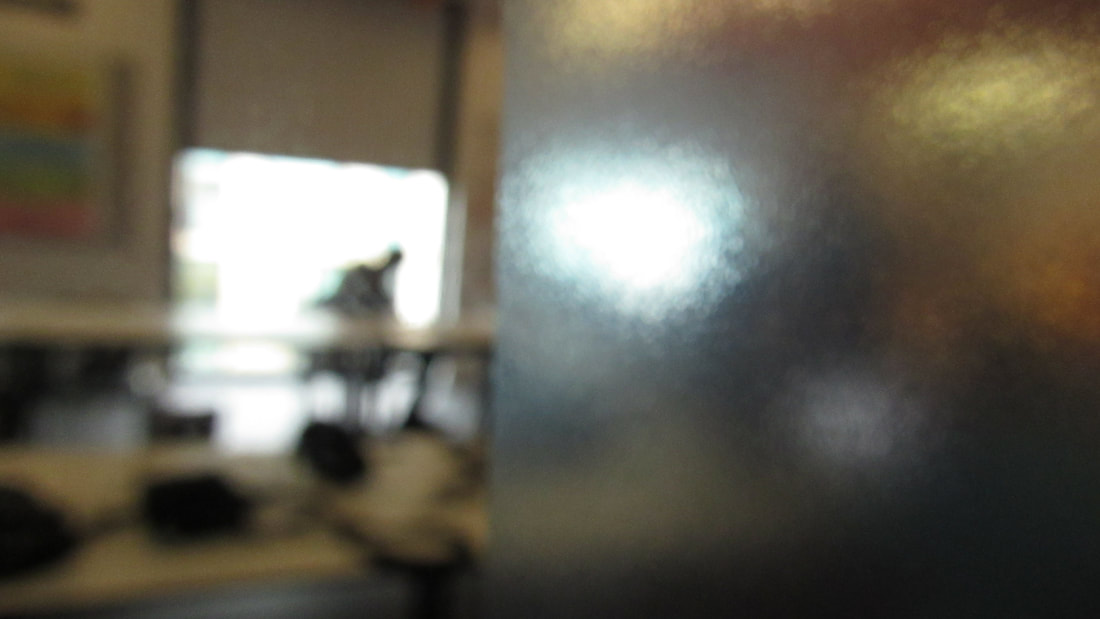
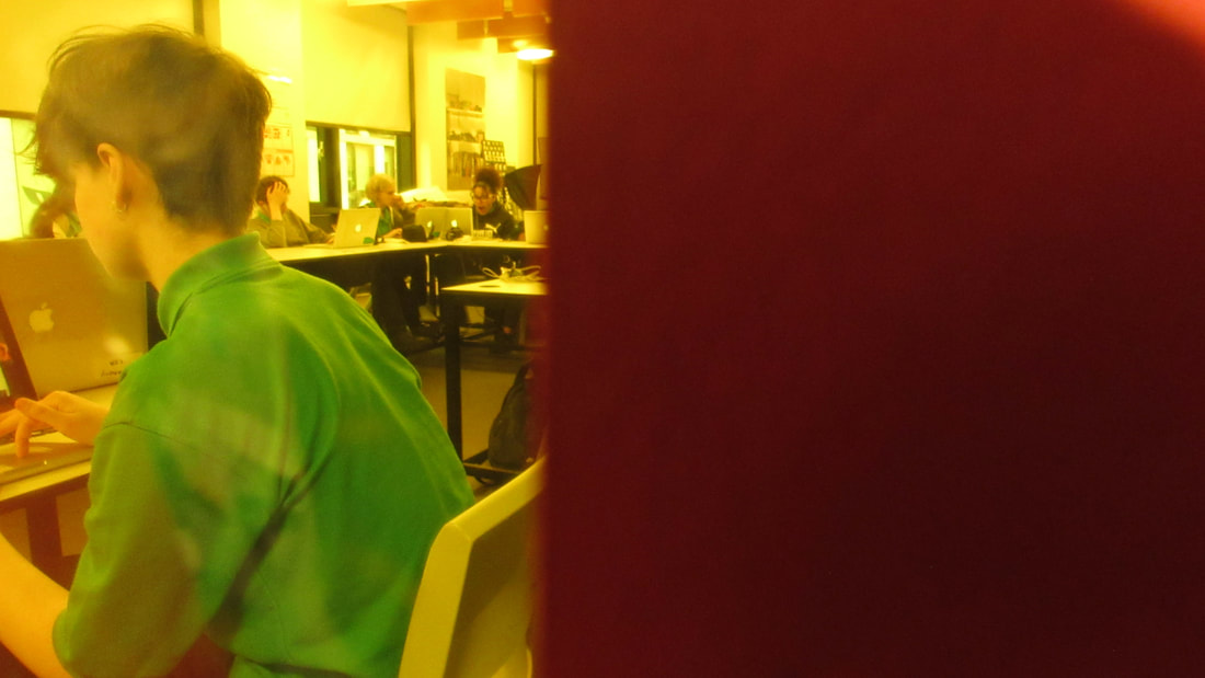
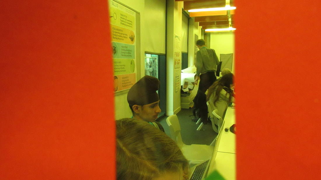
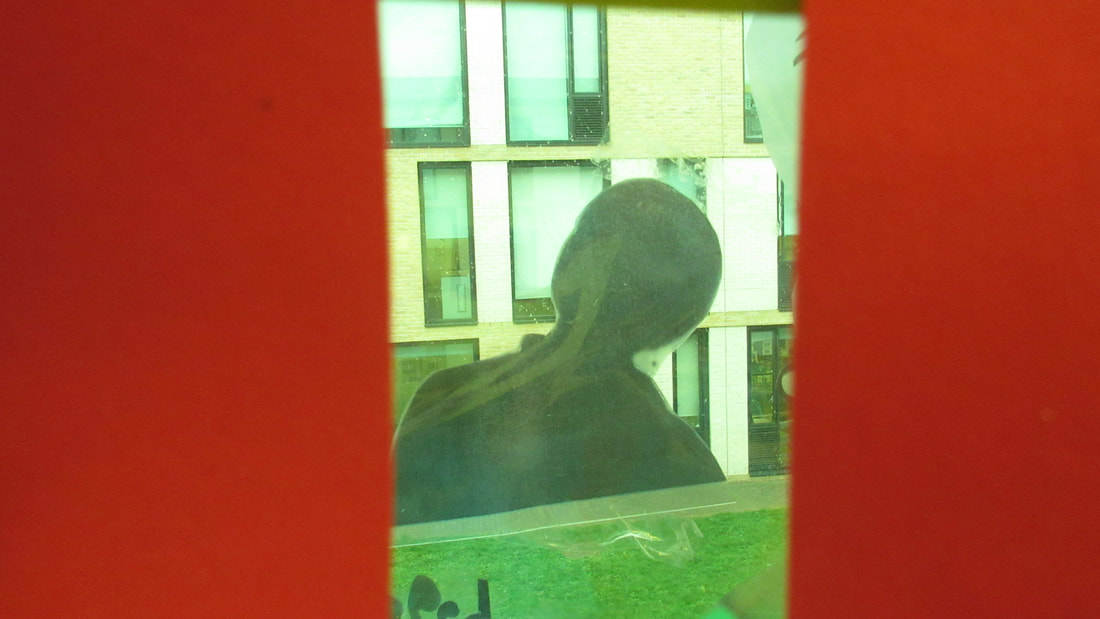
In this task we had to take some abstract photographs around the school keeping in mind that they had to have some elements of the formal elements example line,shape,pattern.
what i think went well was the time keeping and the images i took keeping in mind that this was my first time taking abstract images i still manage to take a decent amount of photos in the amount of time i had.
Although it will be even better if i zoomed in to my objects or my focus more as you can still tell what i have taken a picture of even though the point is to zoom in far enough so we are not able to tell what it really is.
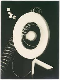
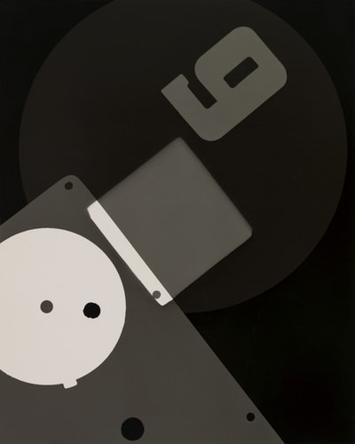
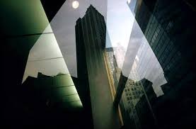
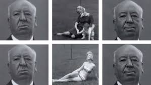
AKIHIKO MIYOSHI
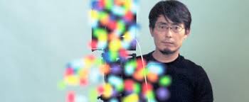
Born in Japan, Akihiko Miyoshi received his MFA in photography in 2005 from the Rochester Institute of Technology after leaving a PhD program in Electrical and Computer Engineering at Carnegie Mellon University to pursue art. Miyoshi is an Associate Professor of photography and digital media at Reed College. His work explores the intersection between art and technology most frequently dealing with issues surrounding photographic representation.
His work has been exhibited in places including Portland, New York, Los Angeles, Rochester, Pittsburgh, and Toronto. He was named the International Award Winner of Fellowship 12 at The Silver Eye Center for Photography in Pittsburgh PA, and the finalist for the Betty Bowen Award from the Seattle Art Museum in 2012 and Aperture Portfolio Prize in 2013. Miyoshi received a Hallie Ford Fellowship in 2012.
i personally find him a very good photographer as he is very creative
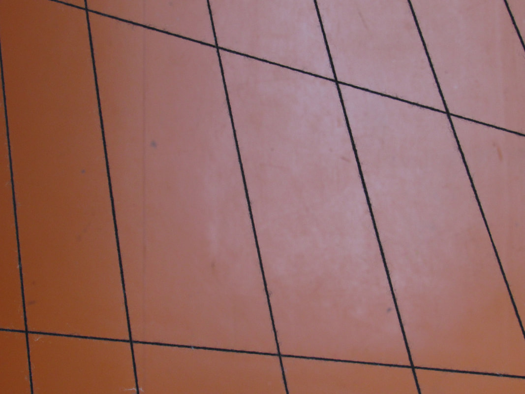
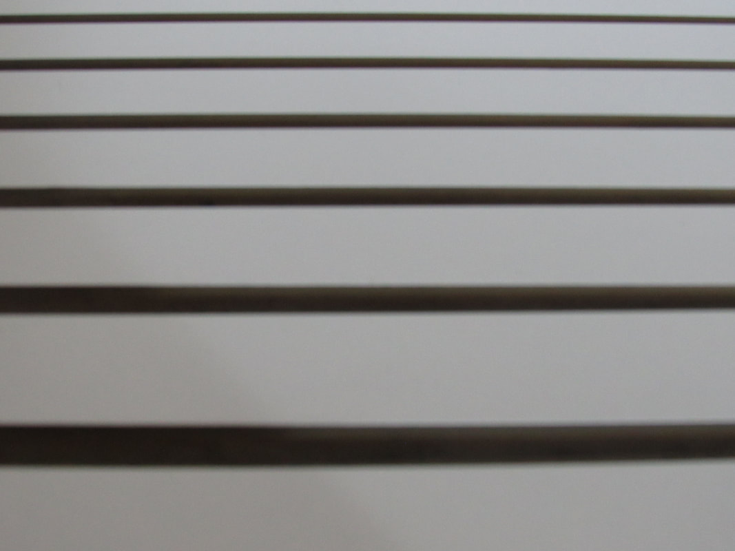
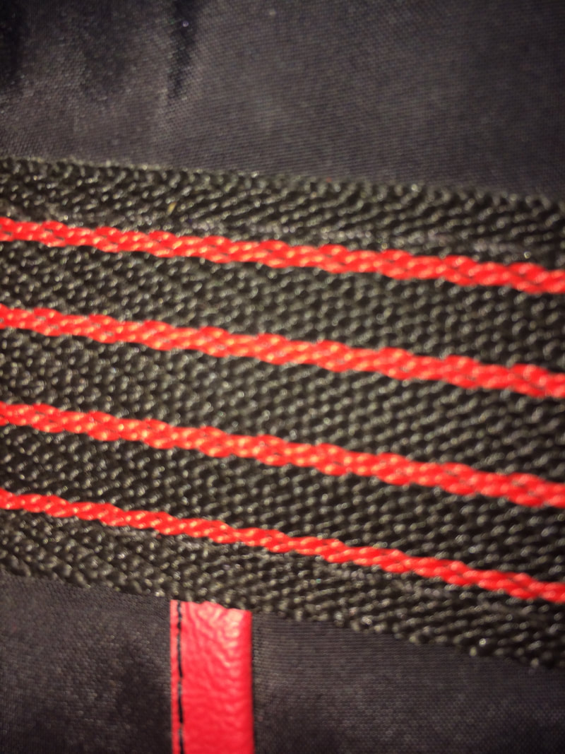
Formal element-lines
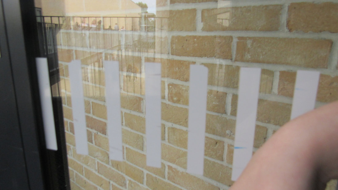
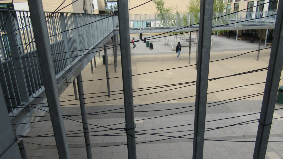
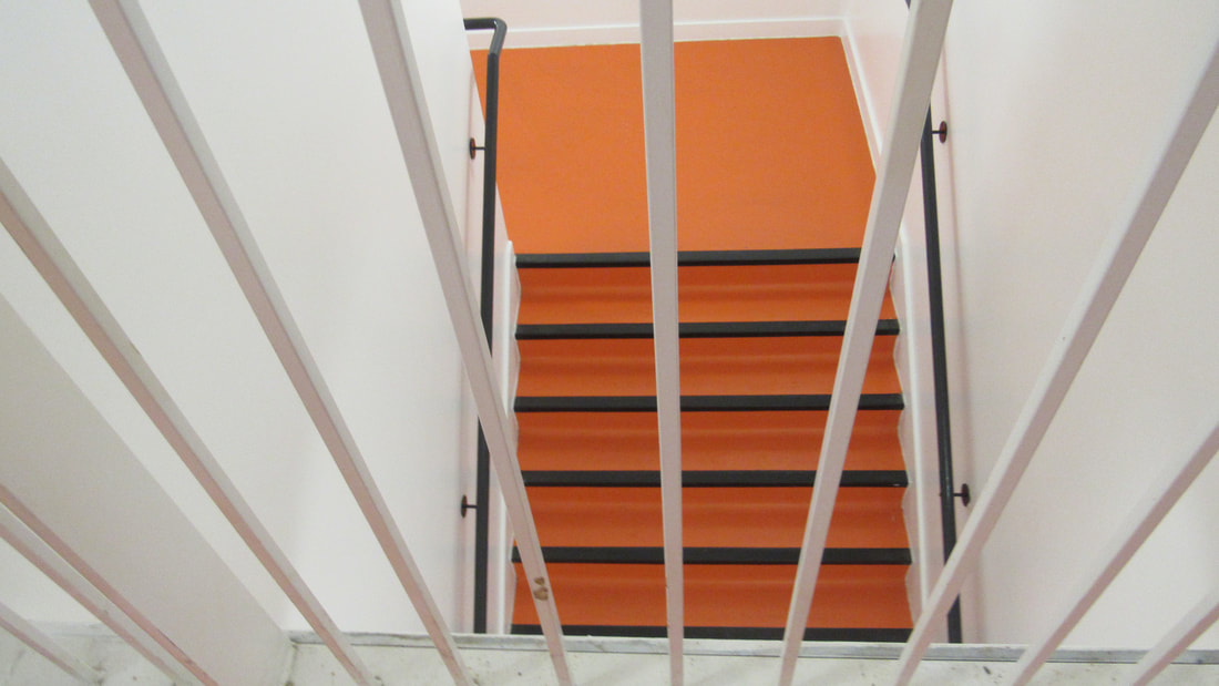
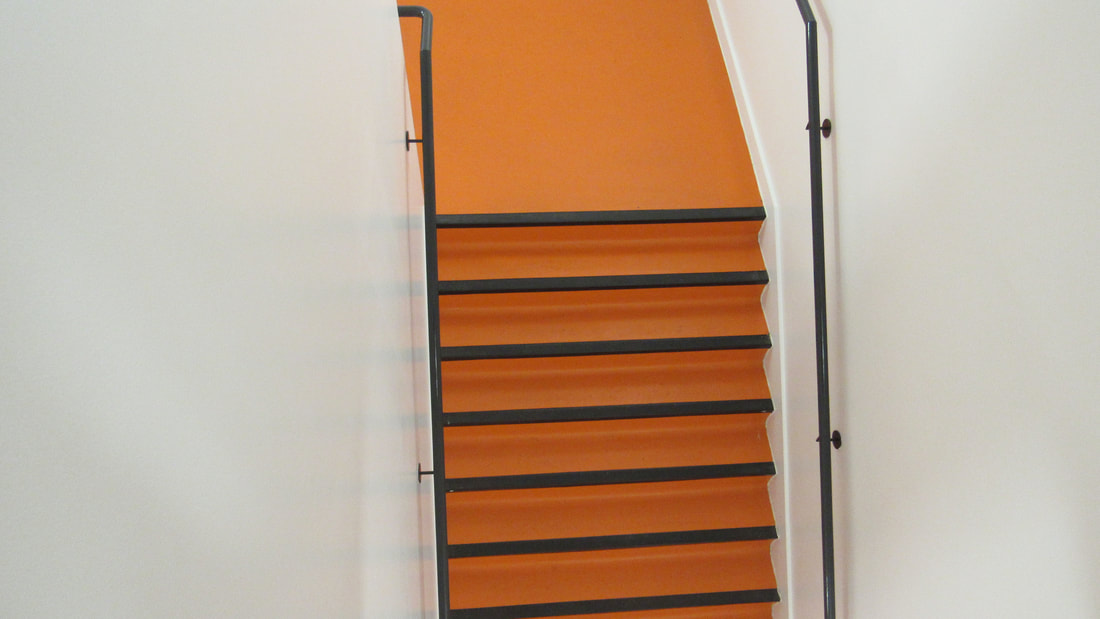
in class we was asked to pick out one formal element and take pictures of them.
I feel like my images came out okay, even though i ran out of time because my camera died halfway through taking images...
www: the amount of images i taken with the amount of technical difficulties
ebi: if i found more abstract lines.
I feel like my images came out okay, even though i ran out of time because my camera died halfway through taking images...
www: the amount of images i taken with the amount of technical difficulties
ebi: if i found more abstract lines.
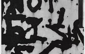
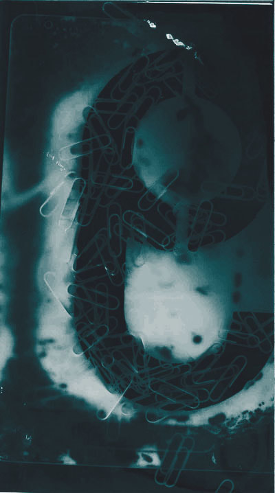
photograms
Man Ray

Man ray research
Man Ray was born 27 August 1890,Philadelphia,Pennsylvania,United States Of America 18 November 1976, Paris France he was an American visual artist who spent most of his career in France
Returning to Paris in 1951, Ray continued to explore different artistic media. He focused his energy on painting and sculpture. Moving out in a new direction, Ray began writing his memoir. The project took more than a decade to complete, and his autobiography "self portrait" was finally published in 1965.
Born Emmanuel Rudnitzky, visionary artist Man Ray was the son of Jewish immigrants from Russia. His father worked as a tailor. The family moved to Brooklyn when Ray was a young child. From an early year, Ray showed great artistic ability. After finishing high school in 1908, he followed his passion for art; he studied drawing with Robert Henri at the Ferrer Center.
How to make abstract photogram
- you get photo paper and place it under a light projecter
- you place your objects on top
- remove the flap for 3 secounds
- place flap back on the light
- put it in the devloper chemicals
- into to the stop then fix
- rinse off with water
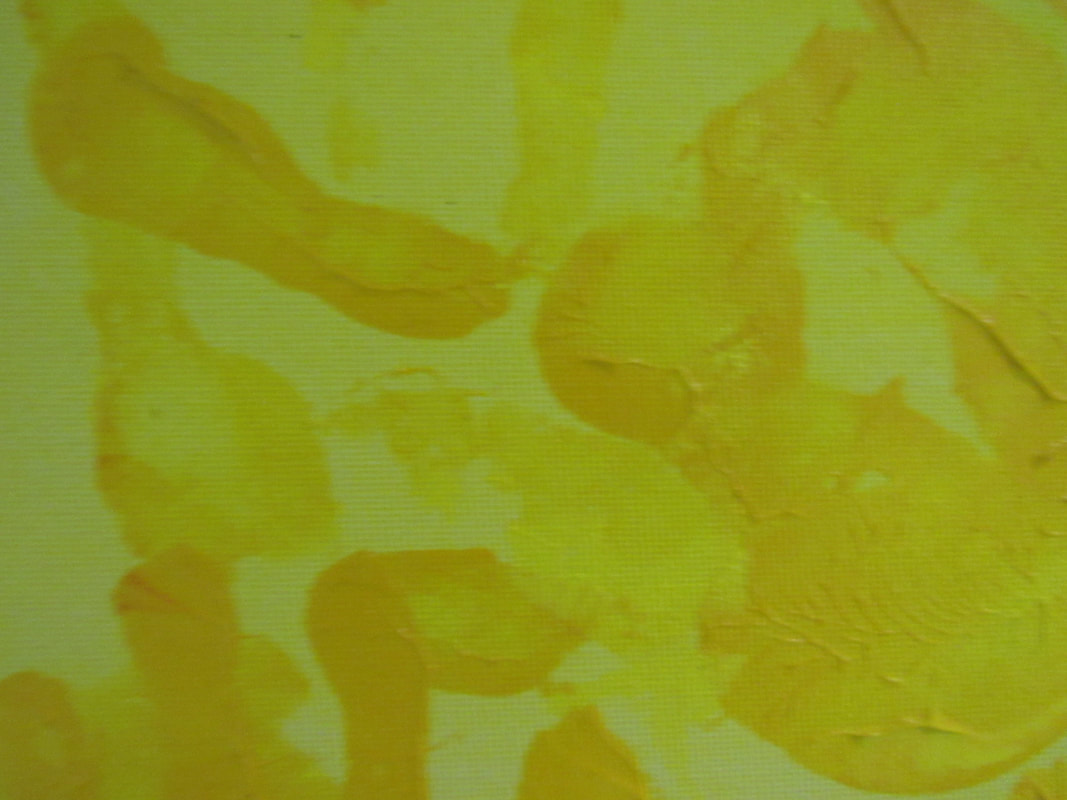
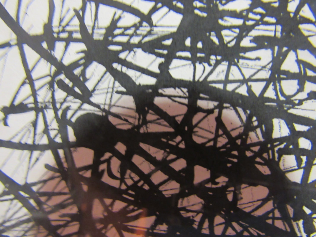
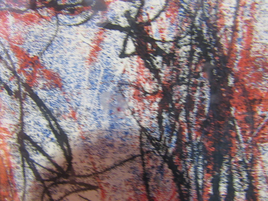
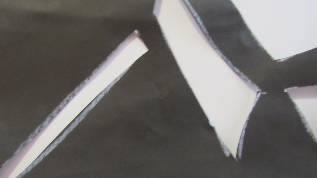
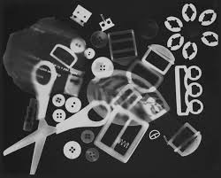
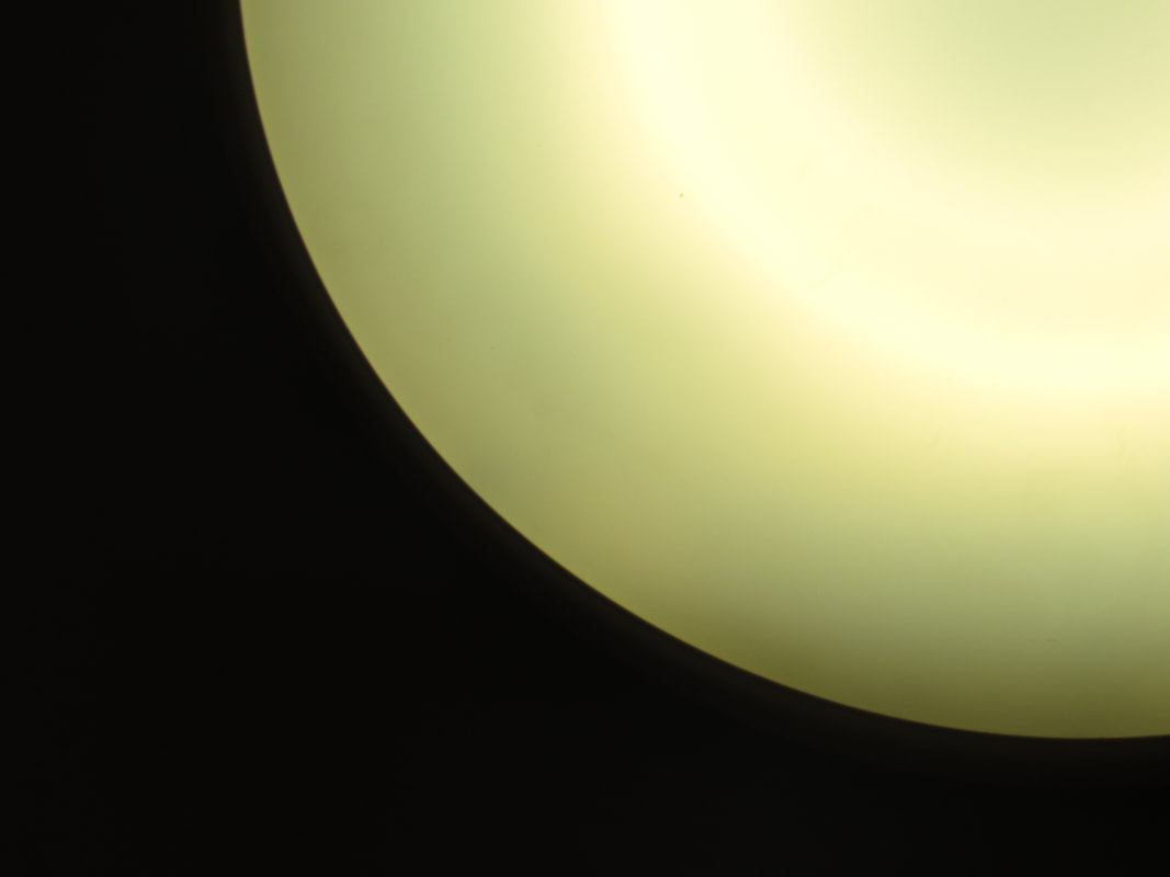
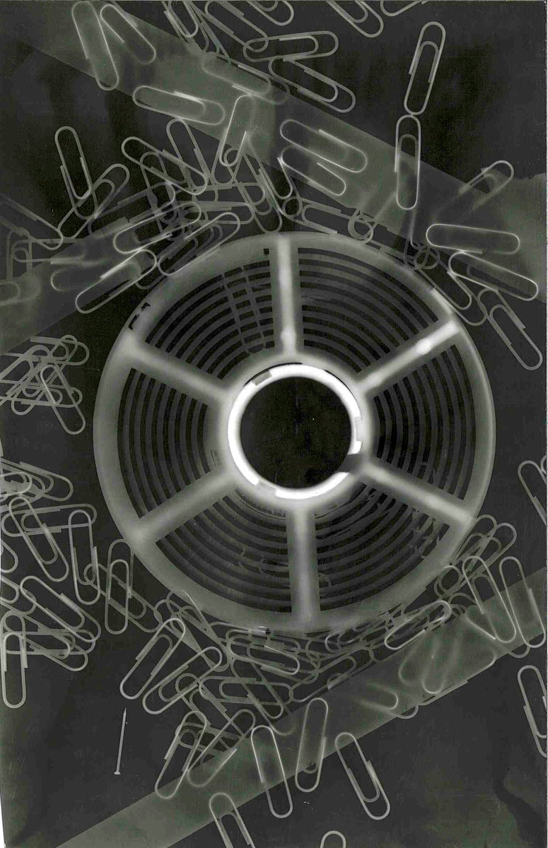
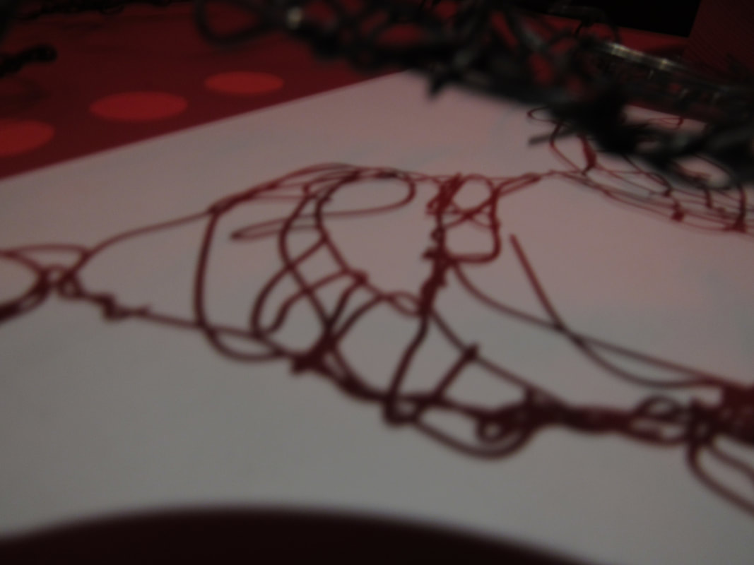
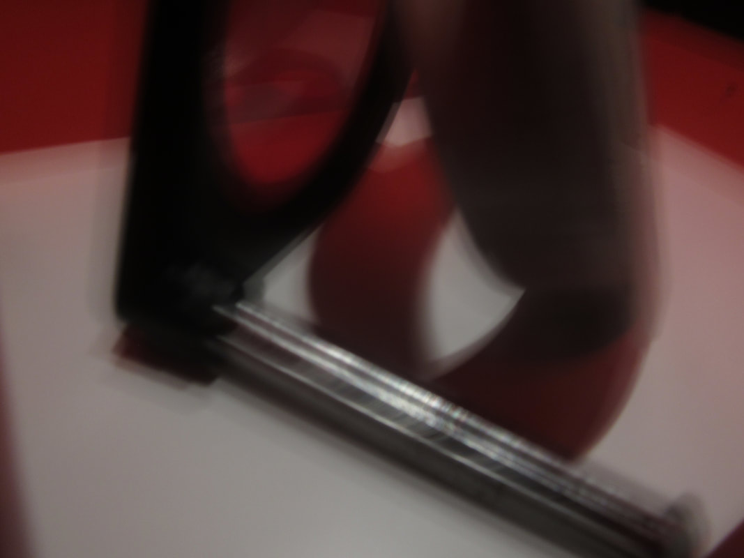
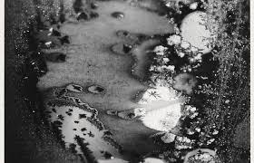
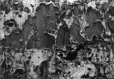
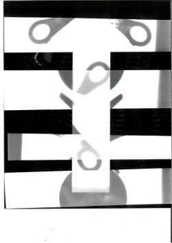
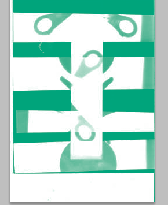
my favourite abstract image.
The reason why like this image the most is because its the cleanest and neatest and is exposed around the right time which makes the image my favourite. I also like the fact that its very abstract and the fact that you really cant tell what is really is make its more interesting.
I can see it involves the formal element of shape as you can clearly see shapes like squares and circles and it and it also has a lot of spacing which is another formal element between the shapes.
I can see it involves the formal element of shape as you can clearly see shapes like squares and circles and it and it also has a lot of spacing which is another formal element between the shapes.
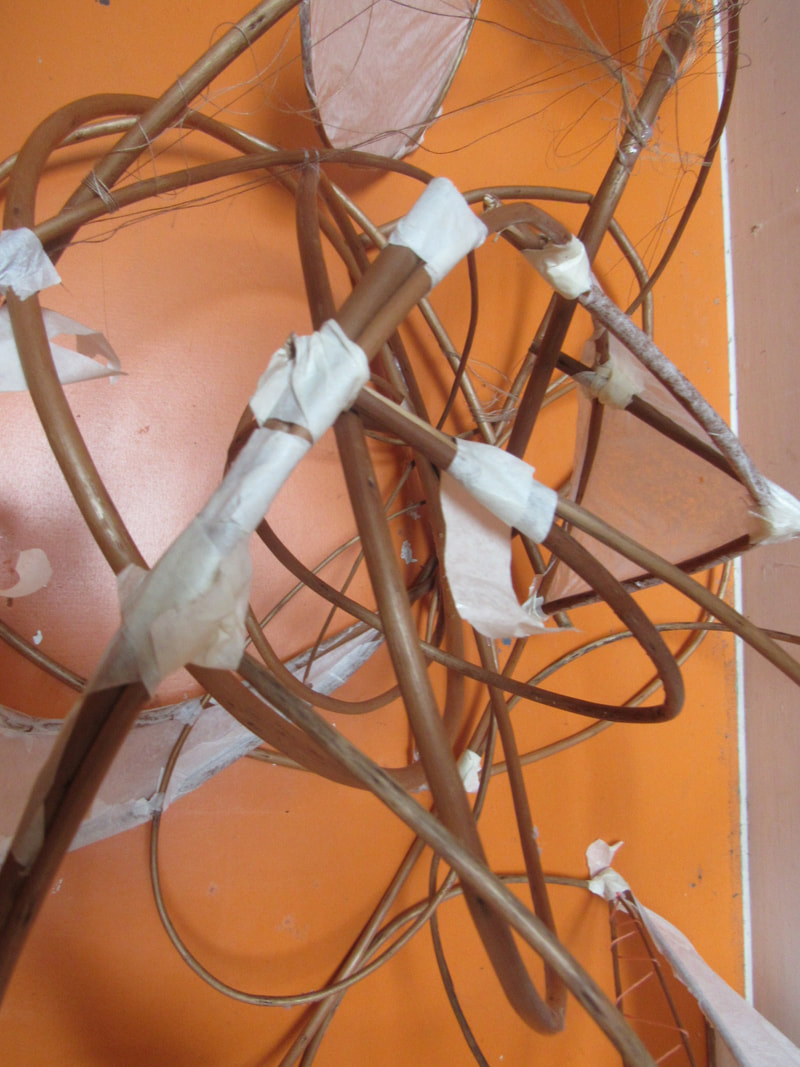
Attempt 2

During my second attempt i had the idea that i would like to try doing more of the formal elements of line and shape.
what i think went well: was the amount of pictures i had taken as i personally felt i took
what i think went well: was the amount of pictures i had taken as i personally felt i took
My photograms
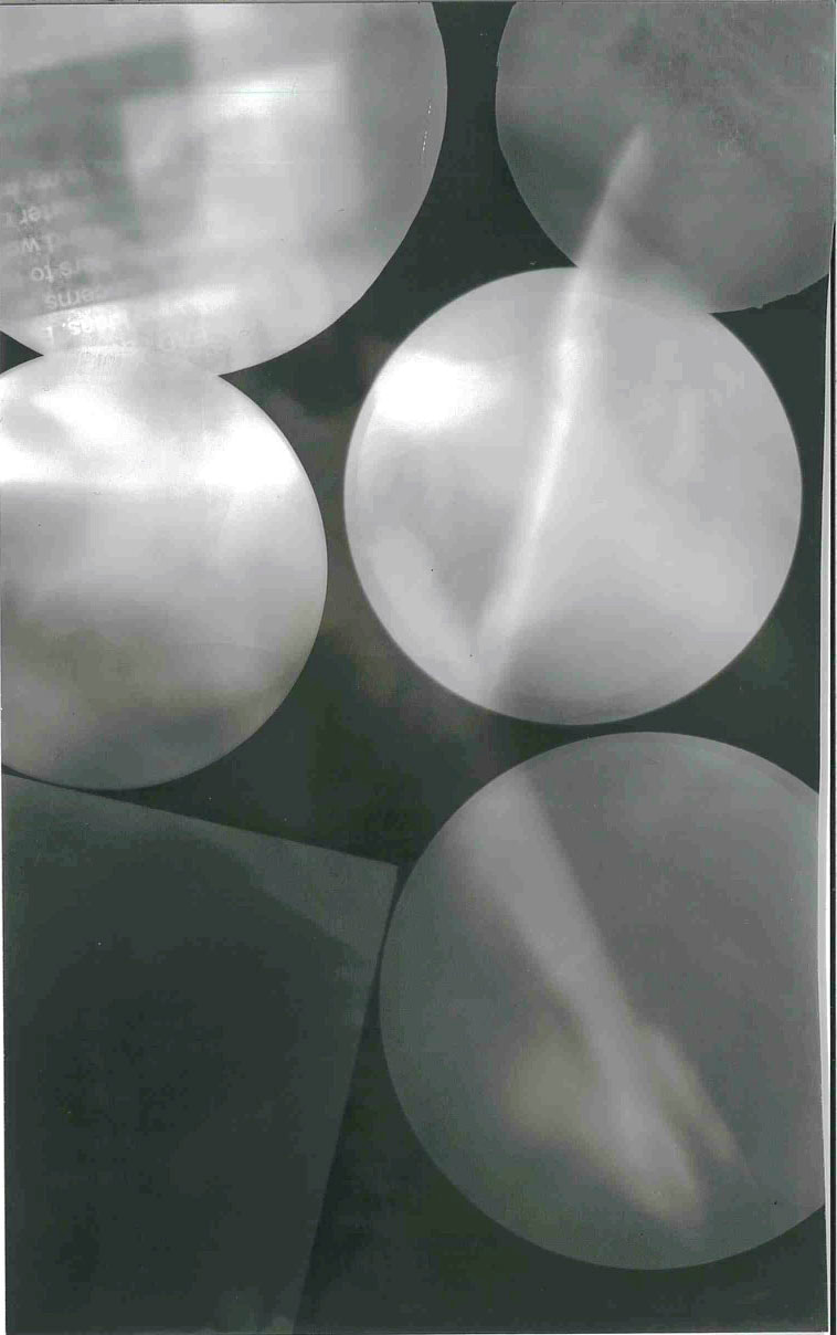
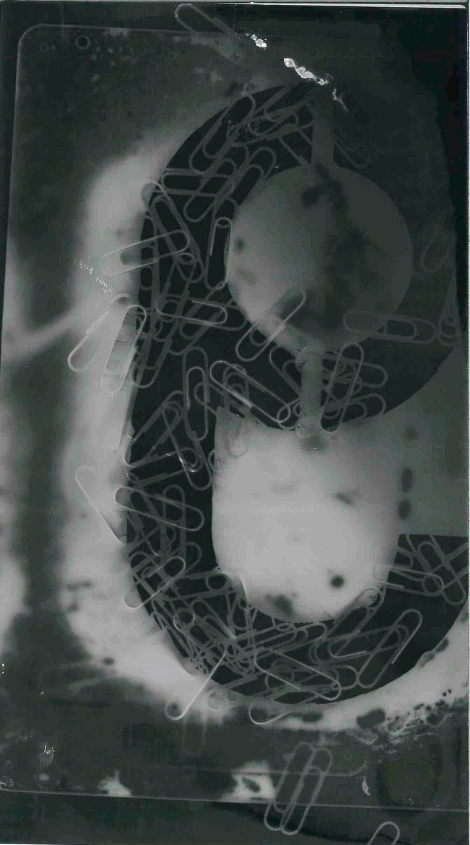
Our task today was to make our own photograms and scan them in.
i personally find this task easy as i had previous experience with doing this type of work but the difficulty i had with this task was not actually the task it self but i found scanning them in hard as when i was scanning them they came out half cropped so i had to keep rescanning until the full image came out but even then it looked very odd so I had to crop it some more.
i personally find this task easy as i had previous experience with doing this type of work but the difficulty i had with this task was not actually the task it self but i found scanning them in hard as when i was scanning them they came out half cropped so i had to keep rescanning until the full image came out but even then it looked very odd so I had to crop it some more.
Take 20 abstract images at home.
For my Independent learning i had to take 20 abstract images at home focusing on 2 formal elements however i had chosen to do 3 which are line,shape,pattern as most of the objects i observed consisted these 3 formal elements so it was kind of hard not to. What i think went well was i managed to reach this tasks goal which was to take 20 images of abstract photos which i found not that difficult because when you are in a comfortable and well known environment you notice where the formal elements are easier and even better if is that i should of taken more risks with this project and taken more abstract images outside.
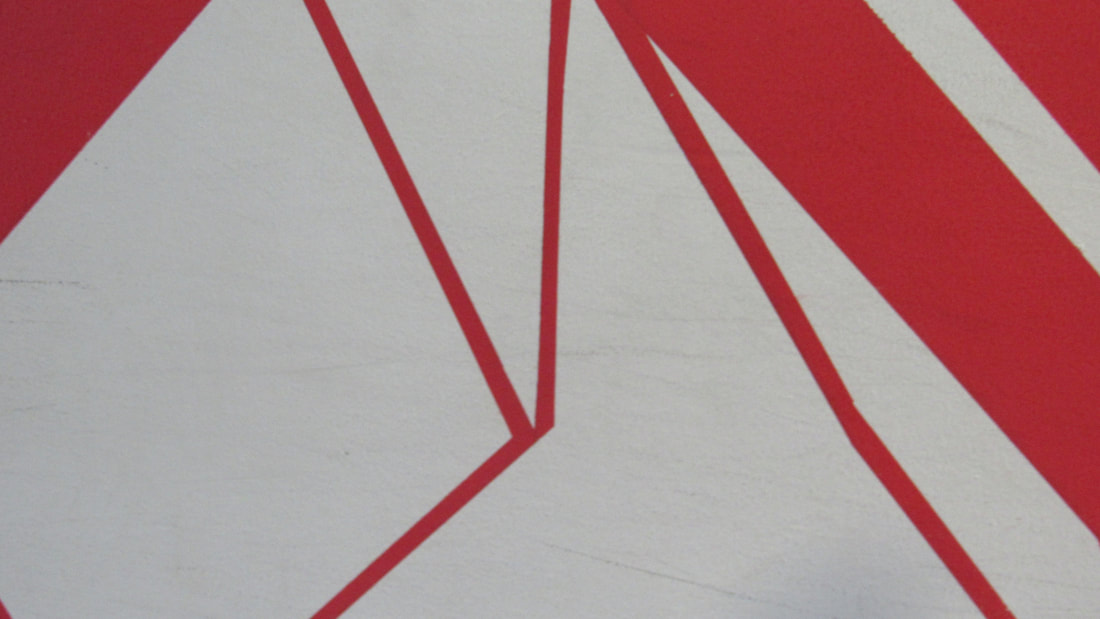
Final Piece Reaseach
Table 1 (school)
- it has picture of the school
- the way its edited and its cut
-they cut the image and edited it a certain colour which made it "abstract" which makes it work
- i like it because it is quite unique
- i may take the idea on how it cut
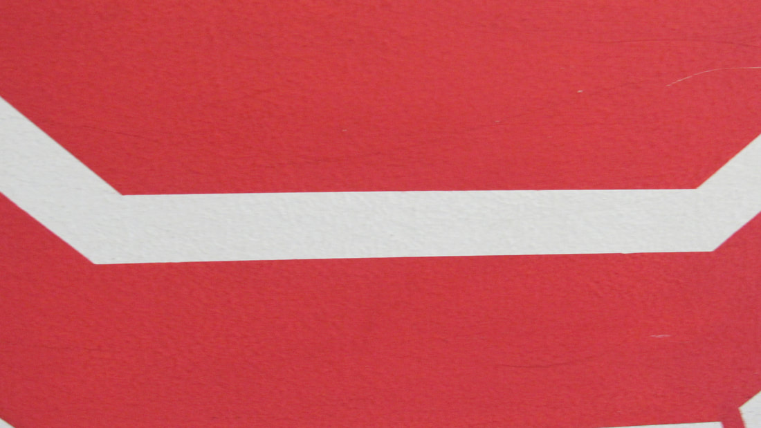
Black paper with red ripple
- its abstract because you cant really see what it is
-they put it on a single board and its surrounded by negative colour
-i like it because its interesting
-im not going to take ideas from this
Geomatic photogram compostion
- they cut some pieces up
- because you cant really tell what it is
- they put the cut up images a certain way
- i like it abit because theres a pattern
- im not going to take anything away from this.
Rectangle board with clouds and a poem
- the idea behind the mark is clouds
- it abstract because the way it edited make it abstract
- they made it work by presenting it very well
- i like it because it keeps to its theme
- i might take the way its presented
multiple squares
-the idea is to cut up the photograms to really small squares and put them all together
-its abstract because you cant really tell what it is.
- i don't really like it because its quite basic
-im not going to take ant ideas from this
circles and nature
-the idea is a mixture of nature and photograms mixed together
-they kept the idea of abstract nature and photograms
- i like it as it has a mixture of two
- im might take some ideas
- it has picture of the school
- the way its edited and its cut
-they cut the image and edited it a certain colour which made it "abstract" which makes it work
- i like it because it is quite unique
- i may take the idea on how it cut
Black paper with red ripple
- its abstract because you cant really see what it is
-they put it on a single board and its surrounded by negative colour
-i like it because its interesting
-im not going to take ideas from this
Geomatic photogram compostion
- they cut some pieces up
- because you cant really tell what it is
- they put the cut up images a certain way
- i like it abit because theres a pattern
- im not going to take anything away from this.
Rectangle board with clouds and a poem
- the idea behind the mark is clouds
- it abstract because the way it edited make it abstract
- they made it work by presenting it very well
- i like it because it keeps to its theme
- i might take the way its presented
multiple squares
-the idea is to cut up the photograms to really small squares and put them all together
-its abstract because you cant really tell what it is.
- i don't really like it because its quite basic
-im not going to take ant ideas from this
circles and nature
-the idea is a mixture of nature and photograms mixed together
-they kept the idea of abstract nature and photograms
- i like it as it has a mixture of two
- im might take some ideas
Research:
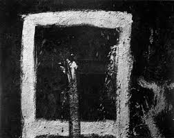
Jaromir Funke
He was a czech photographer and was a leading photographer in czech from about 1920s and 1930s his pictures played with the idea of “photographic games” with mirrors, lights, and insignificant objects, such as plates, bottles, or glasses, to create unique works. His still life’s created abstract forms and played with shadows looking similar to photograms. His work was thought to be logical, original and expressive in nature. A typical feature of Funke’s work would be the “dynamic diagonal." he died on march 22 1945
its abstract because you cant really see what it is which makes it more interesting.
Joromir Funke has a very unique way of producing abstract photos and because of this his photos often has a confusing effect as some of his photos are really difficult to make out what it is which is the sole purpose of abstract photography.
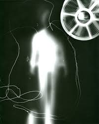
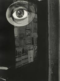
Unedited photos inspired by Jaromir Funke
In today task i had to take some images inspired by one of our chosen abstract photographer and in my case i chose jaomir funke.
as it was quite a dark gloomy day so there was not much shadow to use in my photos so i went to the dark room and use the enlargers as a light source so i can have shadows in my photo and continue on with the project.
what i think went well was how many photos i took and what standard i got it to
it would be even better if i did not have to switch cameras all the time as most of the time there where issues.
Original Image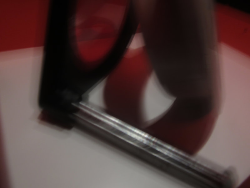
|
Edited Image
|
Ernst Haas
He took up photography after the war. His early work on Austrian returning prisoners of war brought him to the attention of LIFE magazine. He was born on March 2, 1921 Vienna, Austria and has a nationality of Australian and American background. His photos where mainly abstract and had the elements of refection and did a lot of work on water refelection and also a lot on movement.
Haas moved to the United States in 1951 and soon after, began experimenting with Kodachrome color film. He went on to become the premier color photographer of the 1950s. In 1953 LIFE magazine published his groundbreaking 24-page color photo essay on New York City. This was the first time such a large color photo feature was published by LIFE. In 1962 a retrospective of his work was the first color photography exhibition held at New York’s Museum of Modern Art.
Throughout his career, Haas traveled extensively, photographing for LIFE, Vogue, and Look,
Ernst Haas received the Hasselblad award in 1986, the year of his death. Haas has continued to be the subject of museum exhibitions.
Aaron Siskind
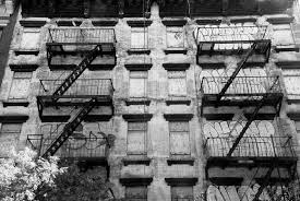
He was an American Photographer
Aaron was born on the 4th of December, 1903 and died on the 8th of February, 1991. Aaron's photographs intensified his approach to picture making - with close-up framing, as well as emphasis on texture, line, and visual rhymes - creating abstract images of the real world.
I chose this photographer because most photographers take photos of perfect structures, however Aaron takes photographs of the imperfect without trying to make it perfect. This gives his photos emotion. I also like the texture and the way he composition makes his work much better.
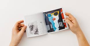
Photobook reasearch


i think my photobook will be very unique as i will change the shape of my photobook so it doesnt look as basic as a normal photobook.
How to make Abstract photos like Aron siskind
- keep your photos black and white
- compostions are quite packed
- vareity of themes
- pictures of destroyed areas
- alot of texture
- a lot of contrast
- rarely take photos of people

The edited photo
What i did was was change the original photos colour and texture by changing it from black and white to more of a cooler colour like cyan which gives the image a more eerie effect to the image. what i think went well was the outcome of this product and even better if i added more brighter colours as i feel i gives another effect other than eerie.
Types of photobooks
There are many types of photo books but i have chosen only two this is because i like how they are simple and one of them i have previously made before.
|
This is what i like to call the "accordion" photo book
i have previously made this before and have experience on how to make it. Another reason why i chose this photo book is because i like the way it presents my images on the book. |
|
The reason why i might find this photo book suitable is because is very large this helps me have more space to put more images on them but a downside may be that it would be to large to lug around.
I like this photo book due to its simplicity its very basic which i quite like and easy to make. its also very portable and very easily assessable. |
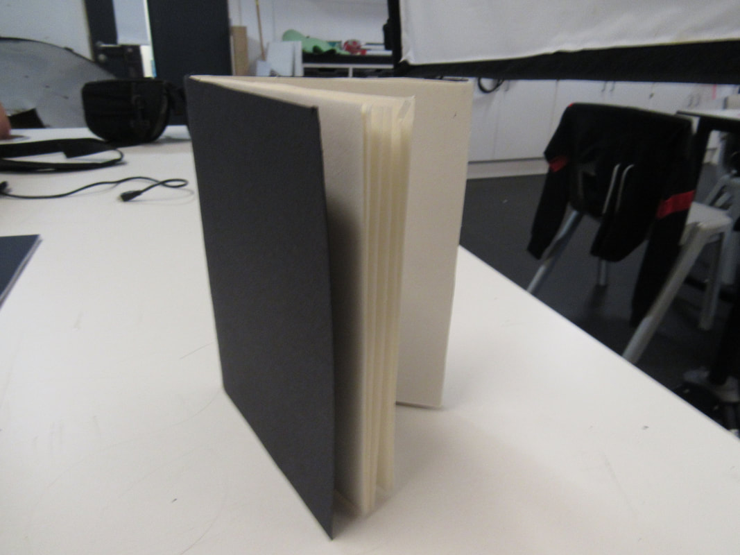
Final choice of photobook
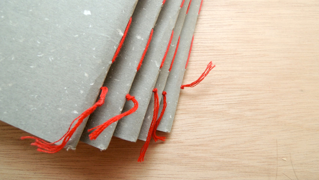
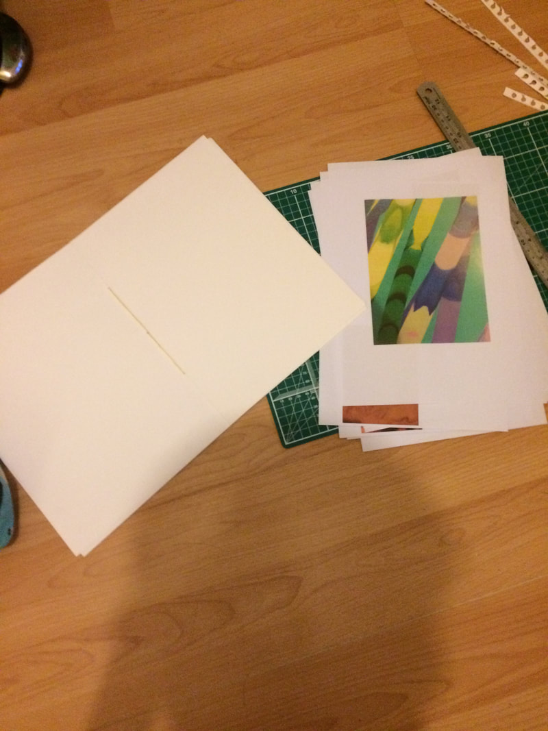
My final choice was a simple book which had stitching on the side i felt like this method had a mix of simple,basic infused with unique. The method that i had chosen was inspired by a task that i had previously completed in year 9 when we made Photo books and ways to bind them.
The image above is similar to my method of stitching.
The image above is similar to my method of stitching.
The process of making my photo book
The first parts of my journey to making a photo book was not documented by image so instead im going to document it in typing.
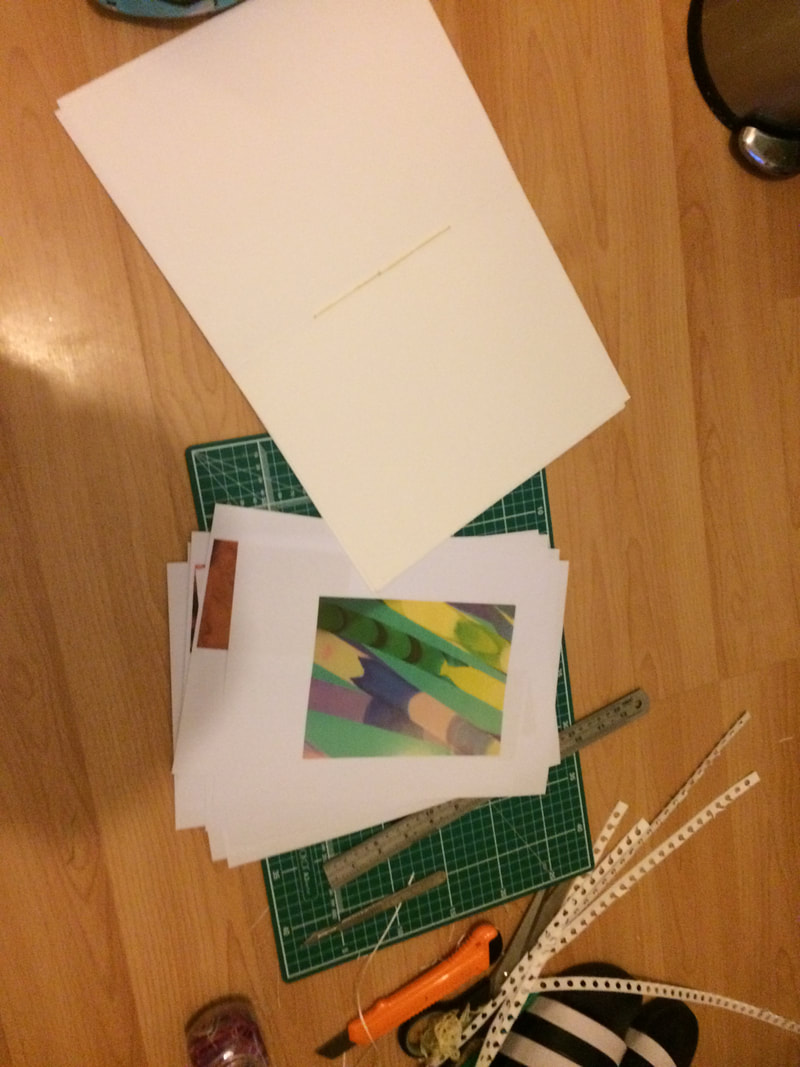
first i popped holes in to my A3 folded into A4 paper and used a stitching technique to make the bindings of my book.
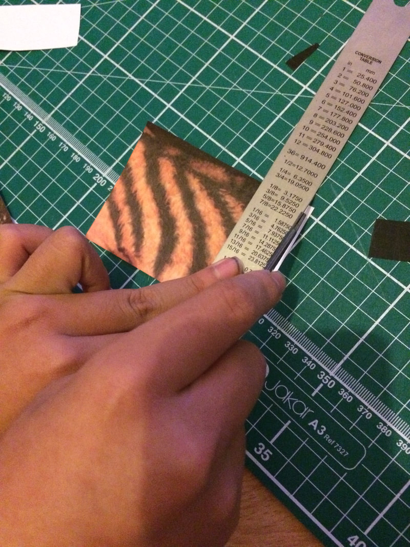
Secondly, i printed out my 30 images and cut them out
thirdly, i stuck them in and into interesting patterns
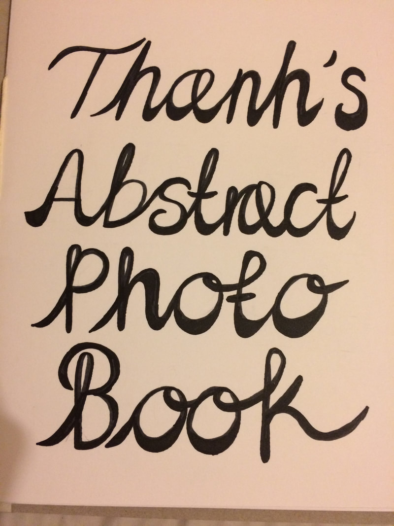
finally, i added some decorations and ended with a decorative title.
first i popped holes in to my A3 folded into A4 paper and used a stitching technique to make the bindings of my book.
Secondly, i printed out my 30 images and cut them out
thirdly, i stuck them in and into interesting patterns
finally, i added some decorations and ended with a decorative title.
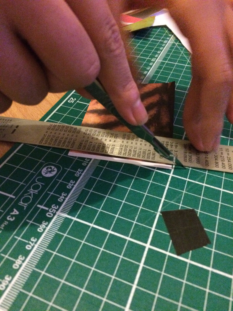
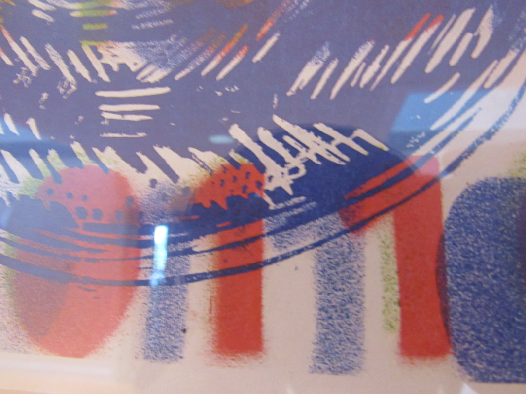
cut up photograms
these are the two duotones that i created and i personally think that it is okay but i do think it was good
what went well was that they were successful and looked better.
i did many cut up image photograms but most of them didn't come out as what i wanted it to come out like or not at all so i had to choose the ones that did come out really well but that was only a few. i now need to get on with duotones and change the colour.
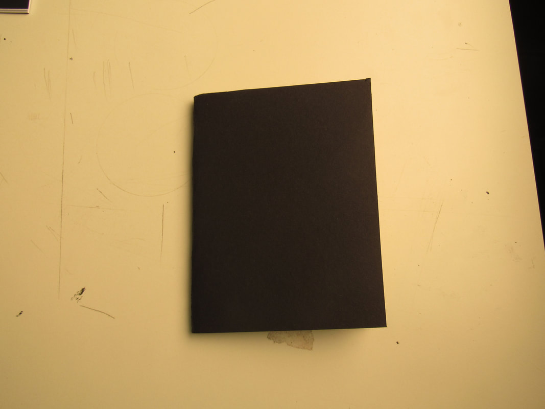
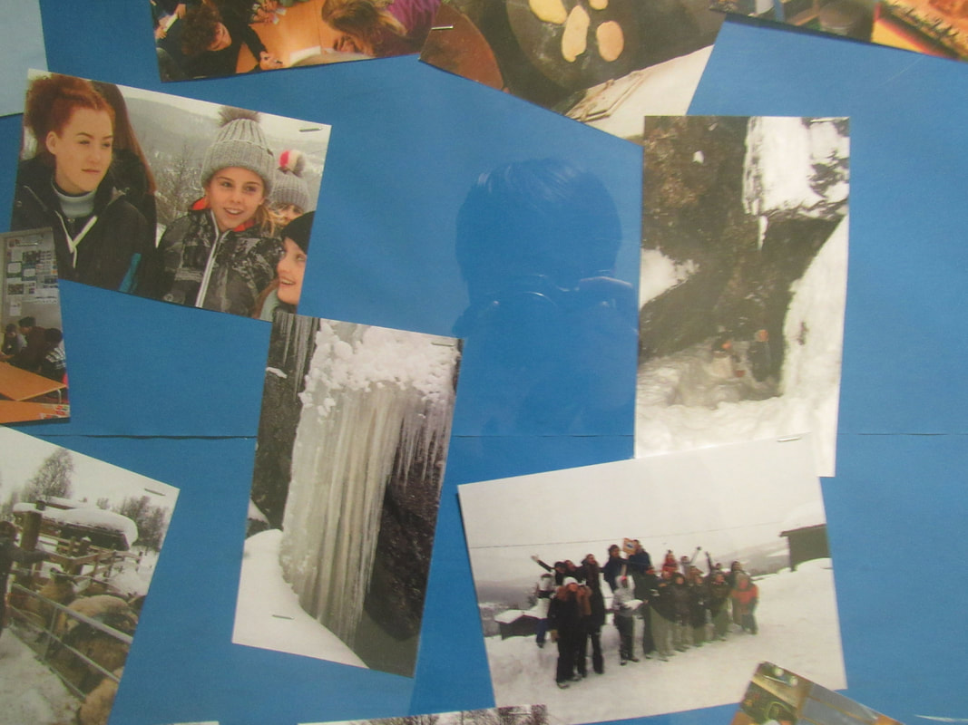
These images are the pictures of my dummy photobook and i will choose some ideas from this dummy and use it as inspiration on my final piece.
how i made this was a very simple process i folded a piece of a4 paper and got a piece of a4 black paper to use as a cover and i stapled the papers together to make my book.
For my final piece instead of stapling the book together i will stitch the book and add interesting patterns on each page just to make it more abstract.
Picture of my duotones
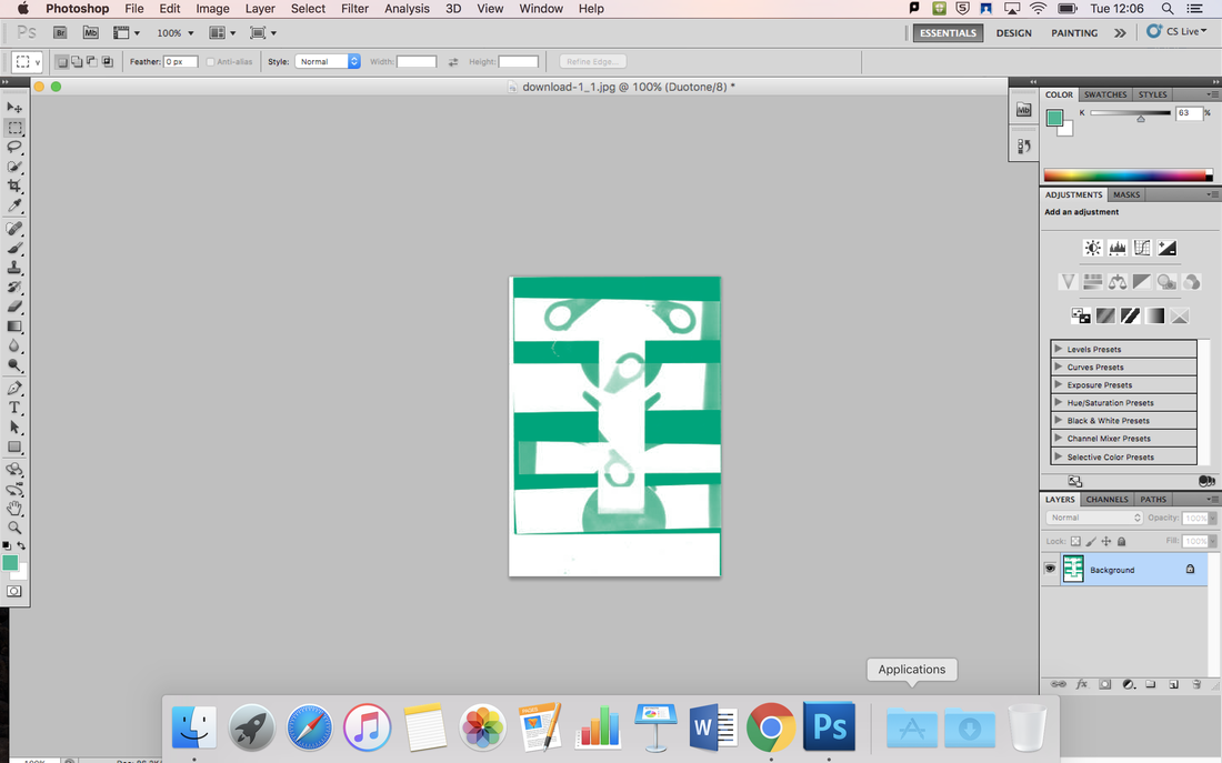
At first i struggled with using photoshop due to the fact because i didn't understand the setting we had to set it to so i can do duotones but furthermore i didn't understand the many steps needed but after a bit of help i managed to understand the program and change the colour of my cut-up pieces eventually and other than that i feel like i did this task very well as i managed to take a screenshot of my progress made in photoshop.
what went well was the fact that i managed to complete the task and i thought i be even better if i understood the program more quicker as it meant i would of finished the task more quicker
what went well was the fact that i managed to complete the task and i thought i be even better if i understood the program more quicker as it meant i would of finished the task more quicker
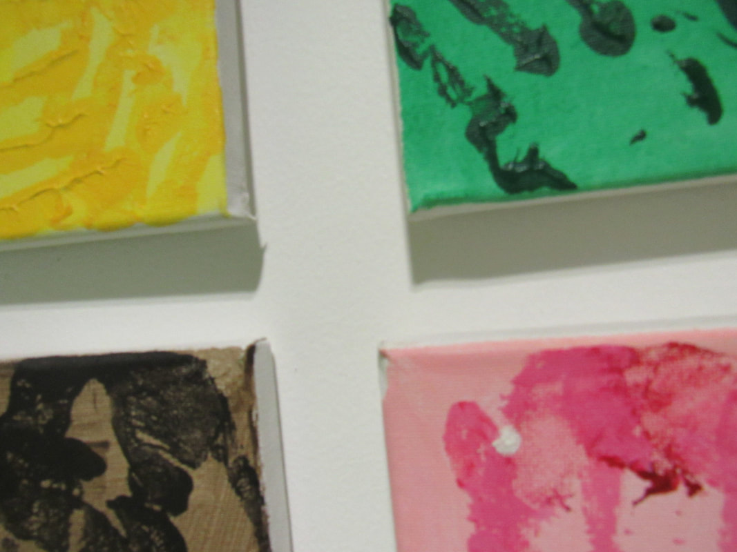
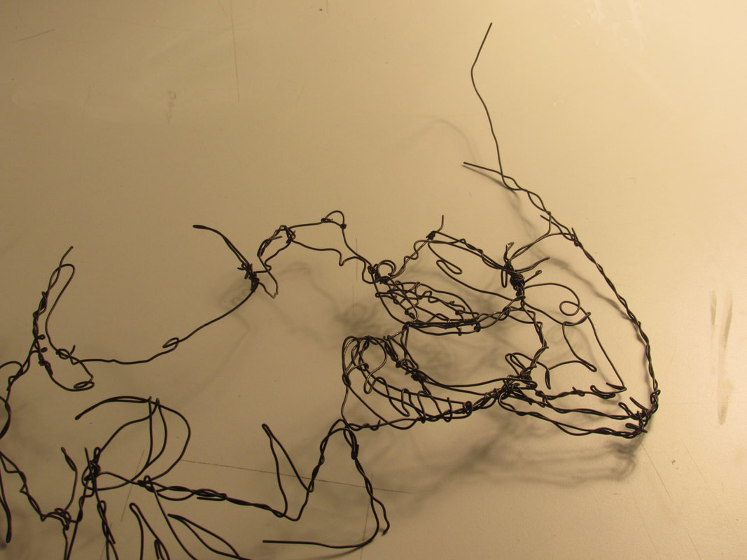
MY FINAL BOARD PIECE
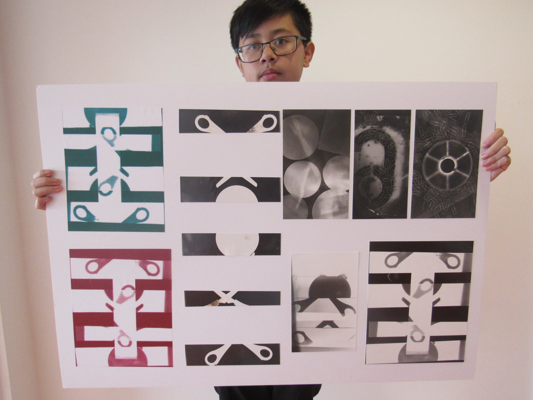
During this very long process i managed to complete my board which represented my journey of abstraction. i am very happy on how this turned out as it looks very professional.
www: was that i placed the images in a very neat and presentable layout
ebi: my trimming was more neater.
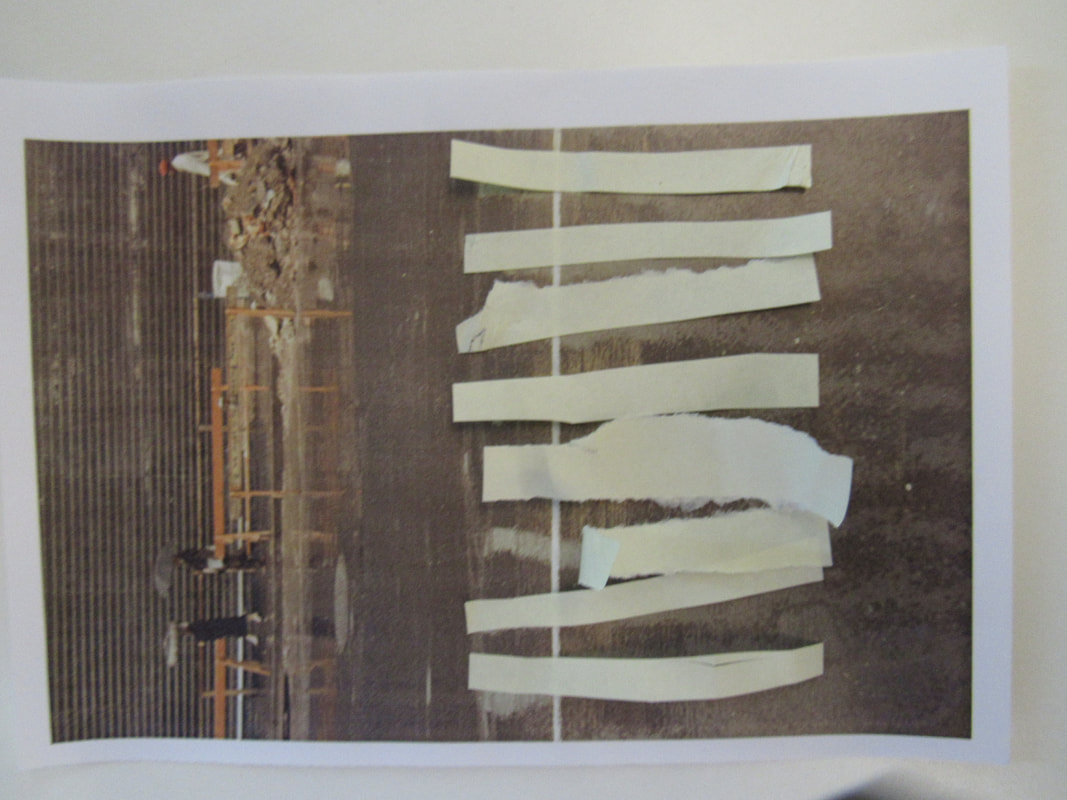
what we did was make photograms and cut them into strips and place the strips on a blank paper then make and new photogram.
i found this process very easy as it made my work look abstract as you cant tell what it is.
i also decided to make duotones of it to see how far and to what extent i can make this board as abstract as possible.
if i had to do this again i would think of shaping the board differently and laying it out differently too,
www: was that i placed the images in a very neat and presentable layout
ebi: my trimming was more neater.
what we did was make photograms and cut them into strips and place the strips on a blank paper then make and new photogram.
i found this process very easy as it made my work look abstract as you cant tell what it is.
i also decided to make duotones of it to see how far and to what extent i can make this board as abstract as possible.
if i had to do this again i would think of shaping the board differently and laying it out differently too,
Final images for my photo book!
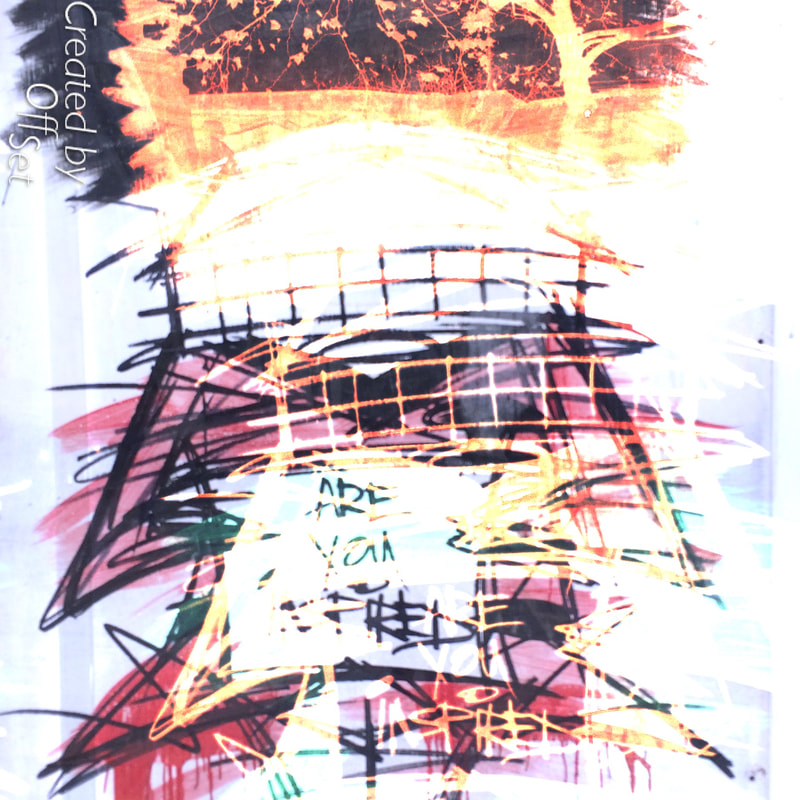
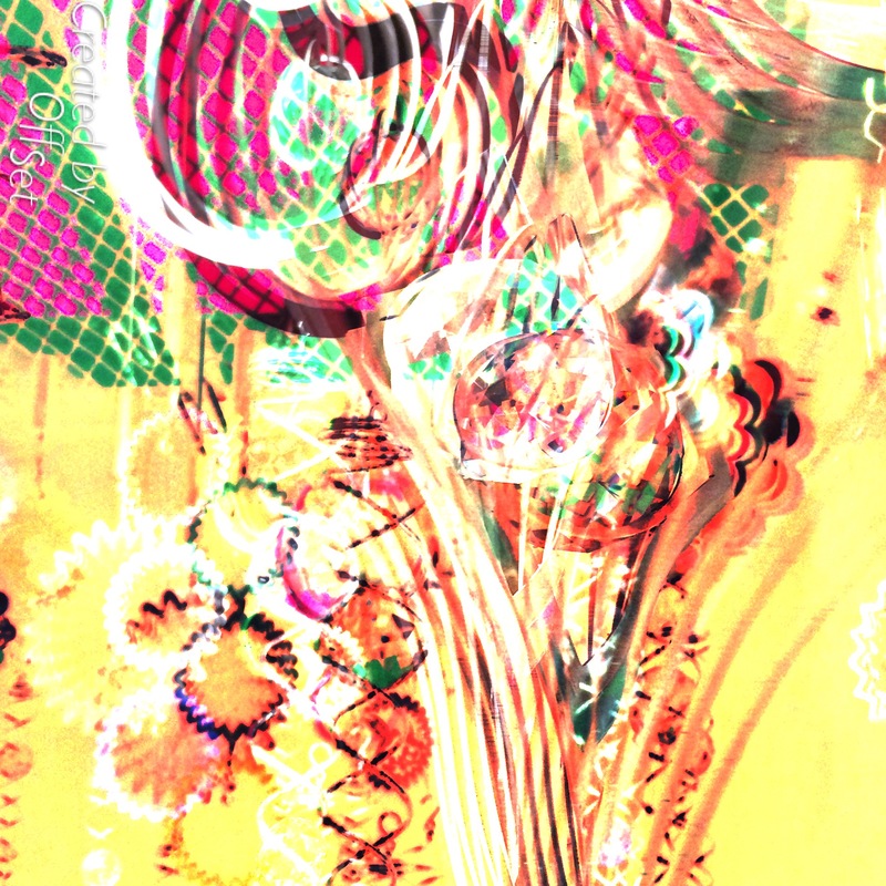
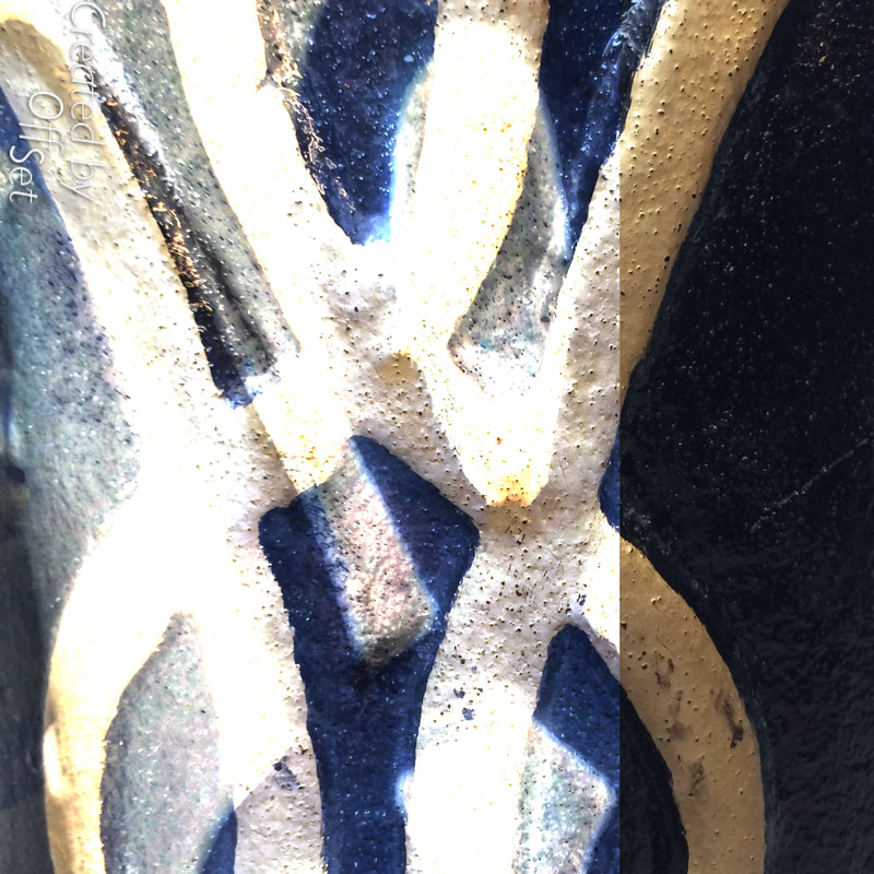
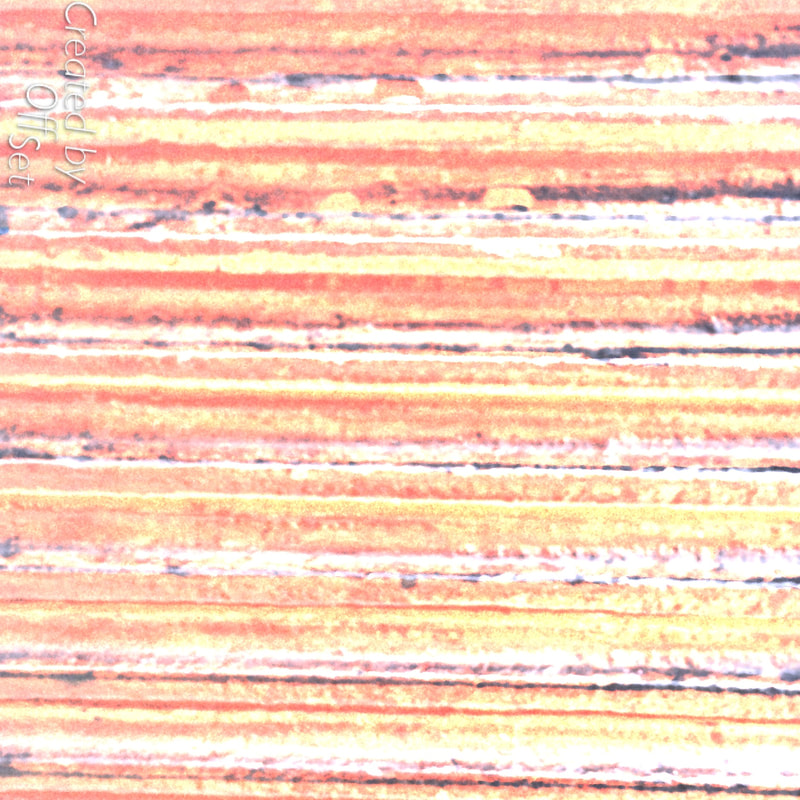
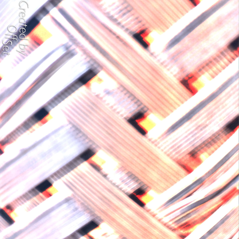
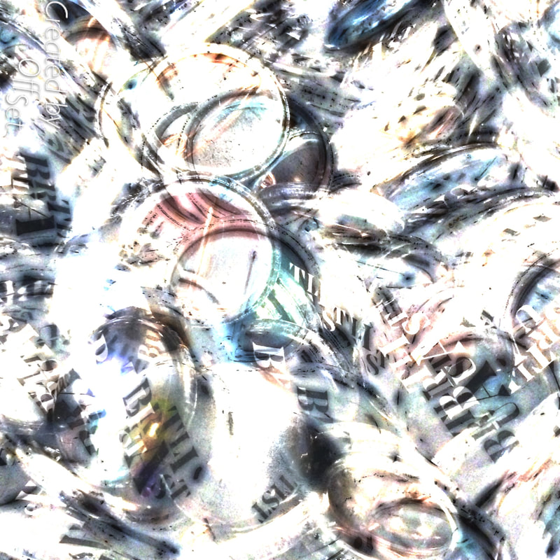
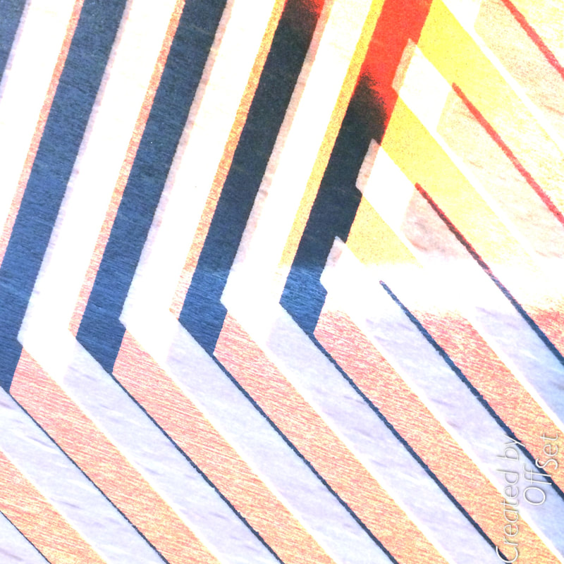
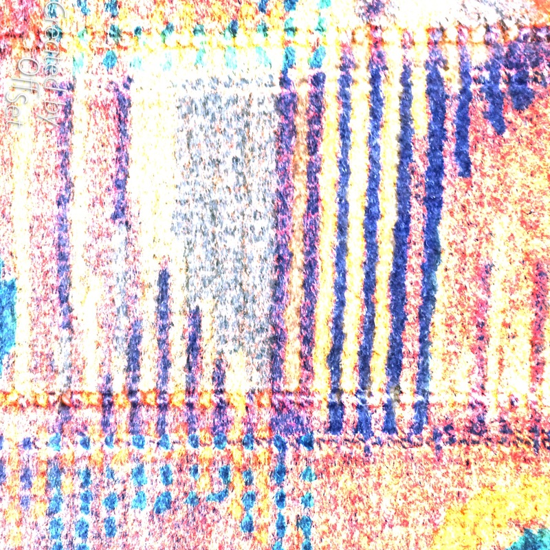
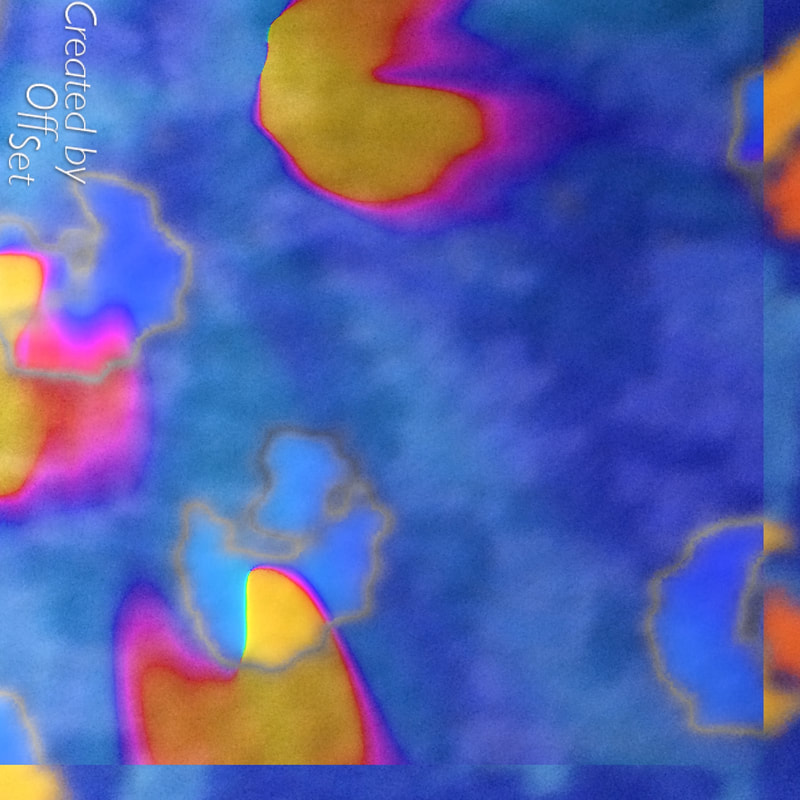
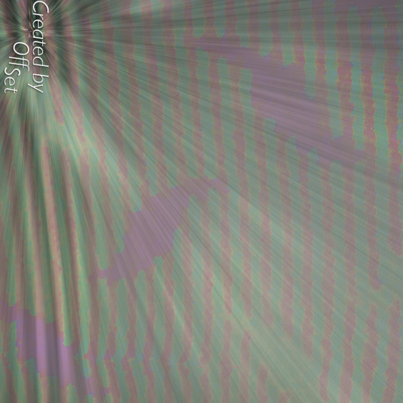
For the homework i did not manage to take 30 images due to technical difficulties however i did manage to take 9 images but i wanted to take it a step further by making my images more abstract by using a editing software i found on my phone i found called "Off set" which really help make my photos abstract and i felt it help me step out of the box a bit and experiment more with my photos.
what i think went well was how i added edits to improve my work and it would of been better if i didn't have technical difficulties and taken more images which i regret.
what i think went well was how i added edits to improve my work and it would of been better if i didn't have technical difficulties and taken more images which i regret.
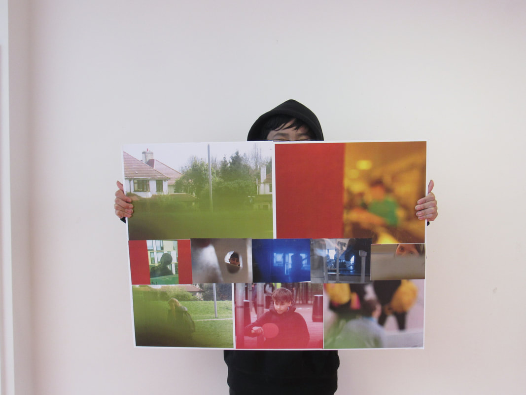
Photo collage
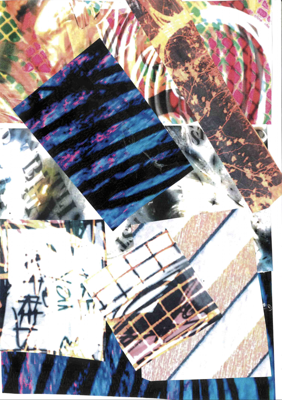
in this task i just took my best abstract work and cut the the images in to little pieces and kind of put them on top of each other a lot so it can make it more abstract.
www: what i think went well was the images that i picked for my collage as i personally thought that those images was the best of the best.
EBI: i was more creative with how cut the images so i could of done them in more unique shapes and patterns.
www: what i think went well was the images that i picked for my collage as i personally thought that those images was the best of the best.
EBI: i was more creative with how cut the images so i could of done them in more unique shapes and patterns.
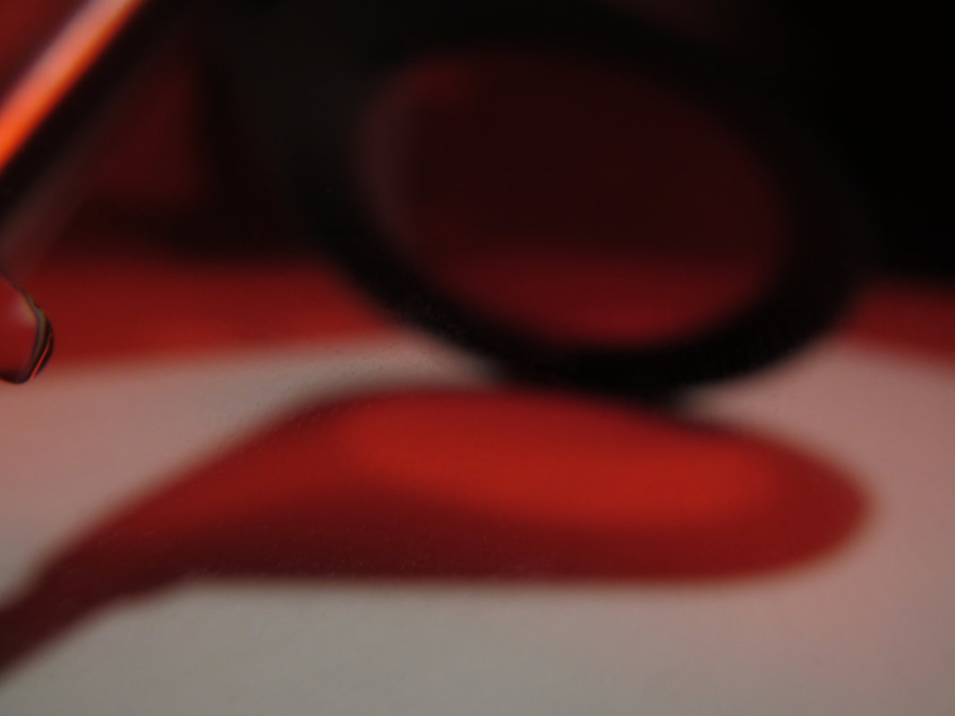
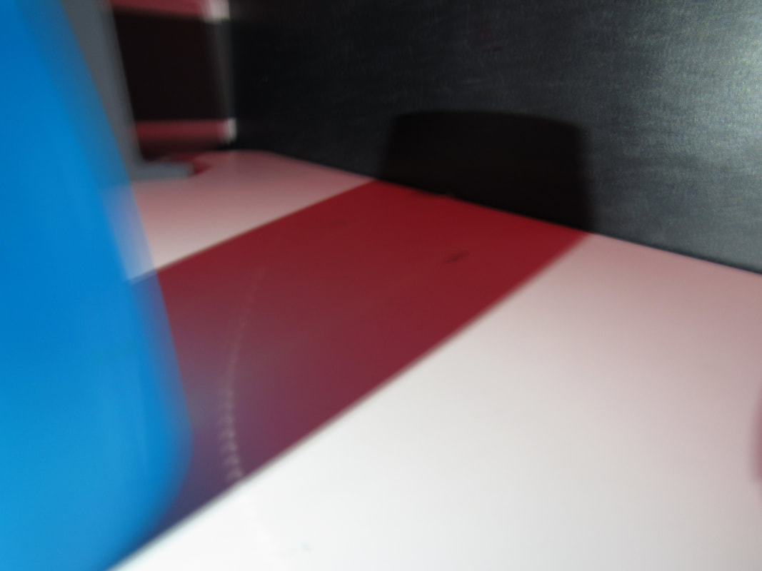
In this project i deciding between making another board with these images which focuses more on lighting and shadows. What i think went well was the amount of images i took and how well they turned out and even better if the the lighting was at different angles but even then it changed the height and contrasts of the shadow changes with it too so i also found that quite annoying.
www: the amount of images taken
ebi: experimented more with composition and angles.
www: the amount of images taken
ebi: experimented more with composition and angles.
ABSTRACT PHOTOSHOP.
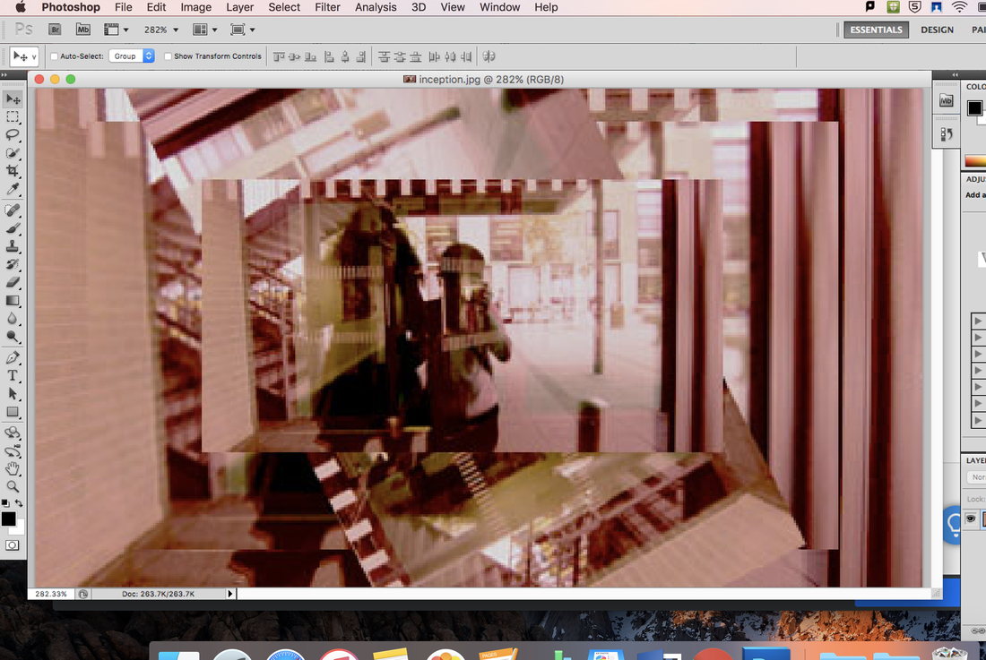
In todays task we had to make our images more abstract by using photoshop.
How i chose how to make my images more abstract i used tools like clone stamp and eraser to copy and repeatedly paste to make an "Inception" type of vibe.
what i found went well was the how the images came out because they came out looking abstract. Even better if i understood photoshops tools a bit more as i kept on forgetting where and what tools i needed to use. Today we also was meant to understand the role of photoshop that plays with abstraction which i understood quite well.
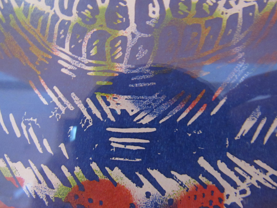
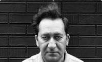
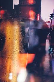
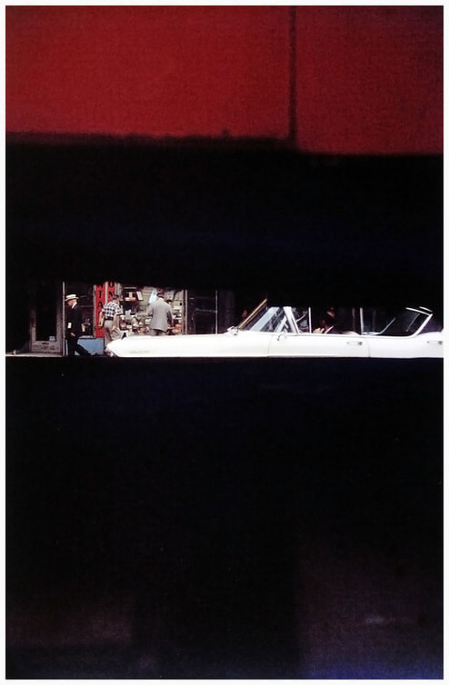
Saul lieter
Saul Leiter (1923-2013) was born in Pittsburgh, Leiter's interest in art began in his late teens, and though he was encouraged to become a Rabbi like his father, he left theology school and moved to New York to pursue painting at age 23. he befriended the Abstract Expressionist painter Richard Pousette-Dart, who was experimenting with photography. His friendship with Pousette-Dart and soon after, with W. Eugene Smith, expanded his interest in photography. Leiter's earliest black and white photographs show an extraordinary affinity for the medium. By the 1950s, he began to work in color as well, compiling an extensive and significant body of work during the medium’s infancy. His distinctively subdued color often has a painterly quality that stood out among the work of his contemporaries.
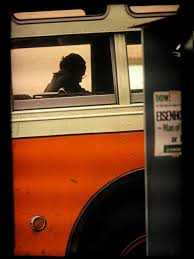
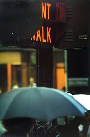

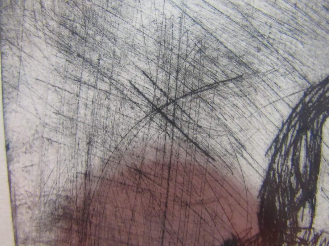
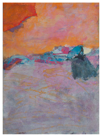
my favourite image
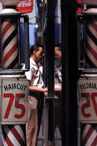
1. because i like how the same perspective is mirrored
2. it is basically one image but is mirrored
3. there is the formal element of lines which is reflected and also reptition is important
4.its is important as it makes up the images itelf the lines on the haircut post makes it look very reflective and fills in the reptition formal element which helps out and is important as it contributes to making the image.
5. he takes normal objects and puts them in a certain way where you can sometimes not even tell what it was..
Saul Liter quote
A Saul lieter qoute
"SOME TIMES I AM AMAZED BY WHAT YOU CAN DO AS A PHOTOGRAPHER"
"SOME TIMES I AM AMAZED BY WHAT YOU CAN DO AS A PHOTOGRAPHER"
Saul Leiter Painting
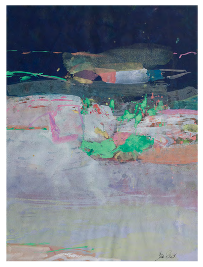
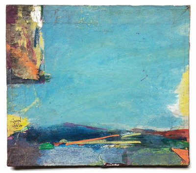
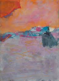


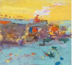
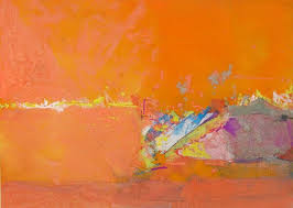
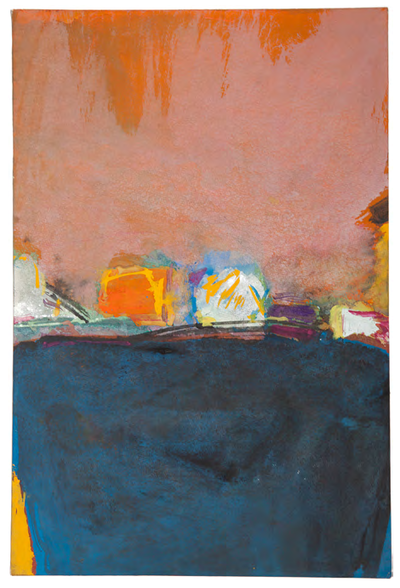
Saul Leiter did arrange of abstracts arts.
he took photographs and also did paintings
sometimes the painting can look very similar to the photographs.
in all of his pictures he uses very bright vibrant colours which makes it look very ubstract and helps with the fact that sometimes you cant really tell what it is.
he took photographs and also did paintings
sometimes the painting can look very similar to the photographs.
in all of his pictures he uses very bright vibrant colours which makes it look very ubstract and helps with the fact that sometimes you cant really tell what it is.
SIMILARITIES |
|
DIFFERENCES |
|
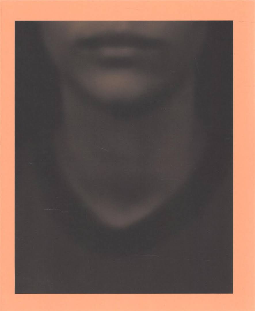
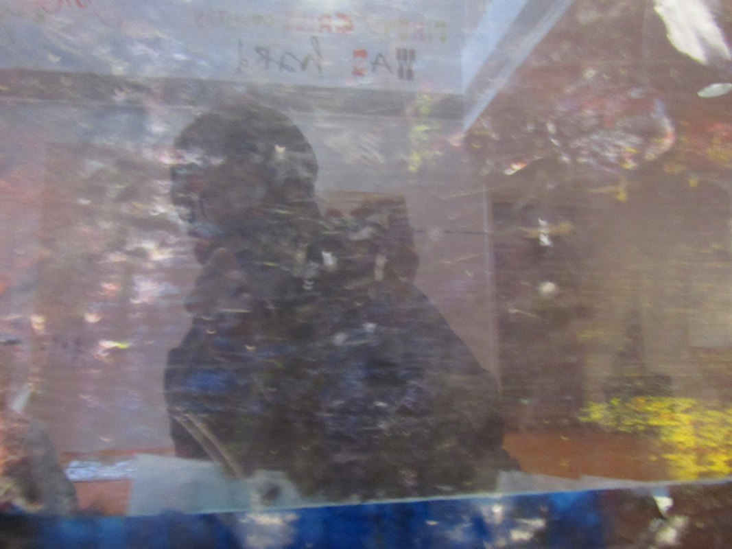
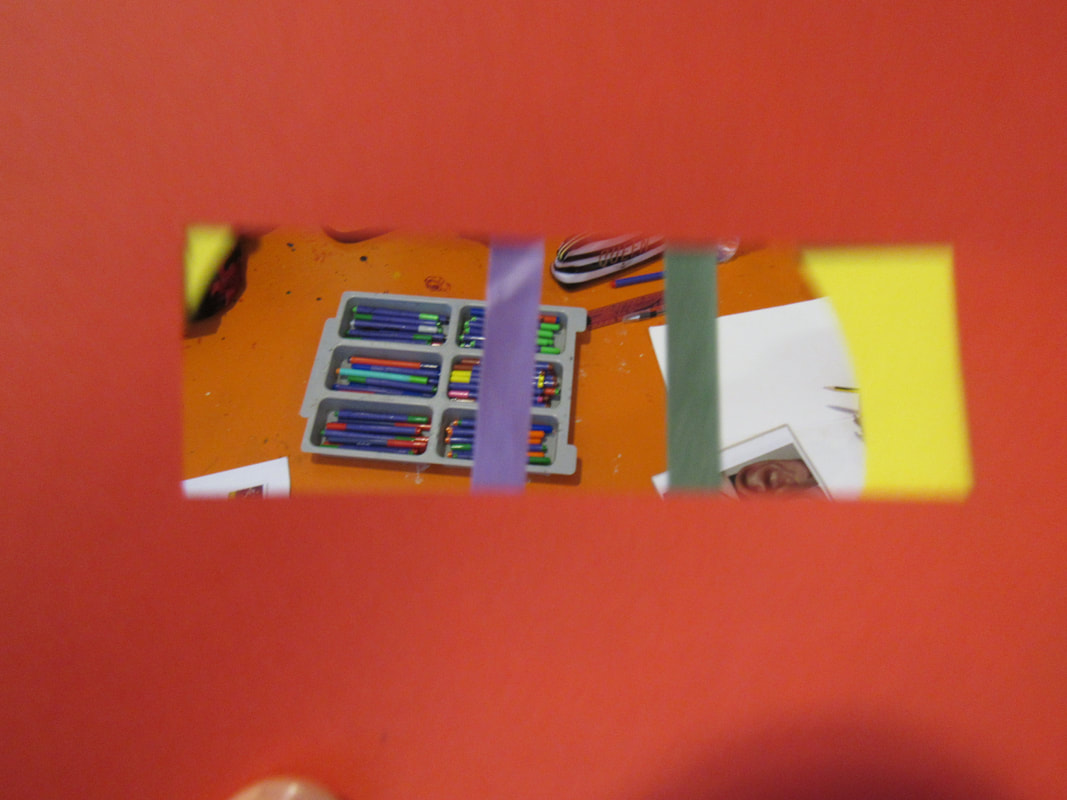
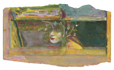
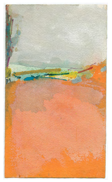
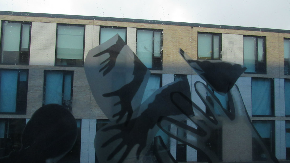
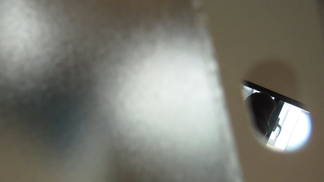
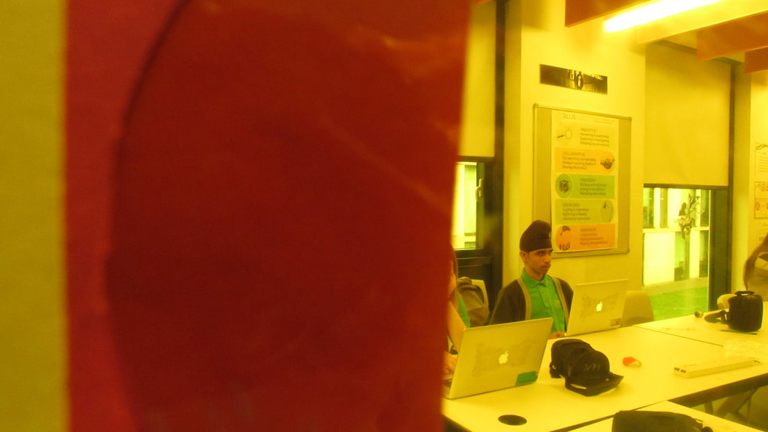
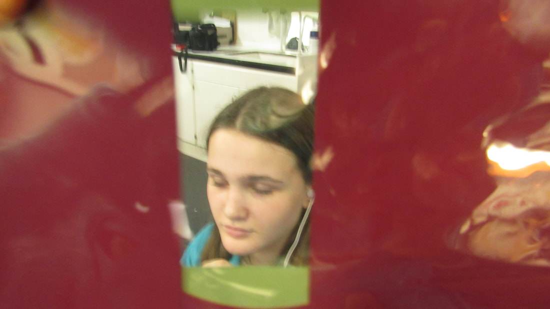
my attempt :
Our task was to paint like Saul Lieter but i cannot paint so it turned out bad....
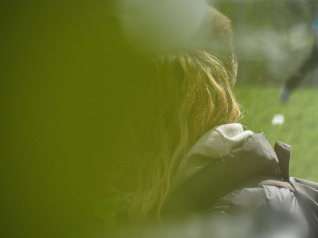
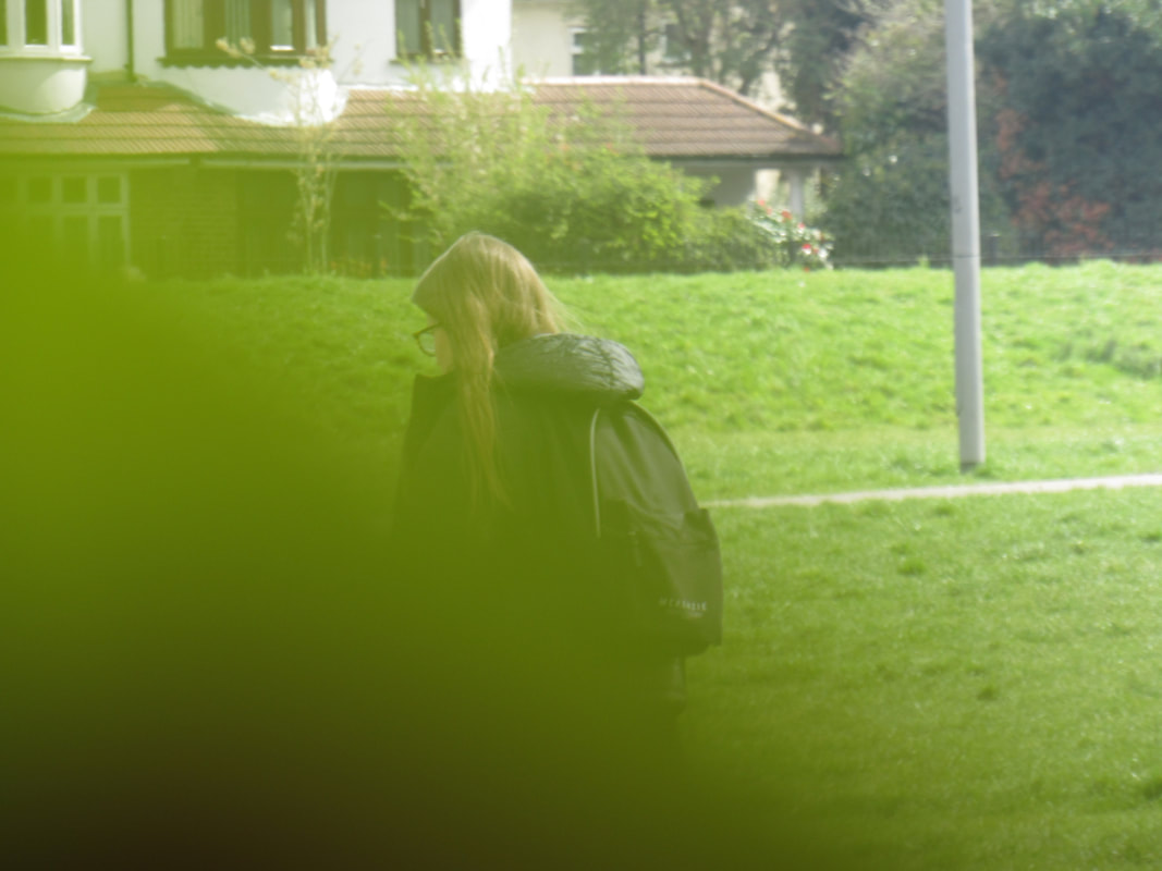
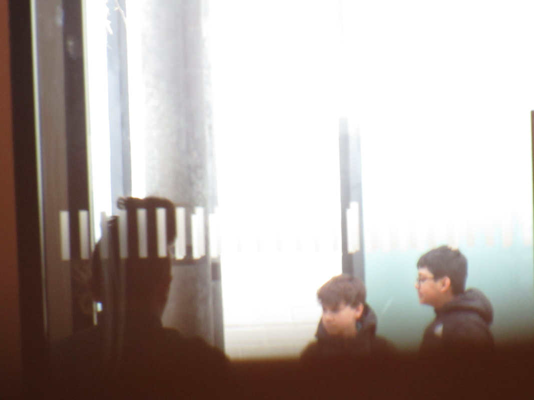
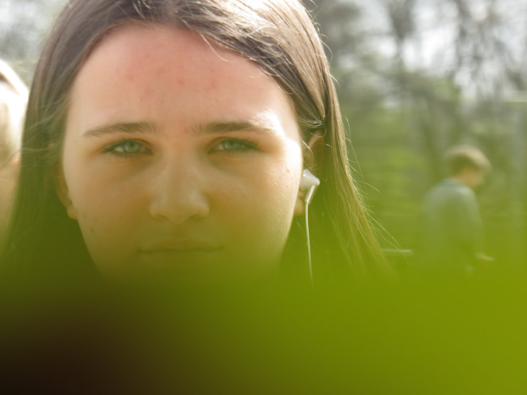
what i did was i attempted to take images of other people and use a post it note to cover or obscure the image i want to take.
i feel like this method gives a Saul Lieter effect
what went well is that the images turned out well.
even better if i took images of other things or took more images or even experimented with the positioning of the post it note more.
i feel like this method gives a Saul Lieter effect
what went well is that the images turned out well.
even better if i took images of other things or took more images or even experimented with the positioning of the post it note more.
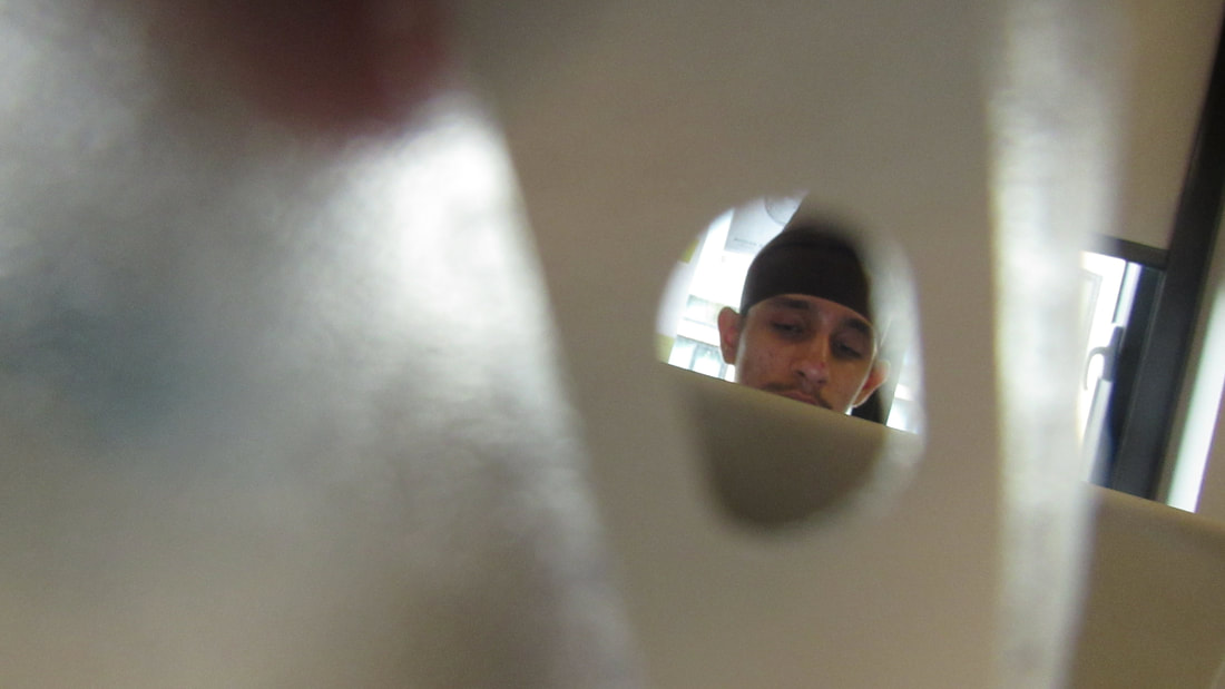
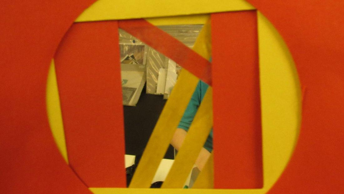
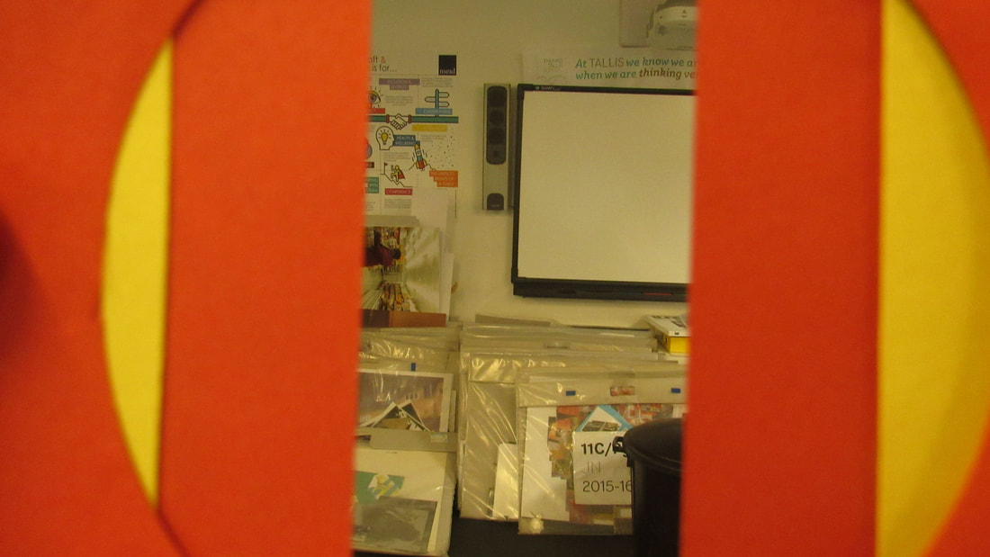
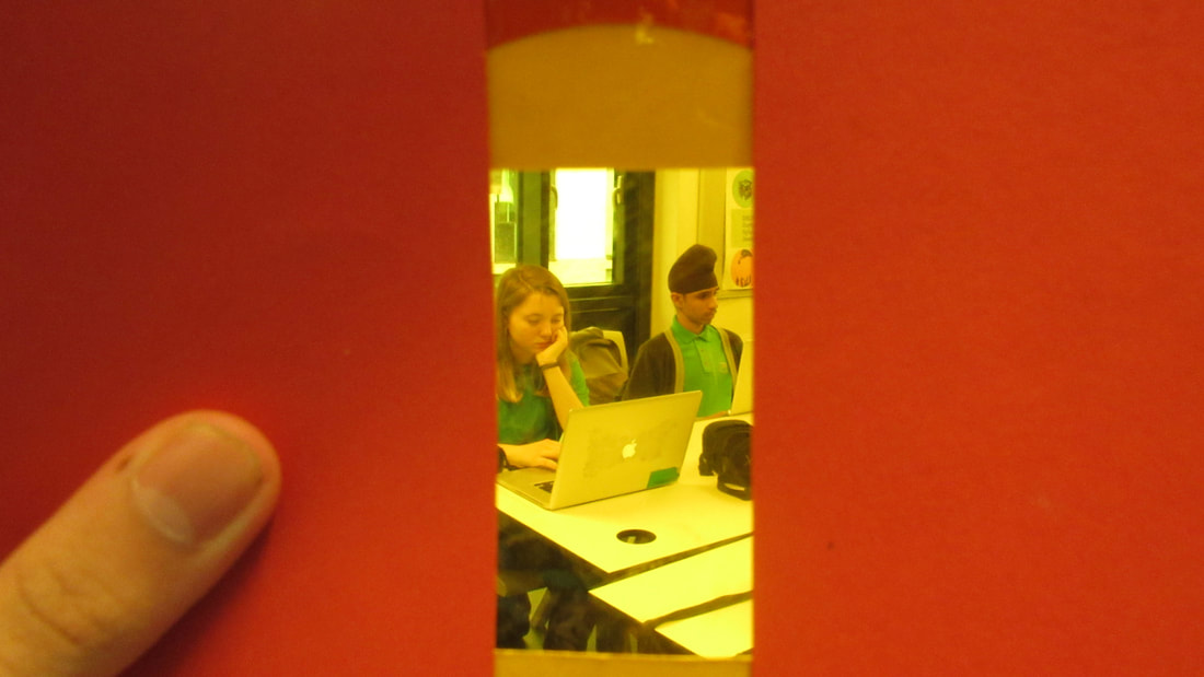
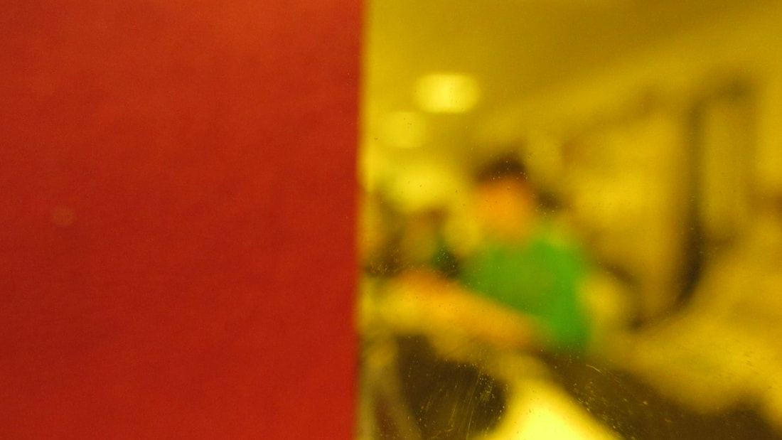

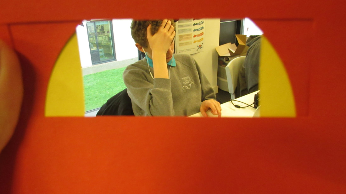
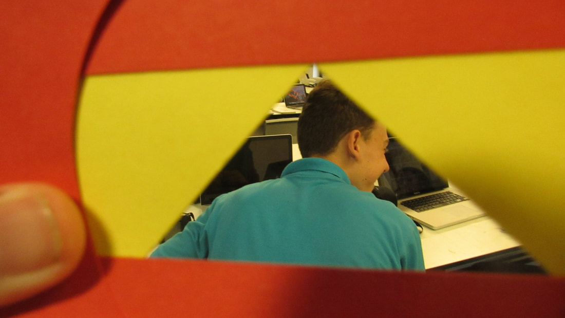
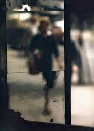
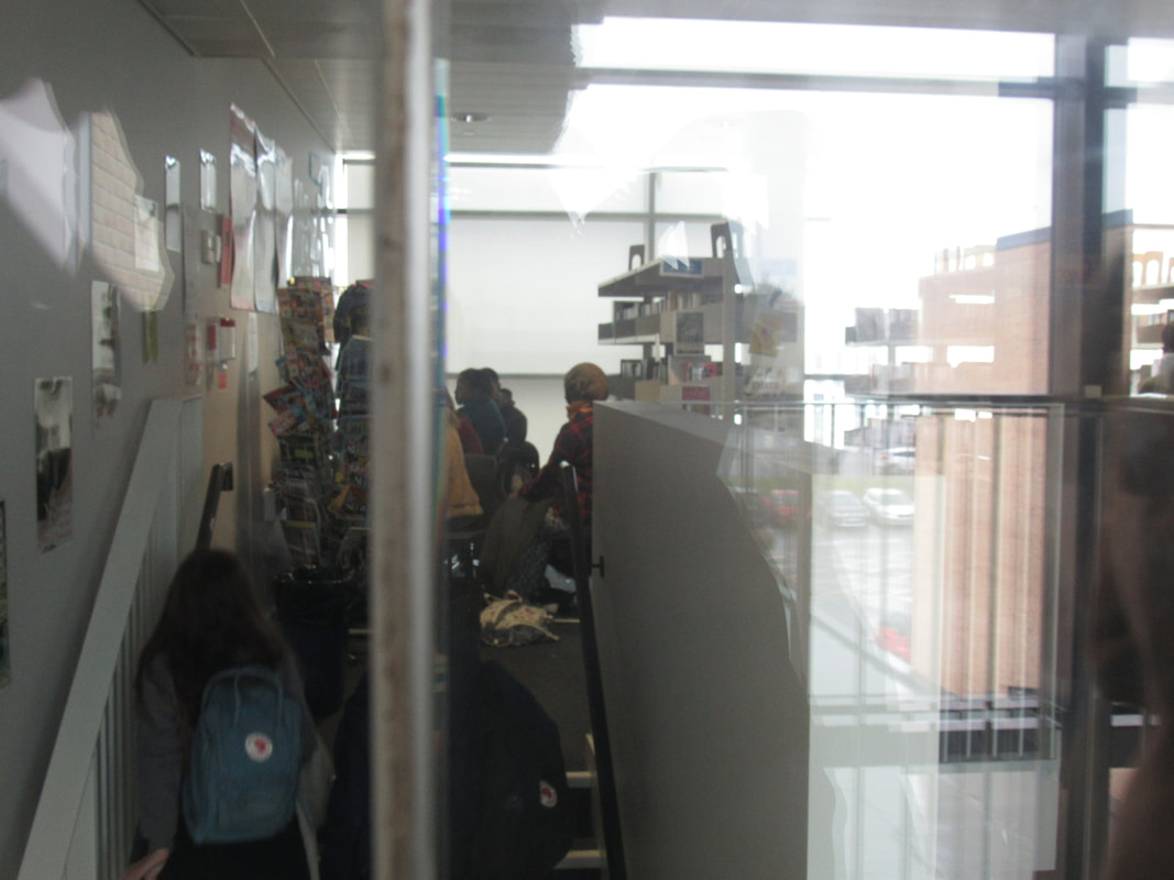
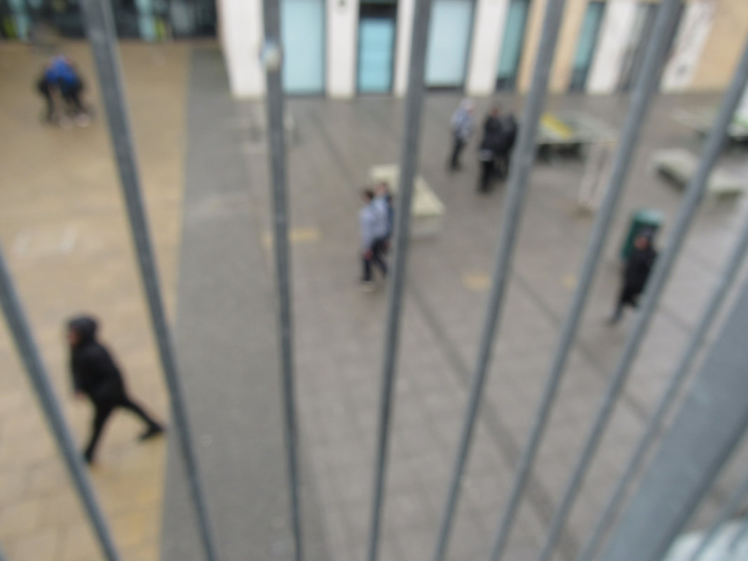
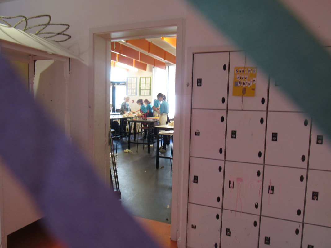
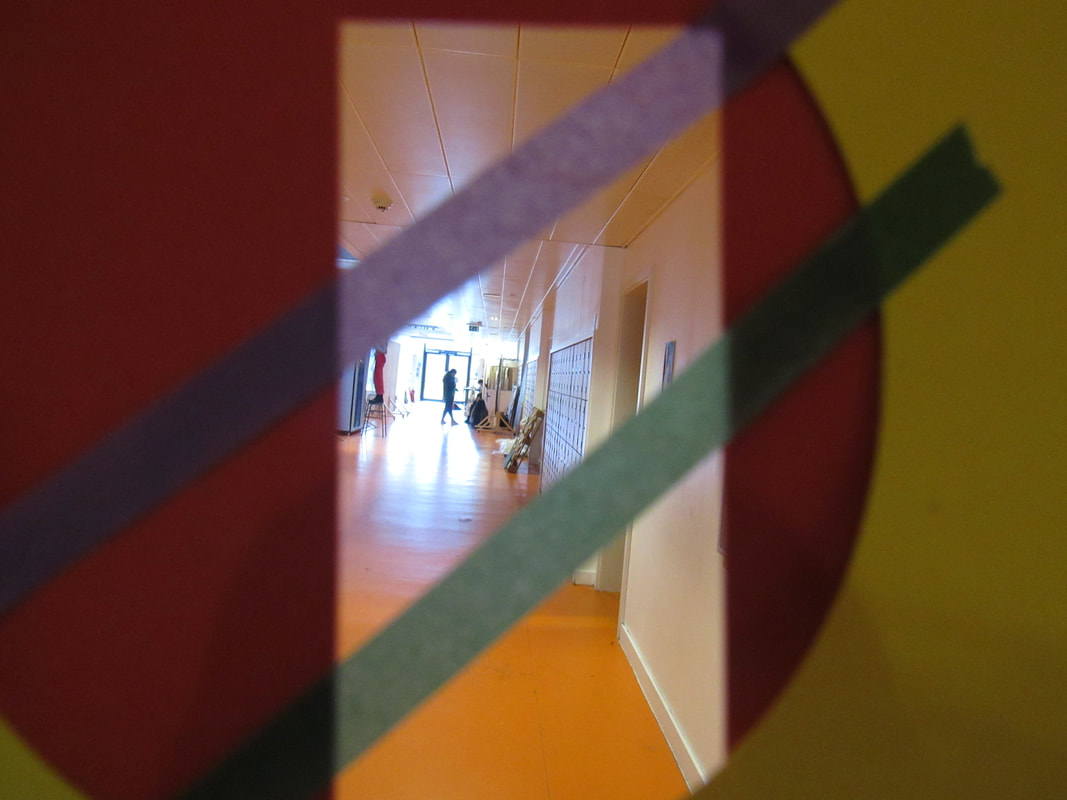
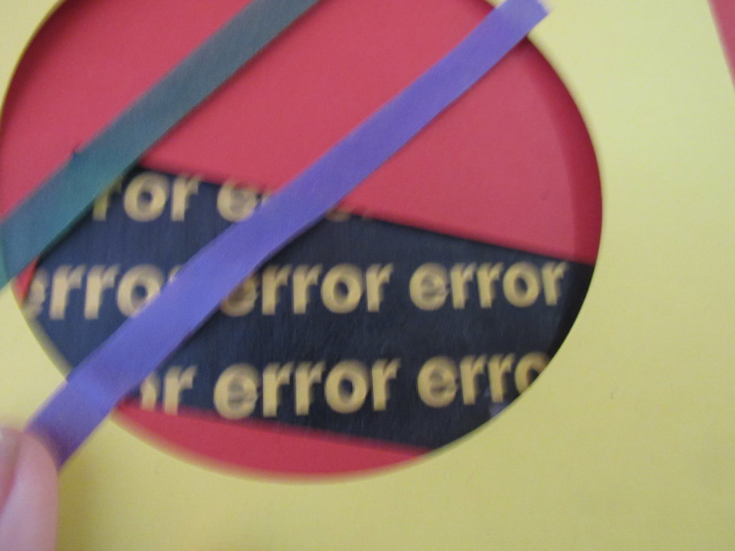
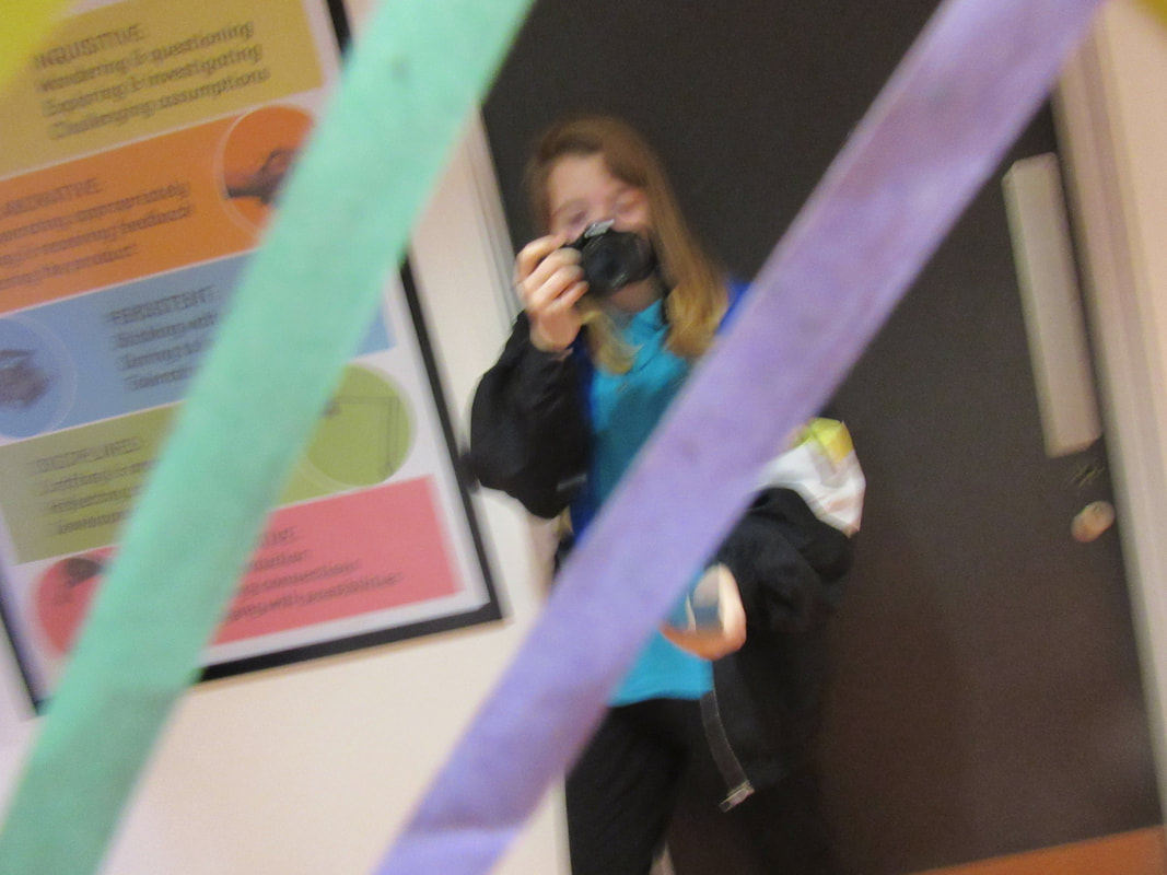
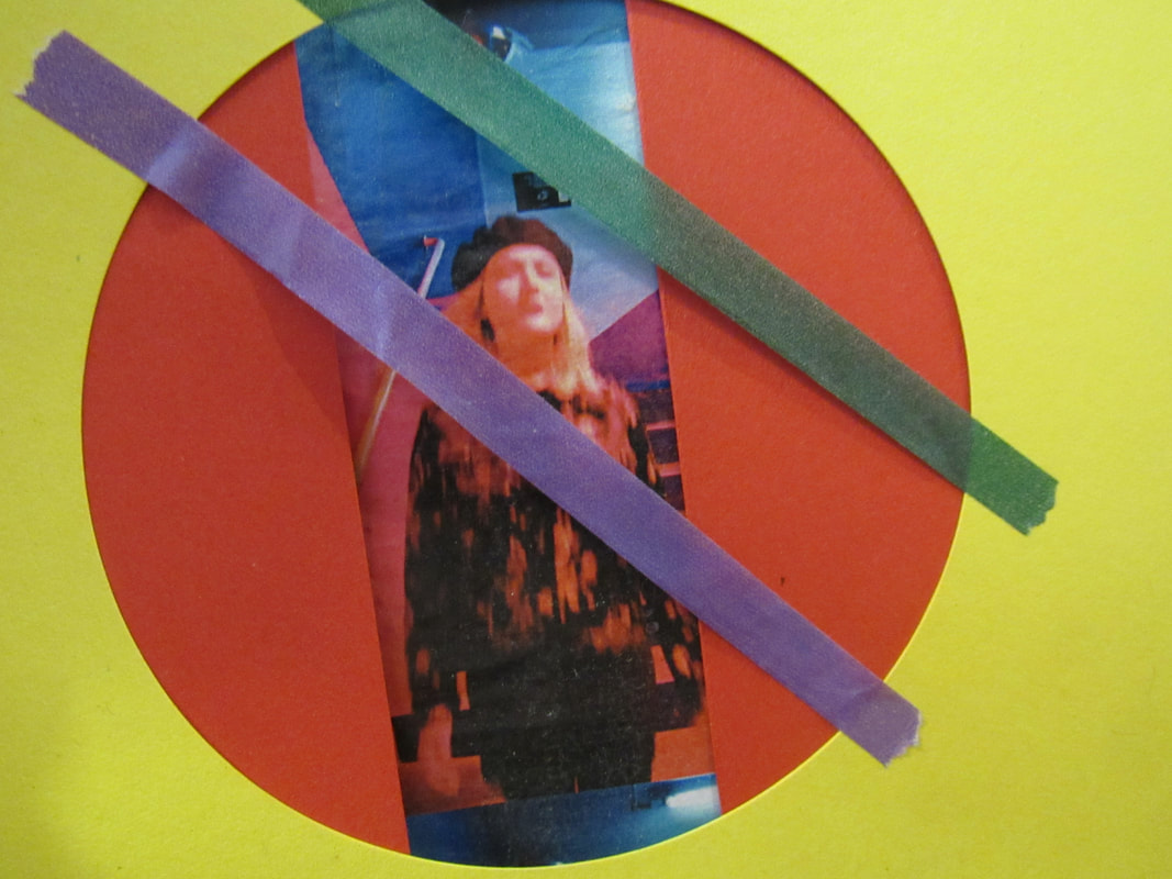
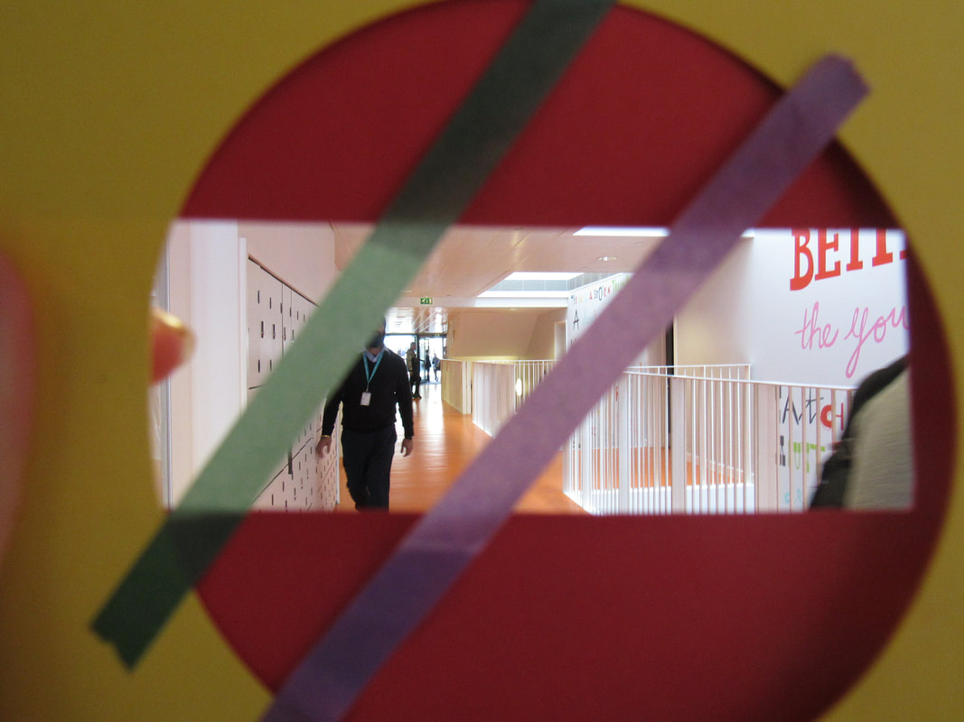
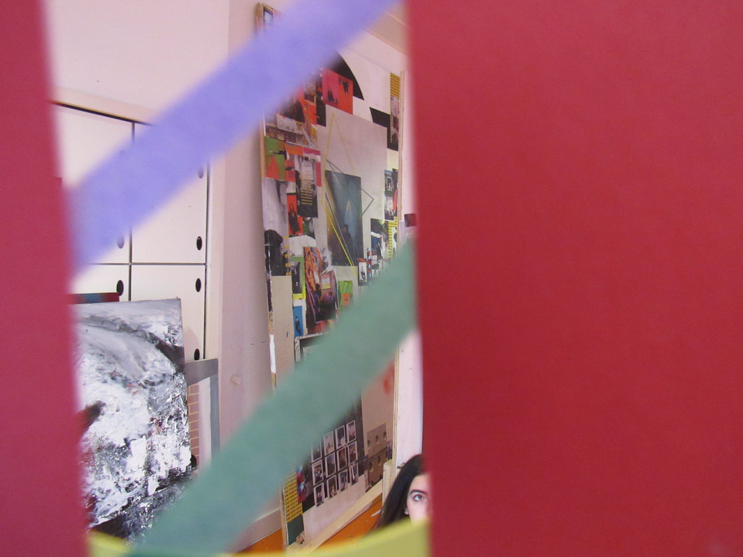
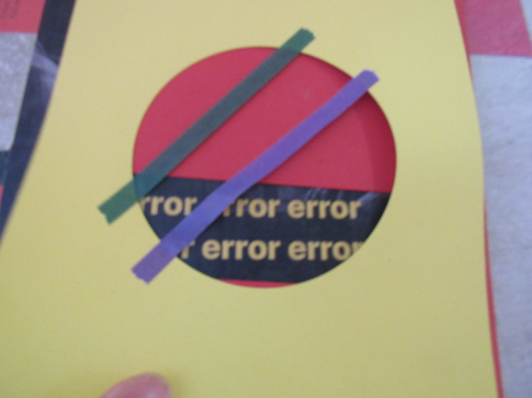
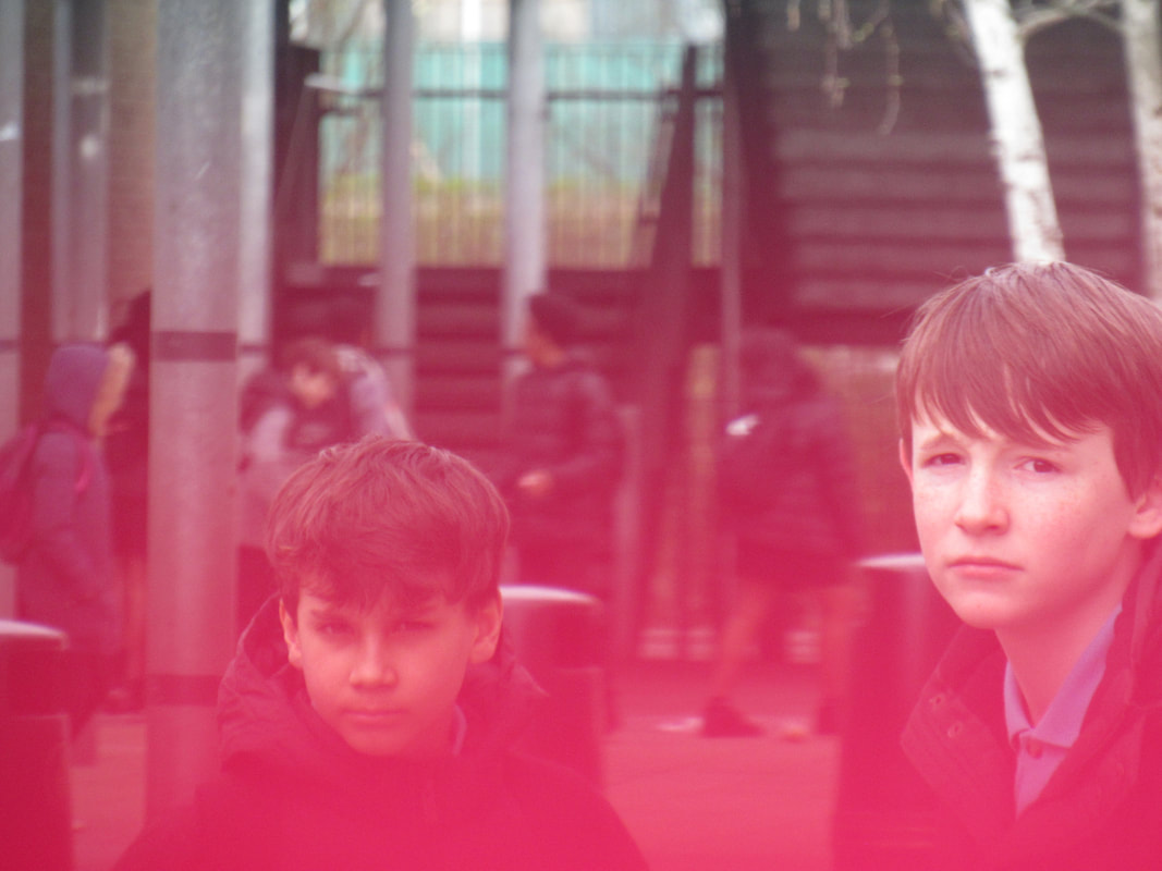
this time i experimented with different types of paper and view finders and changed the positions i put them in.
what went well was that the images turned out differently compared to the previous one
even better if i took more images and experimented more with positions and objects.
what went well was that the images turned out differently compared to the previous one
even better if i took more images and experimented more with positions and objects.
My Saul Leiter board
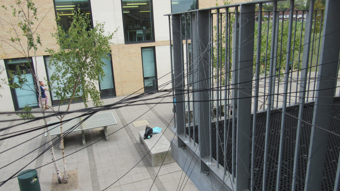
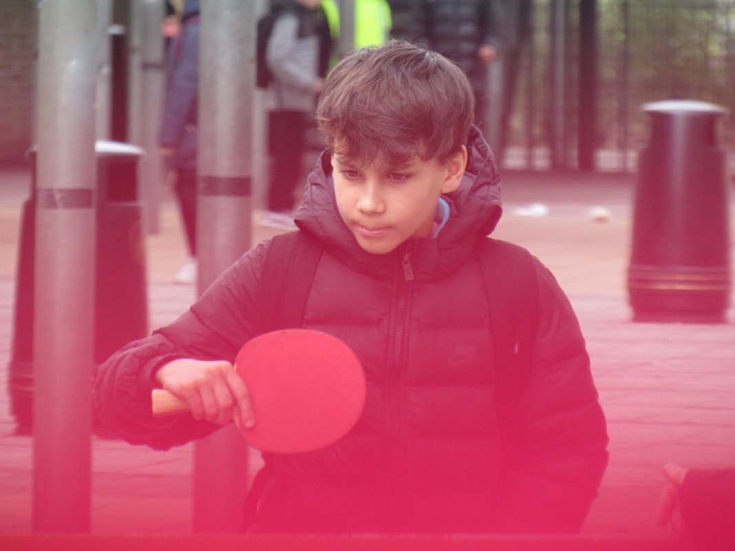
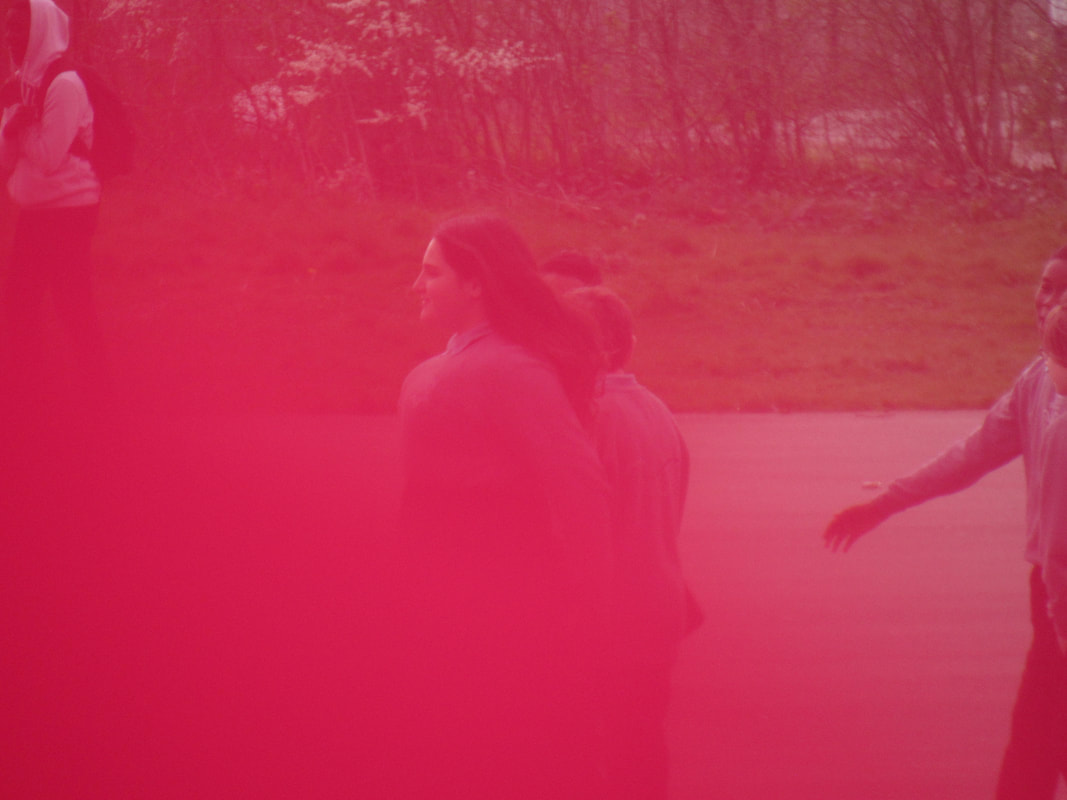
Half Term unusual images homework.
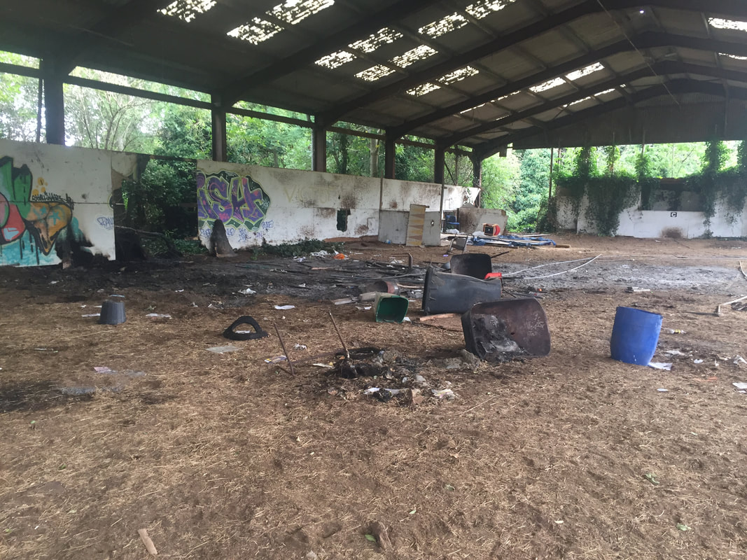
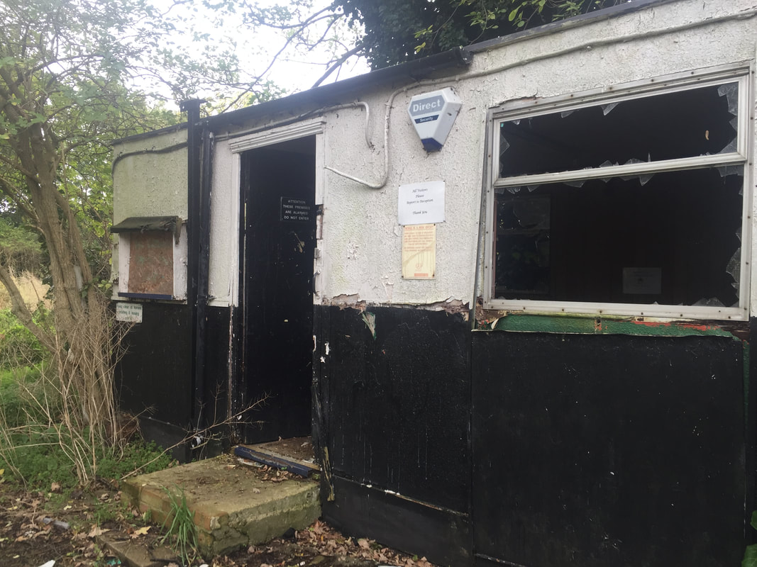
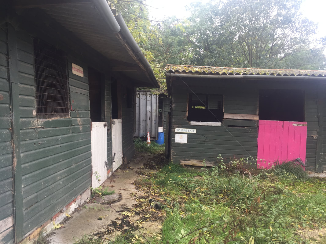
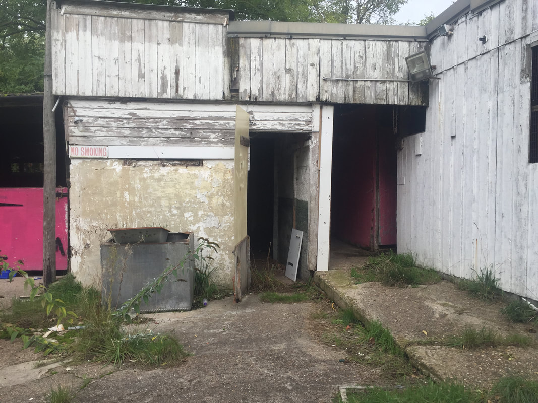
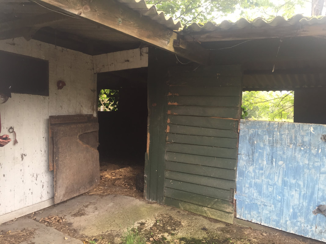
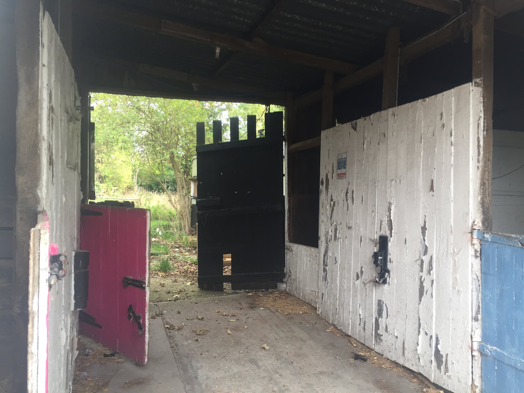
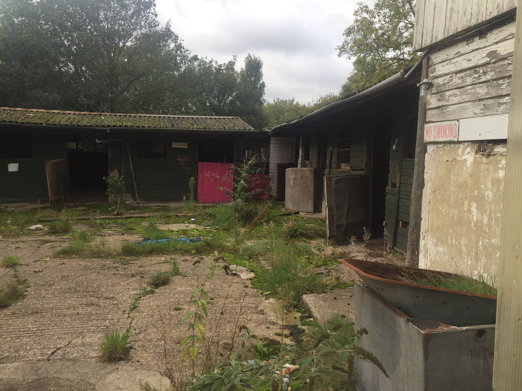
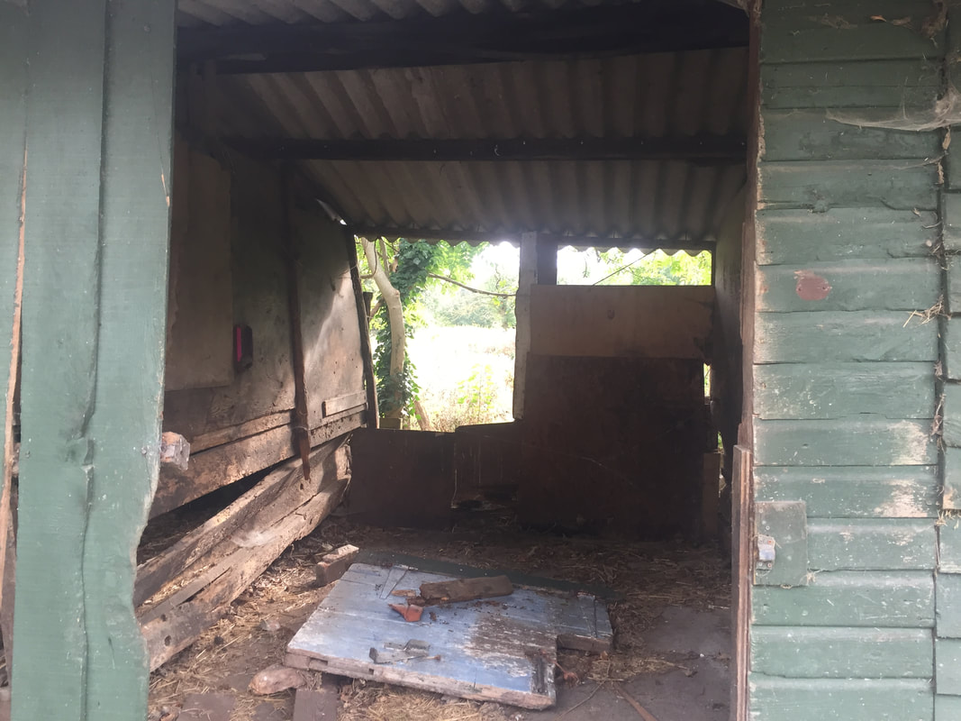
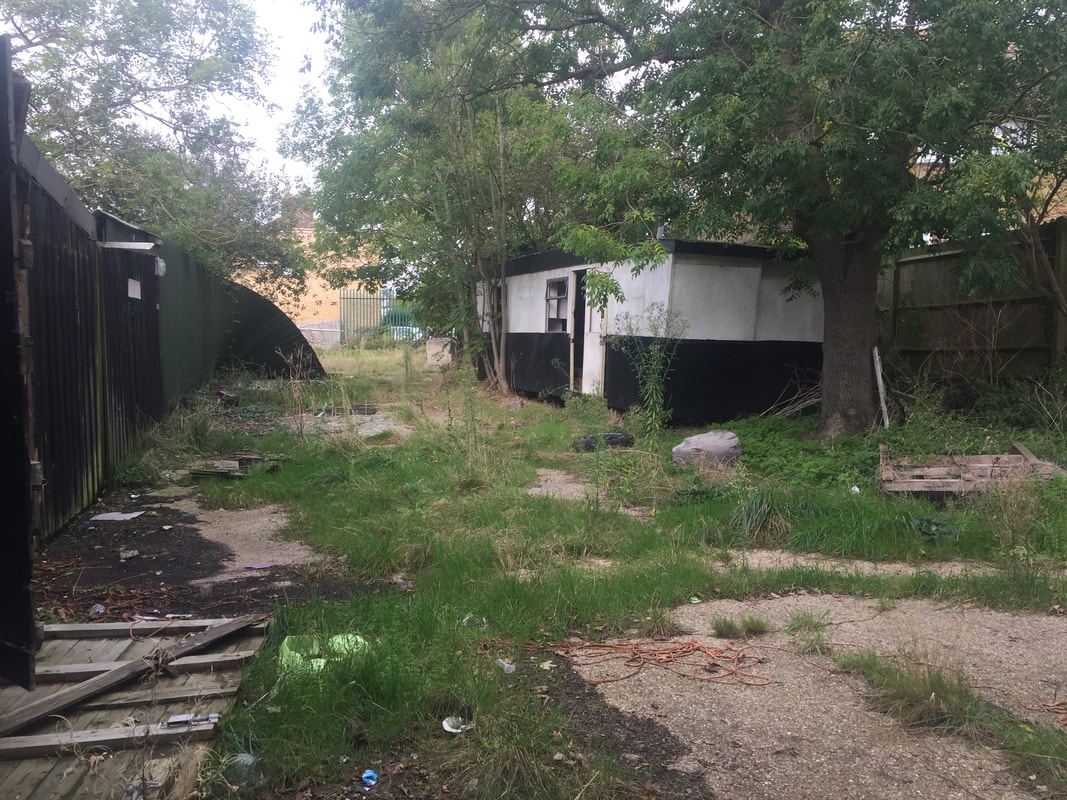
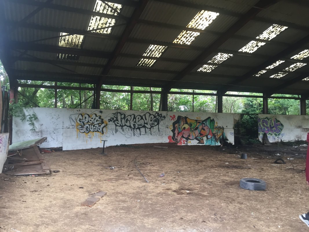
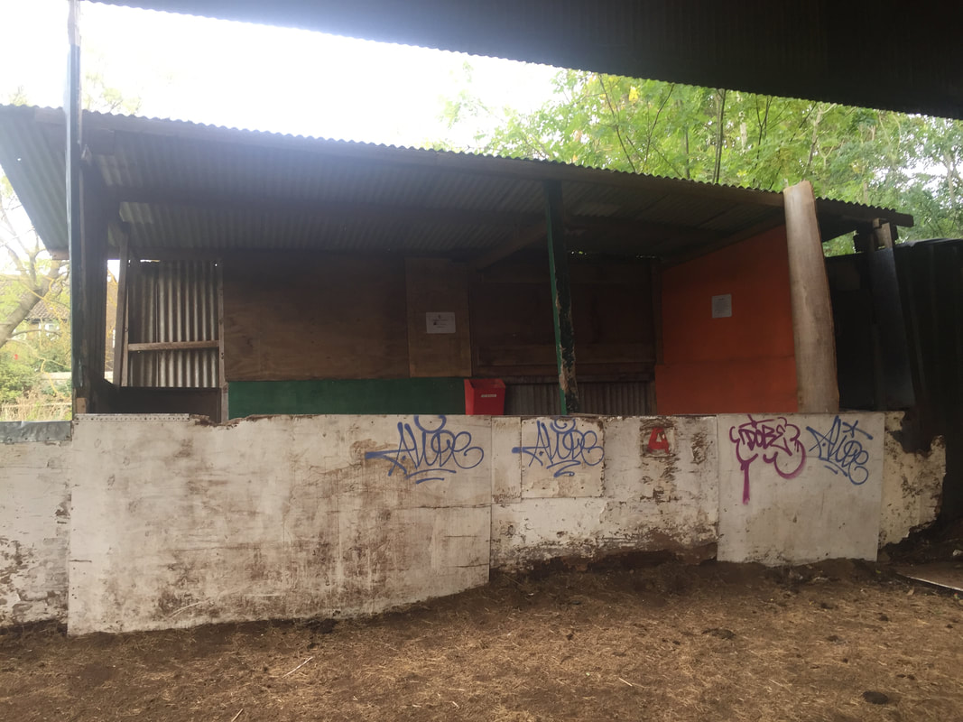
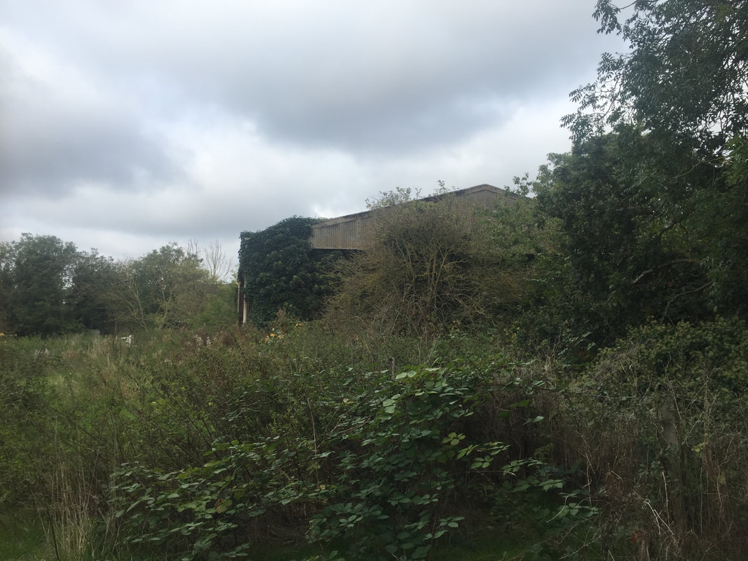
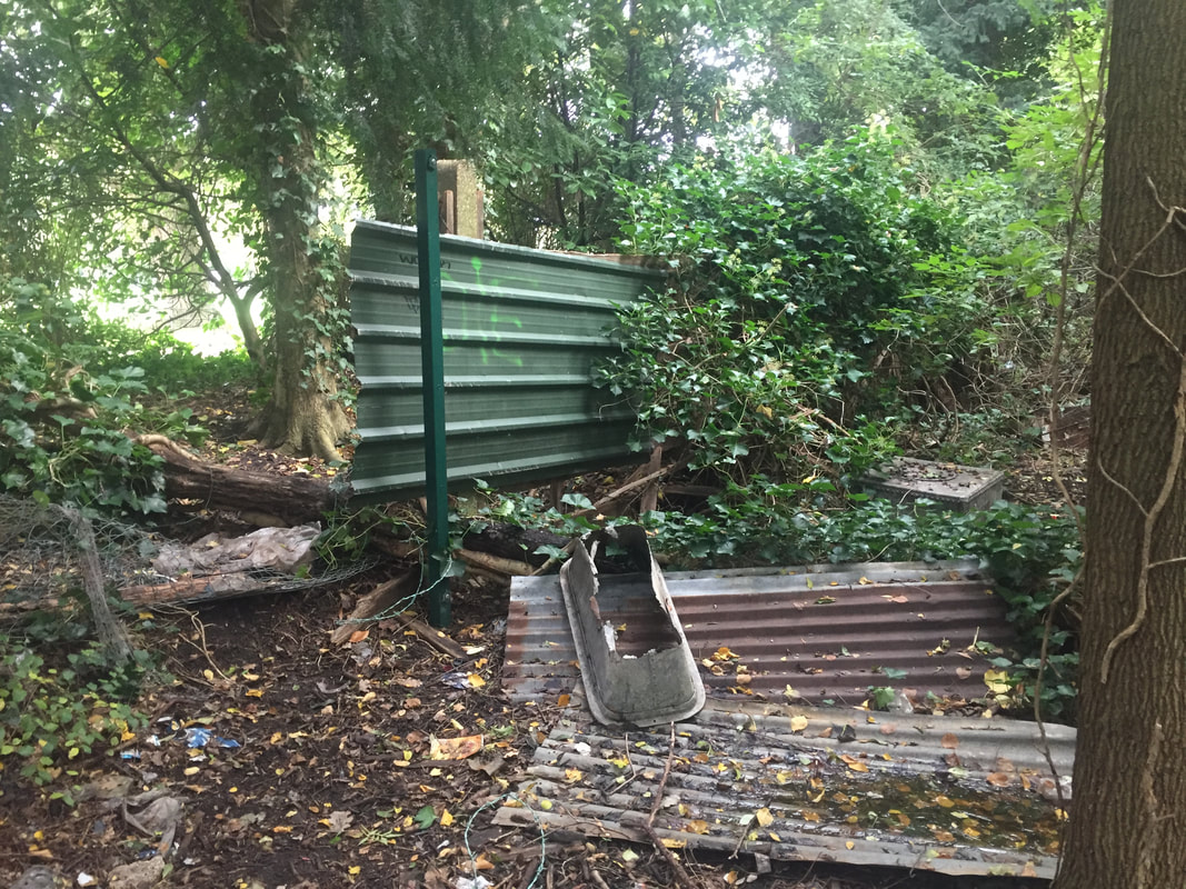
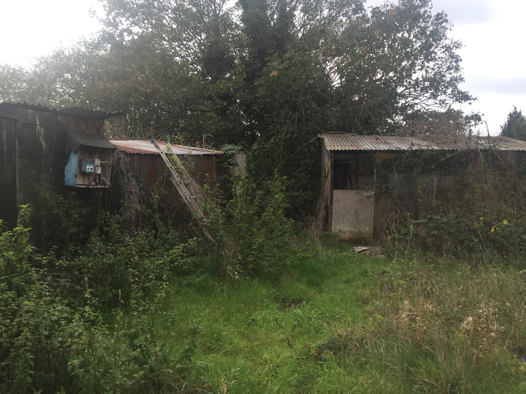
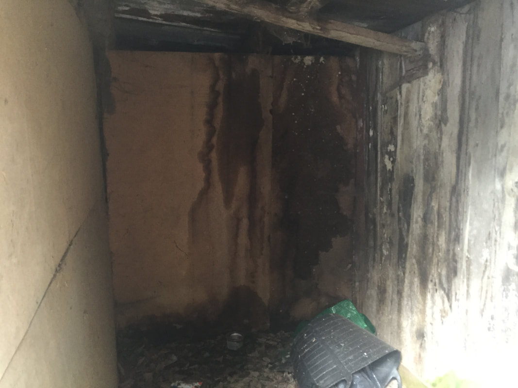
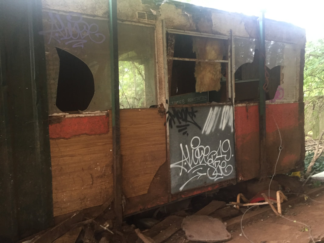
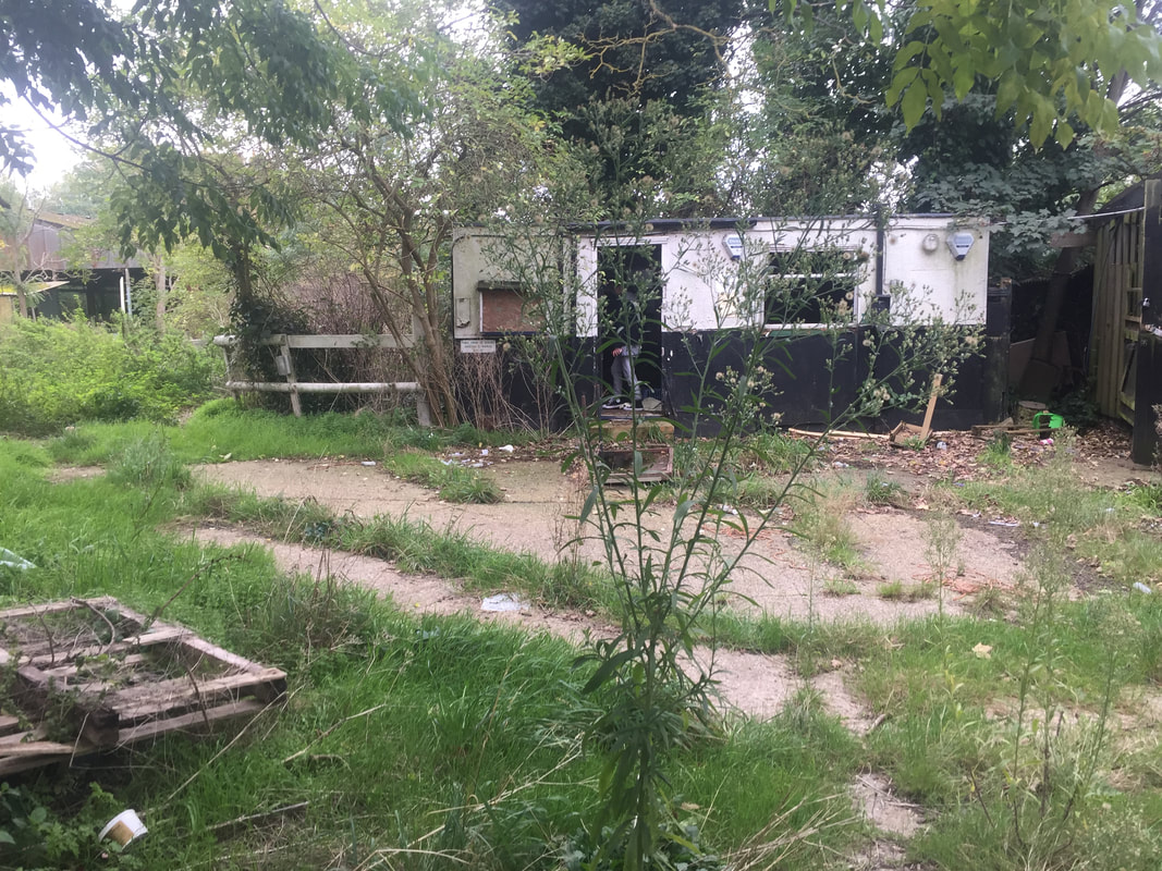
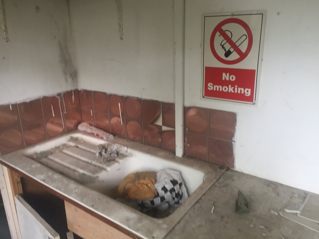
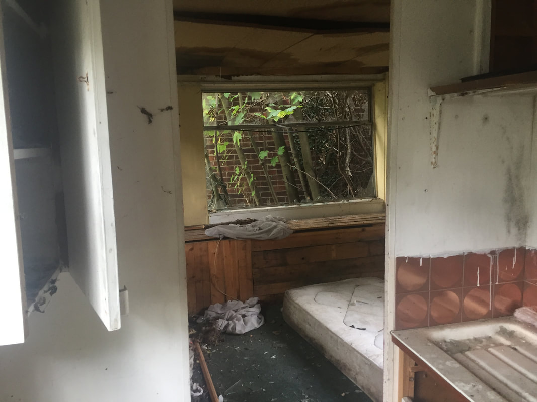
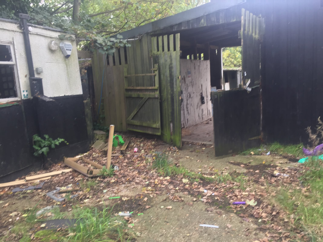
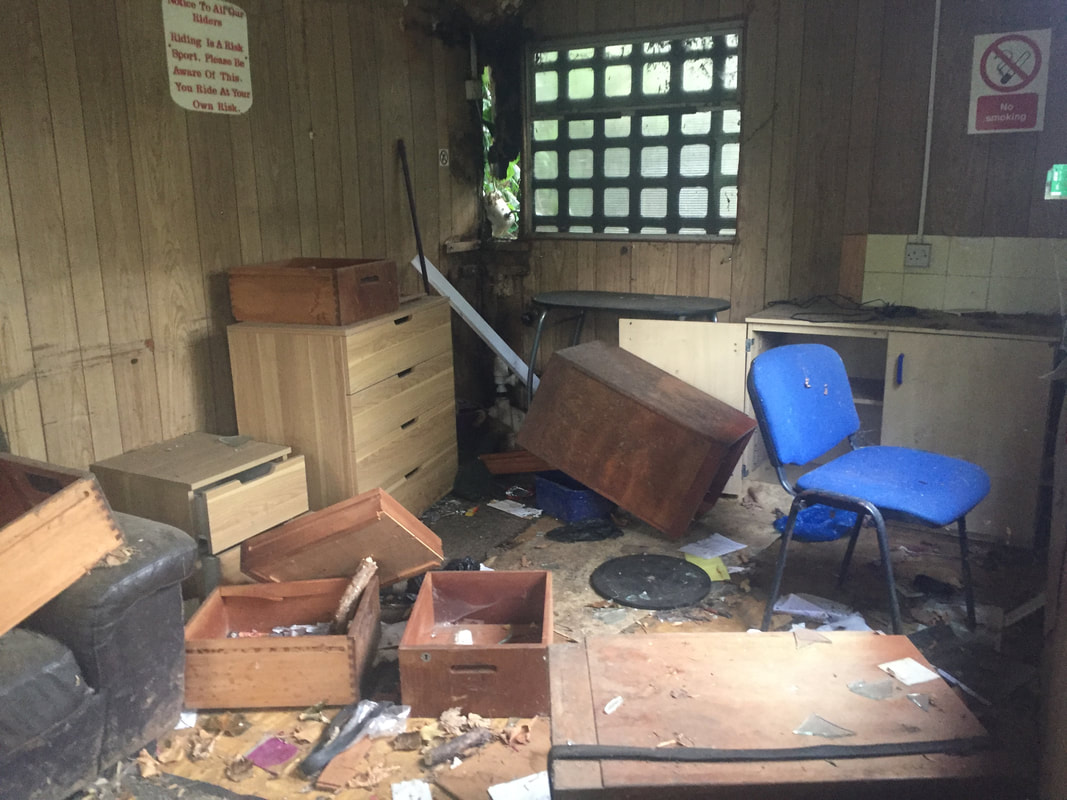
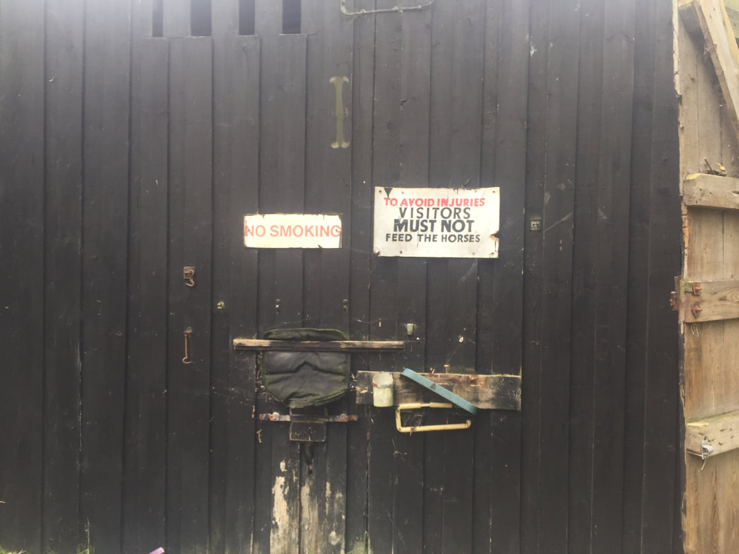
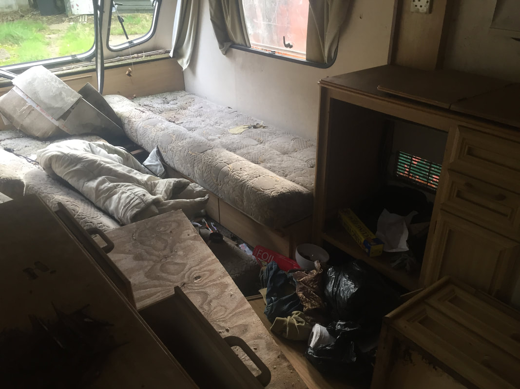
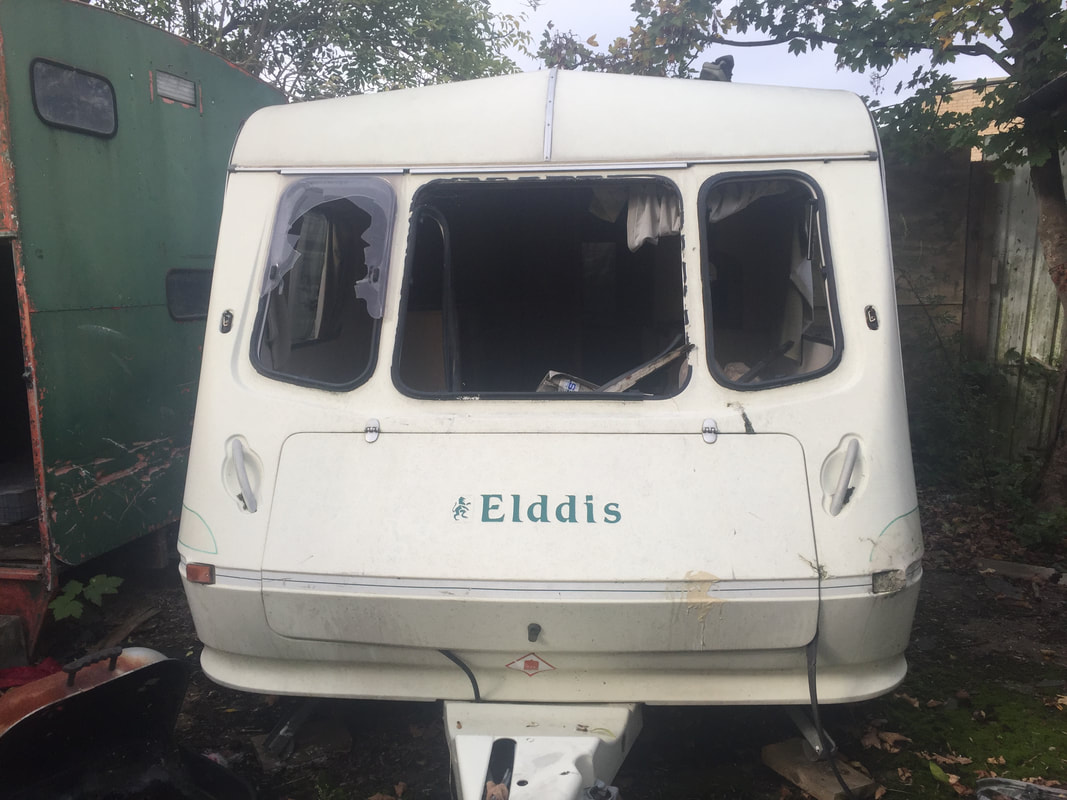
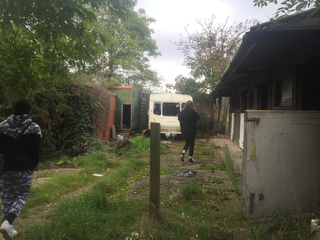
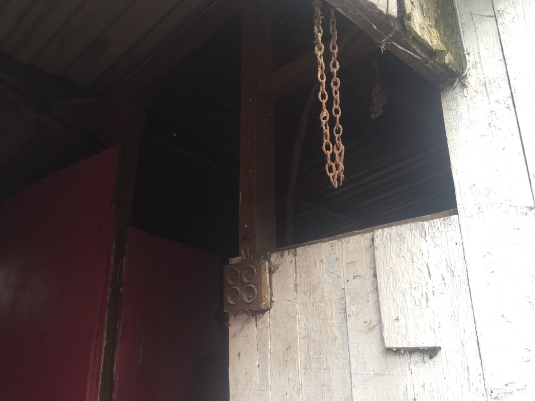
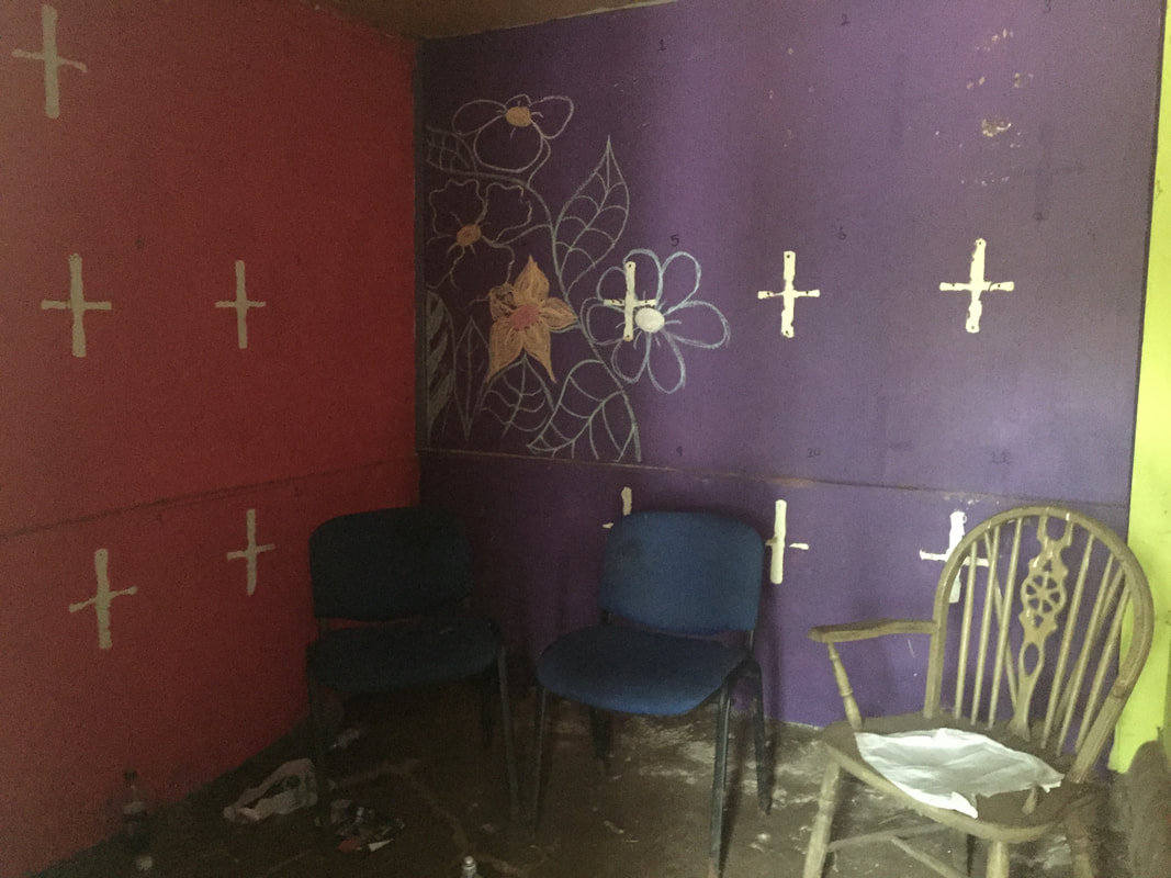
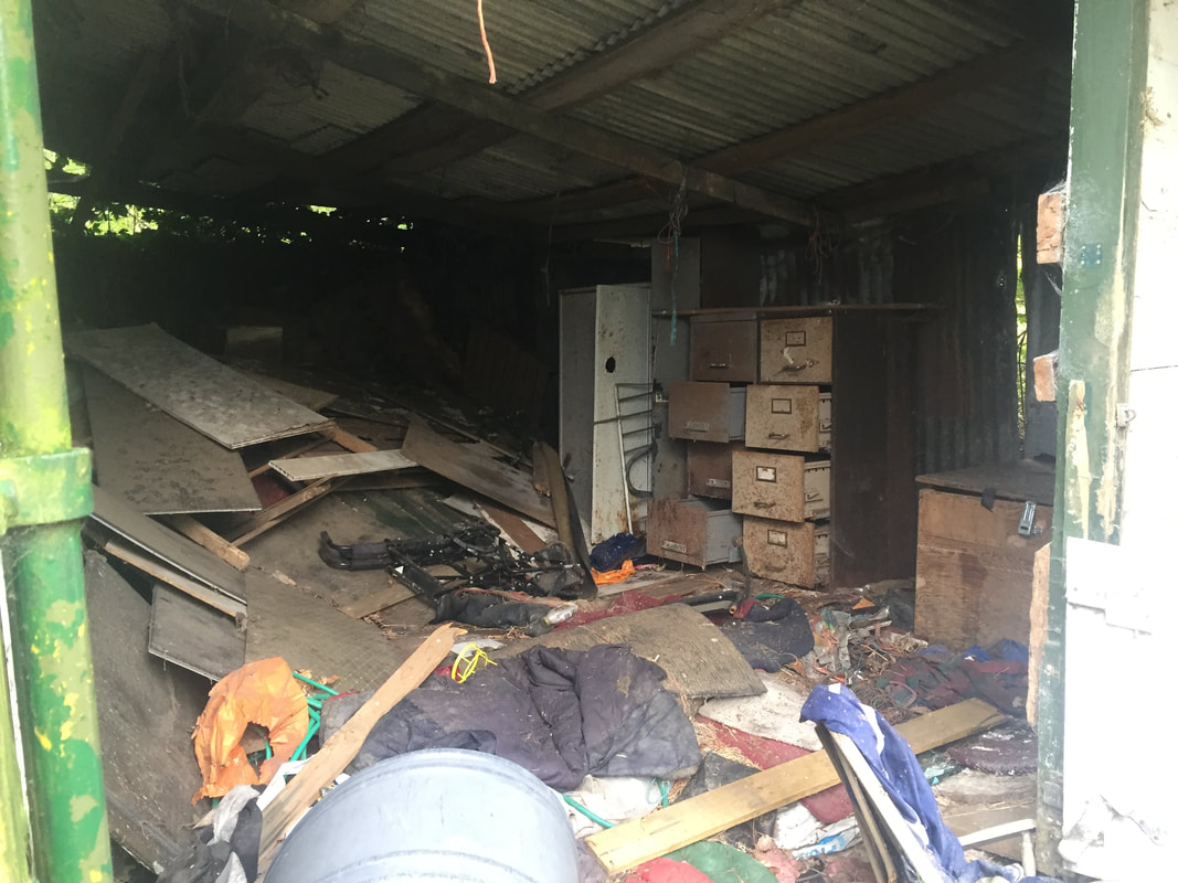
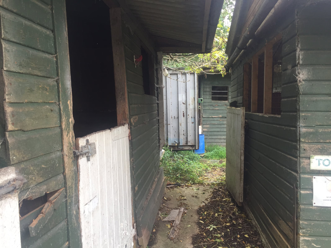
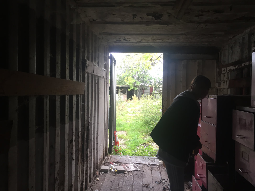
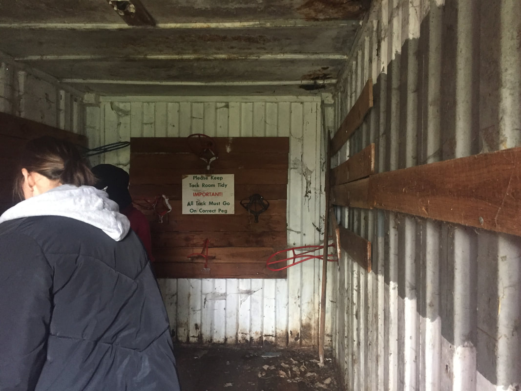
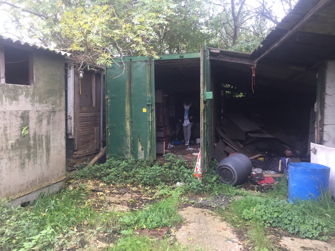
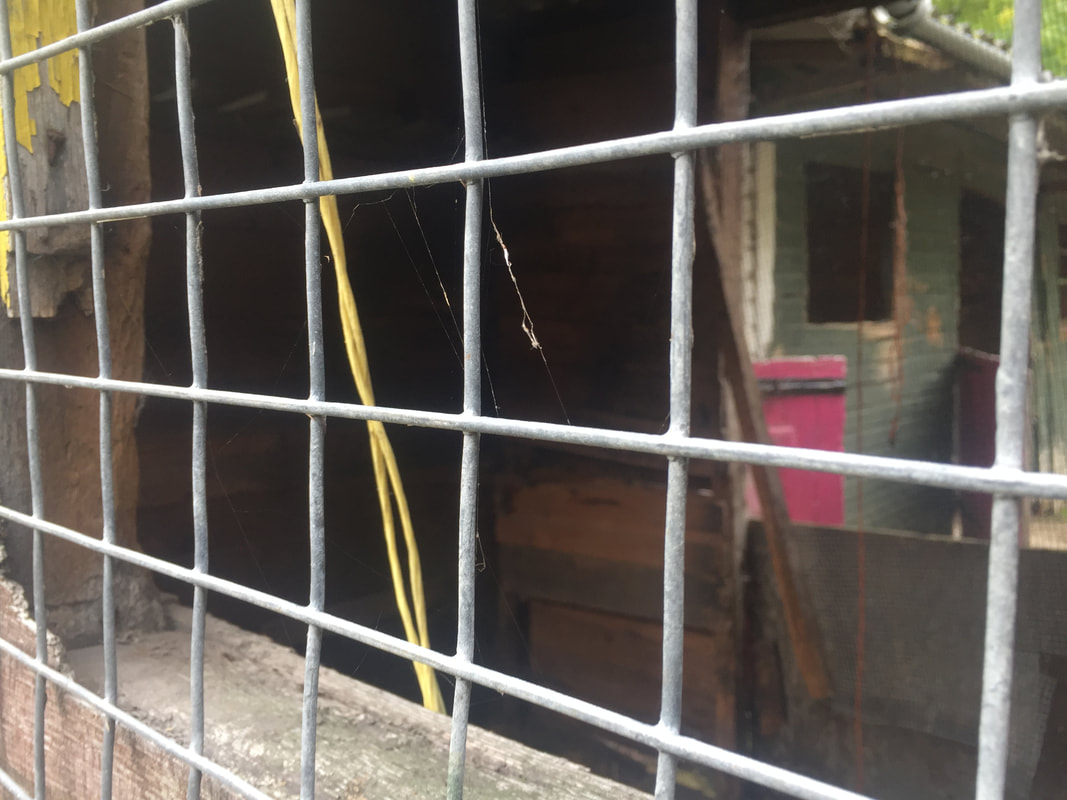
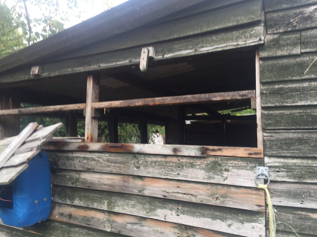
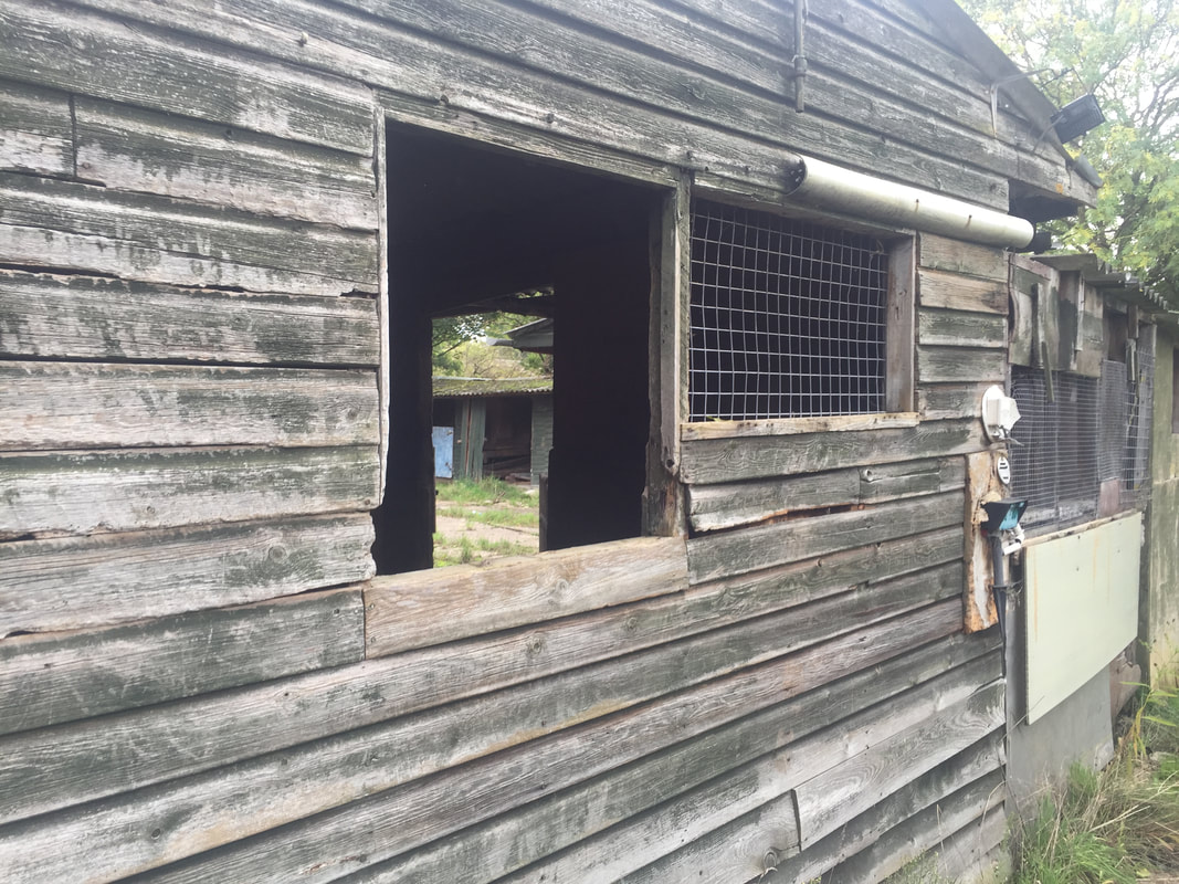
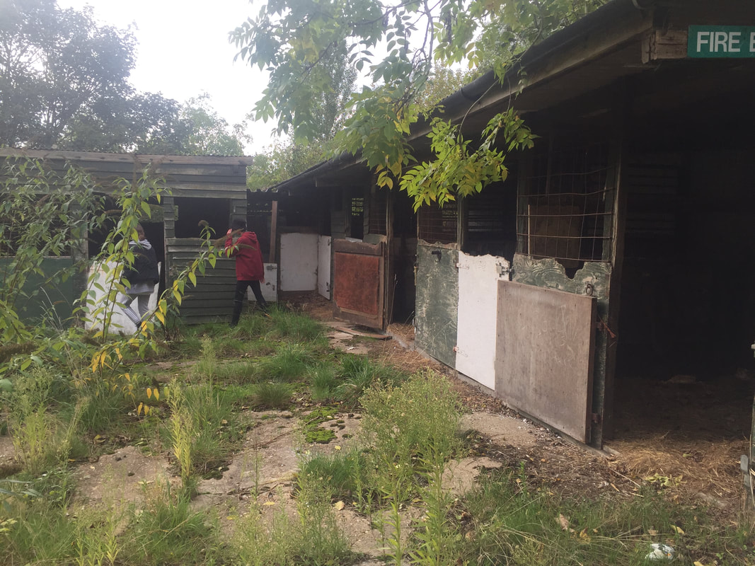
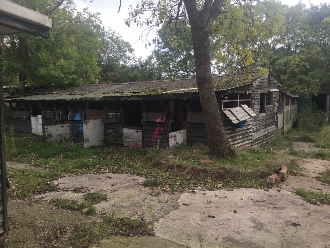
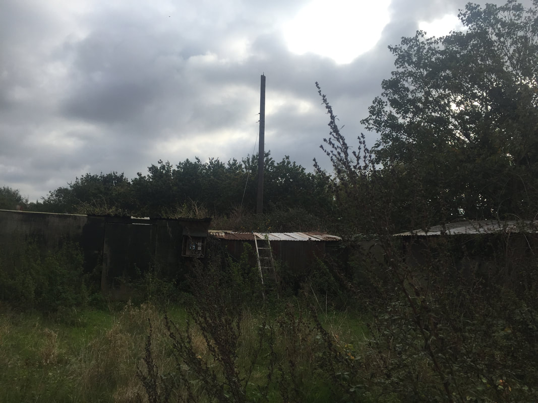
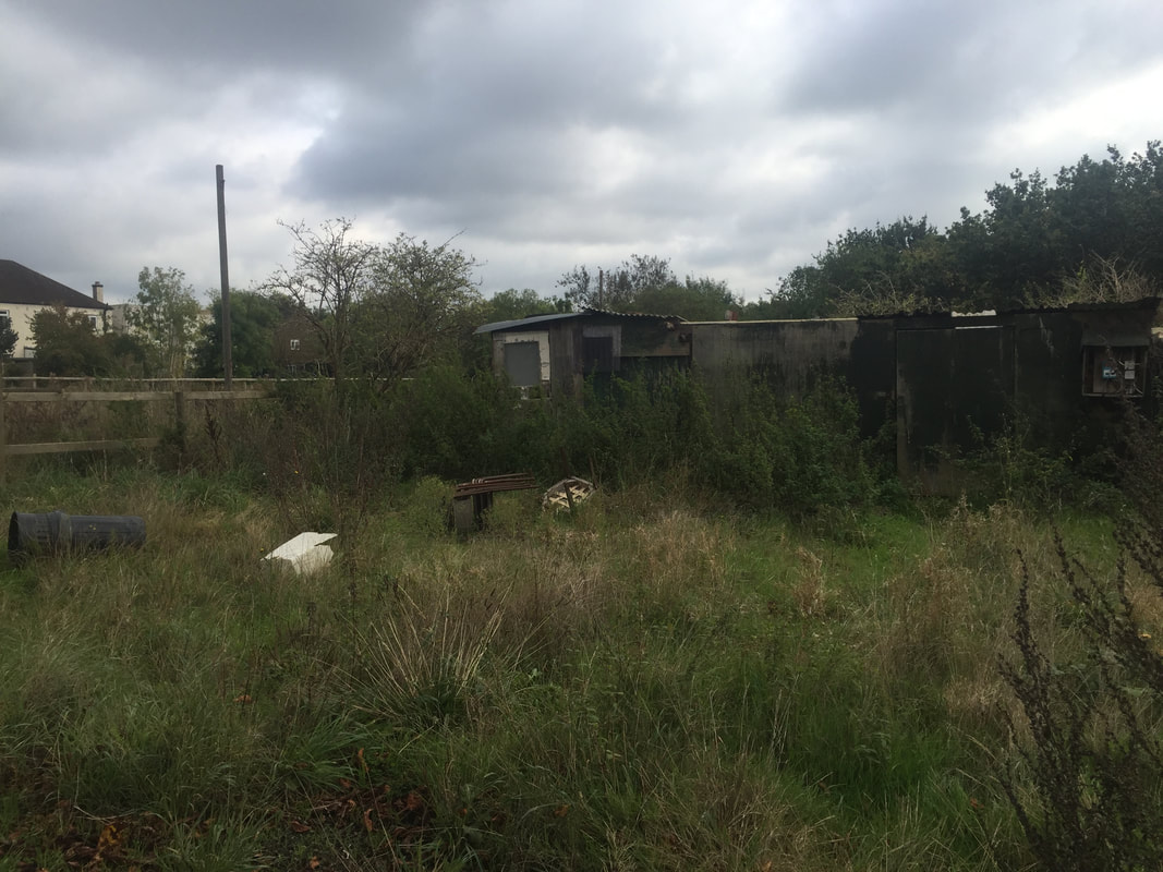
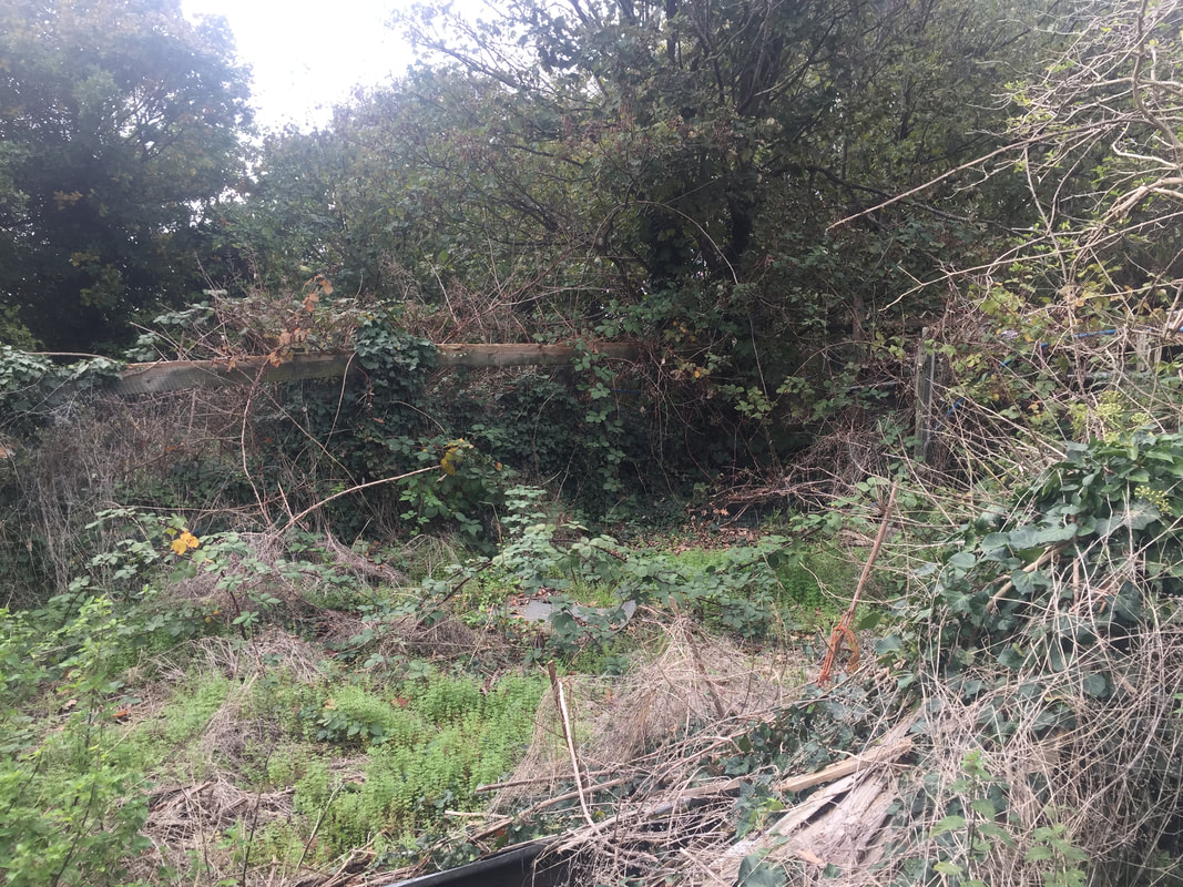
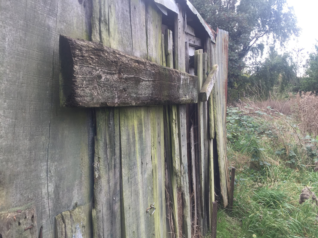
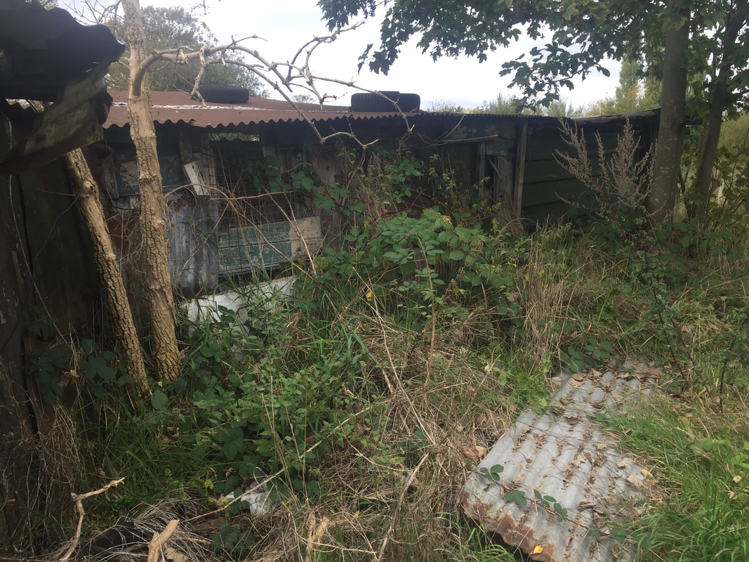
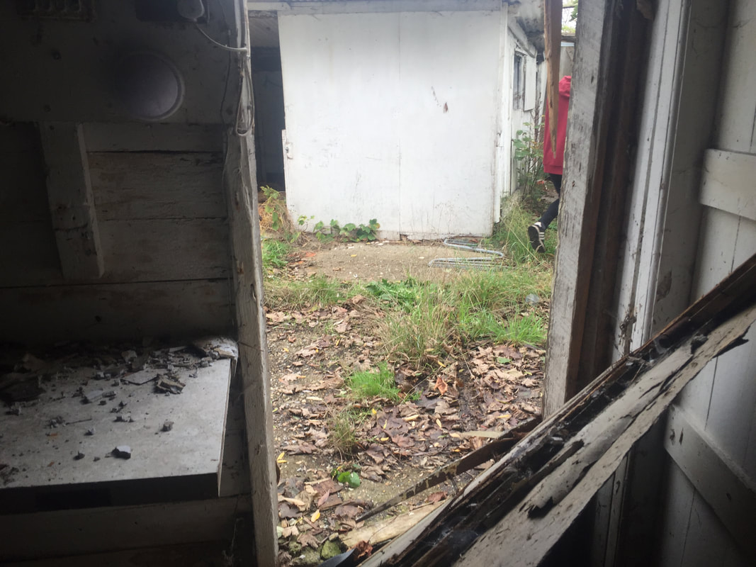
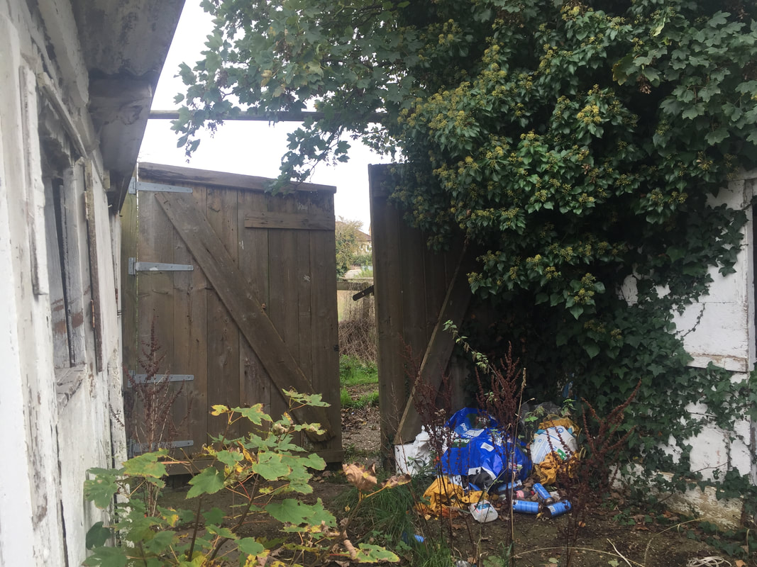
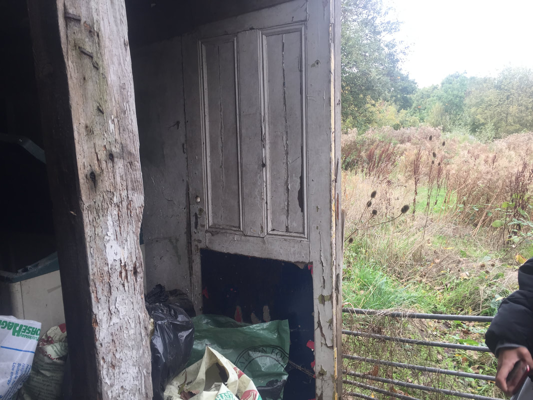
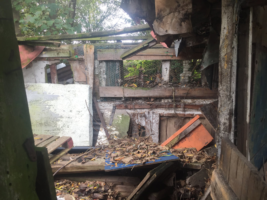
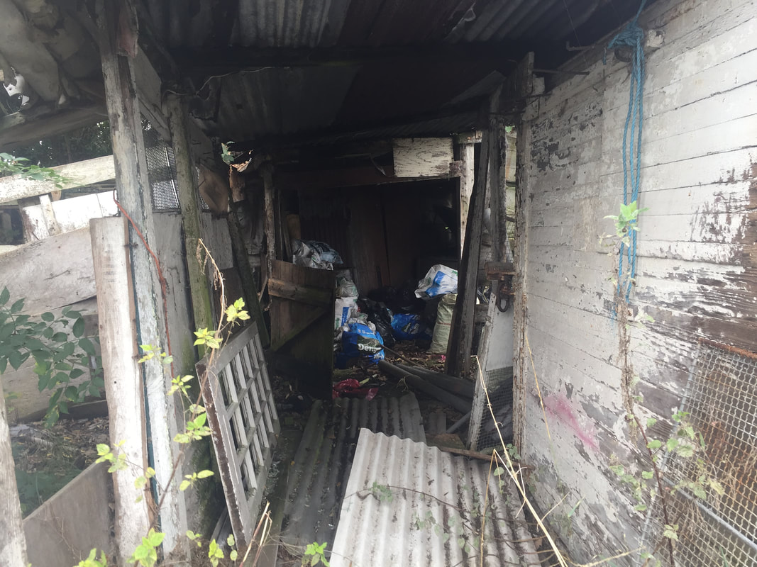
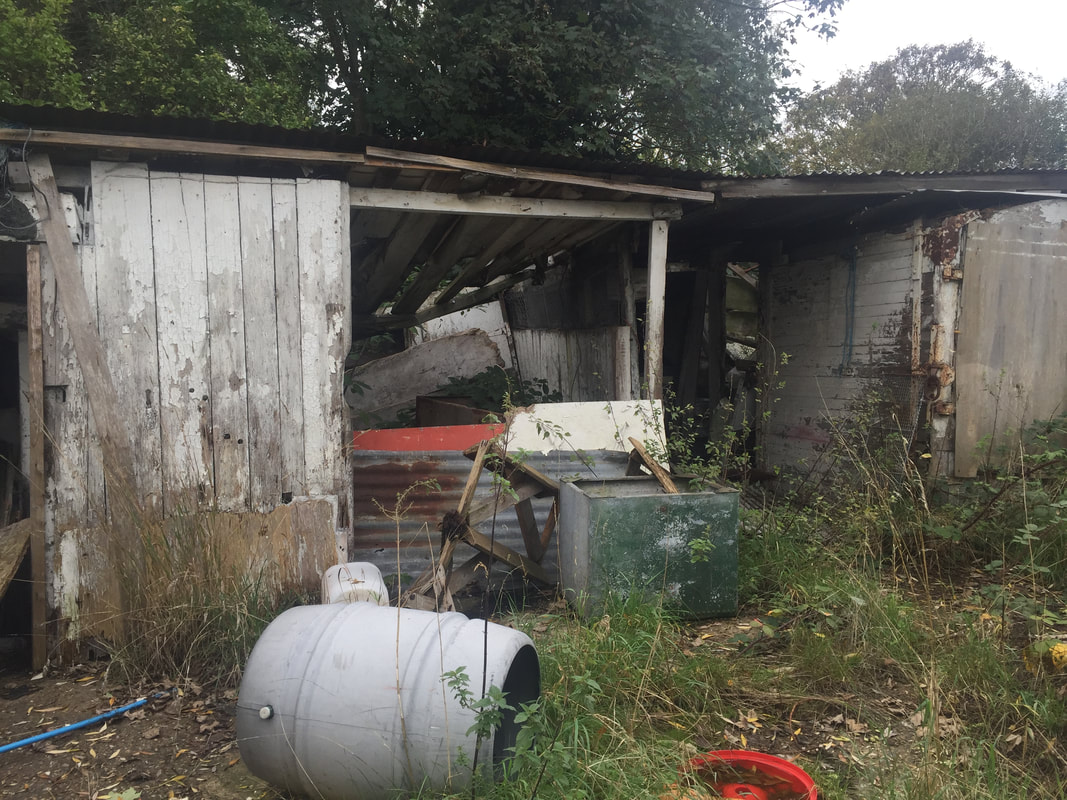
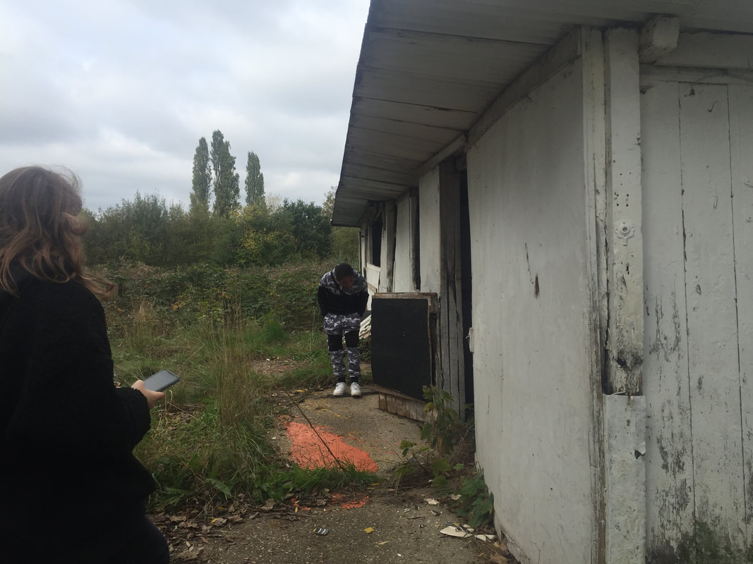
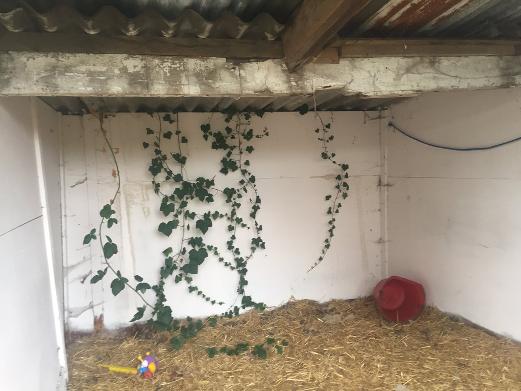
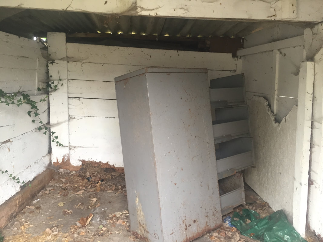
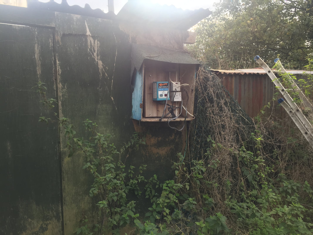
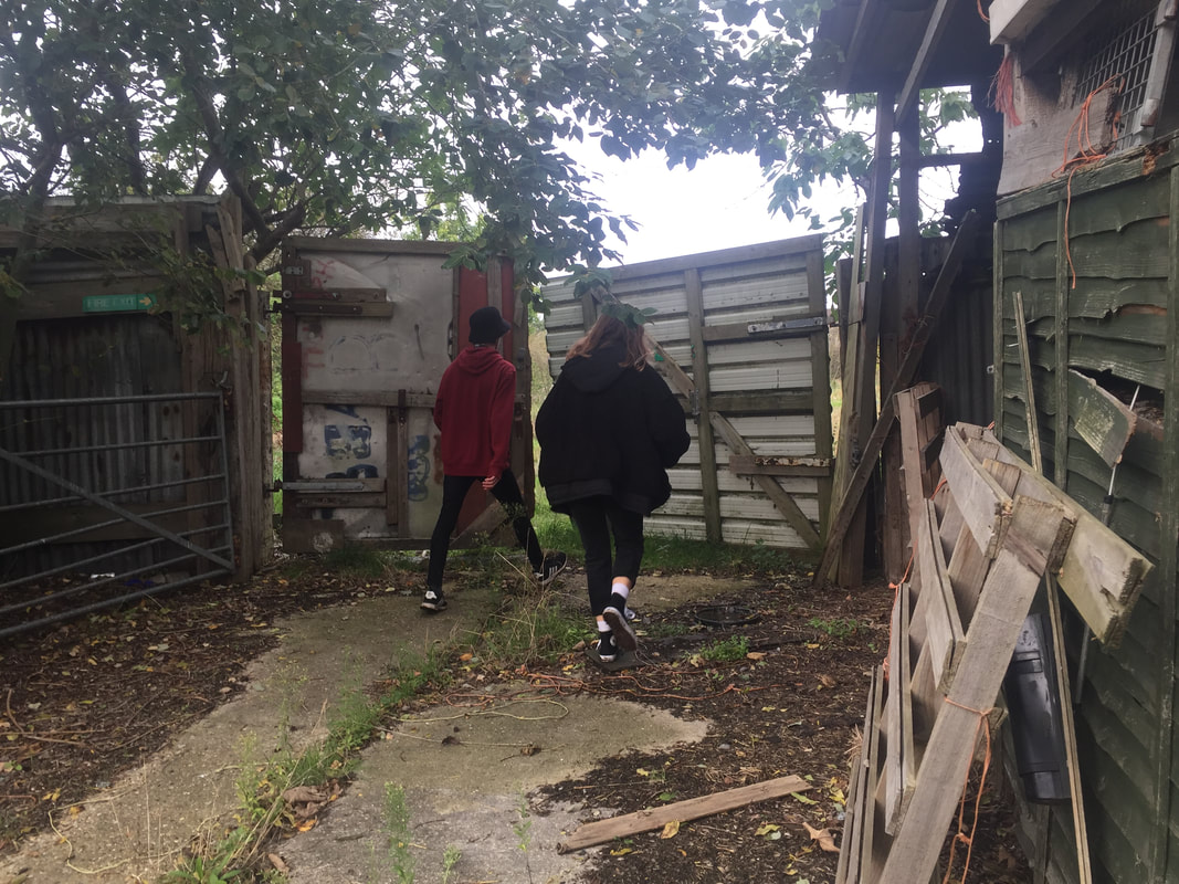
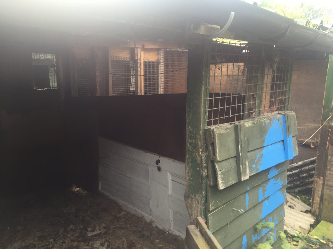
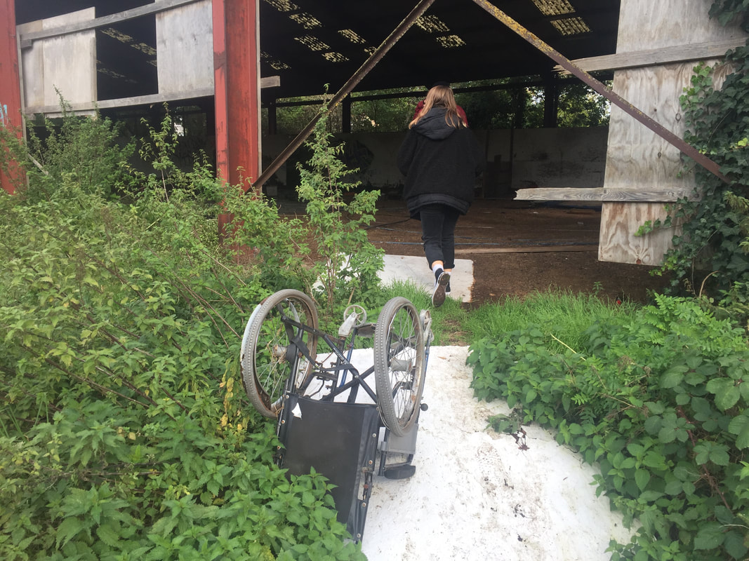
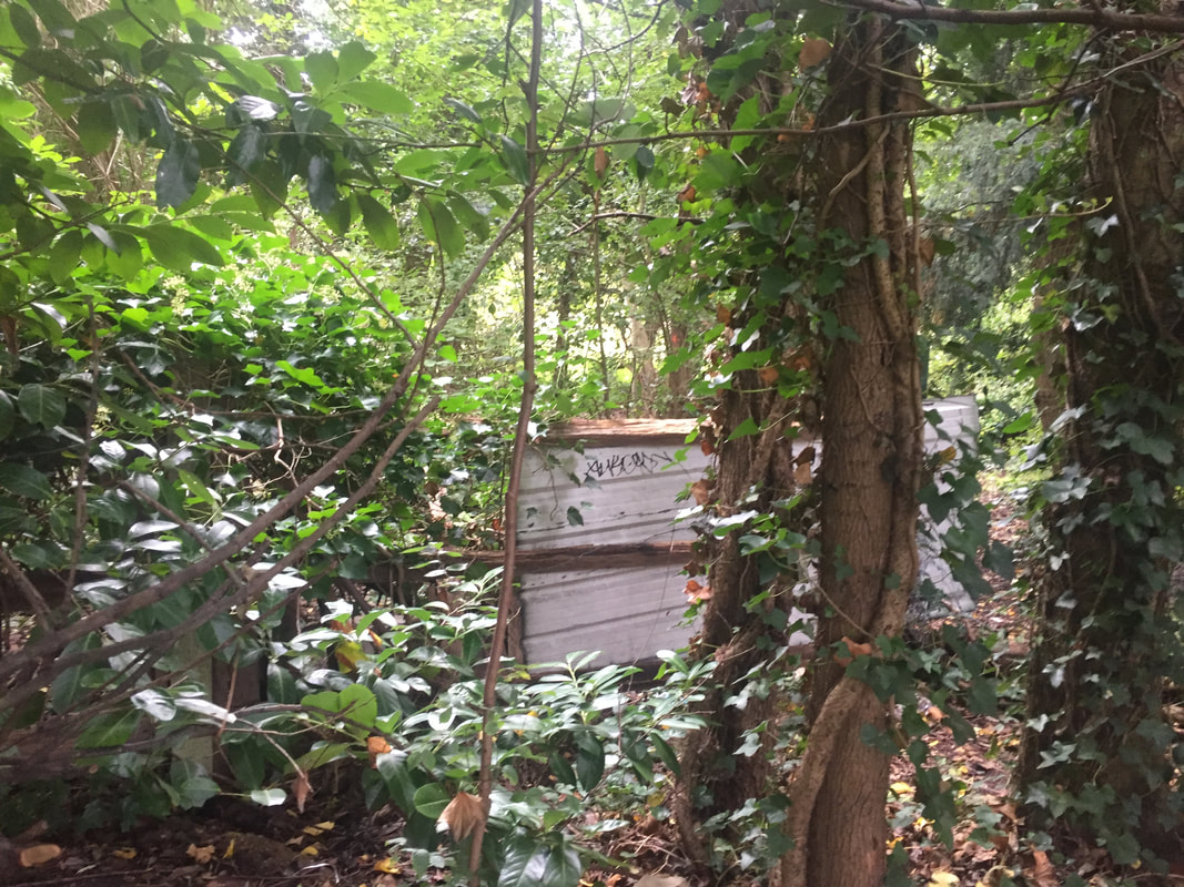
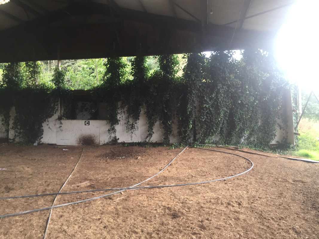
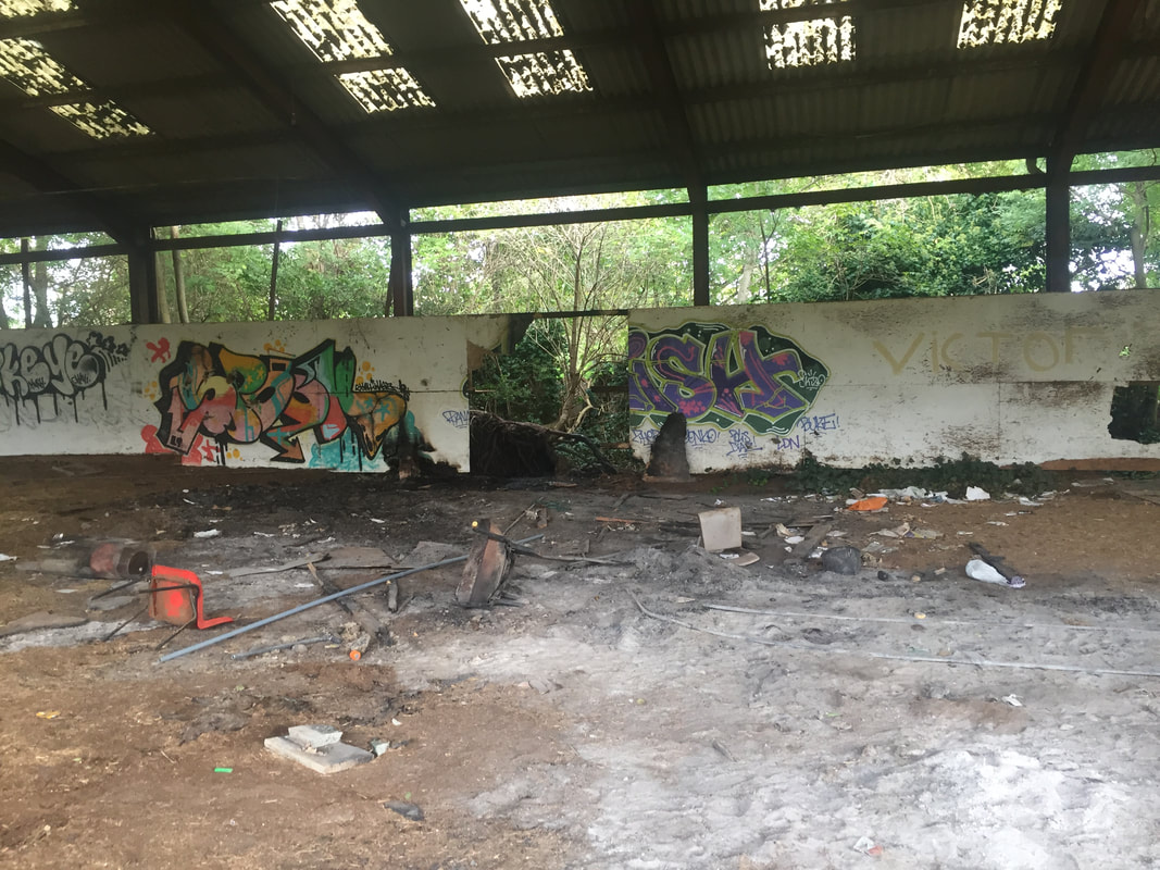
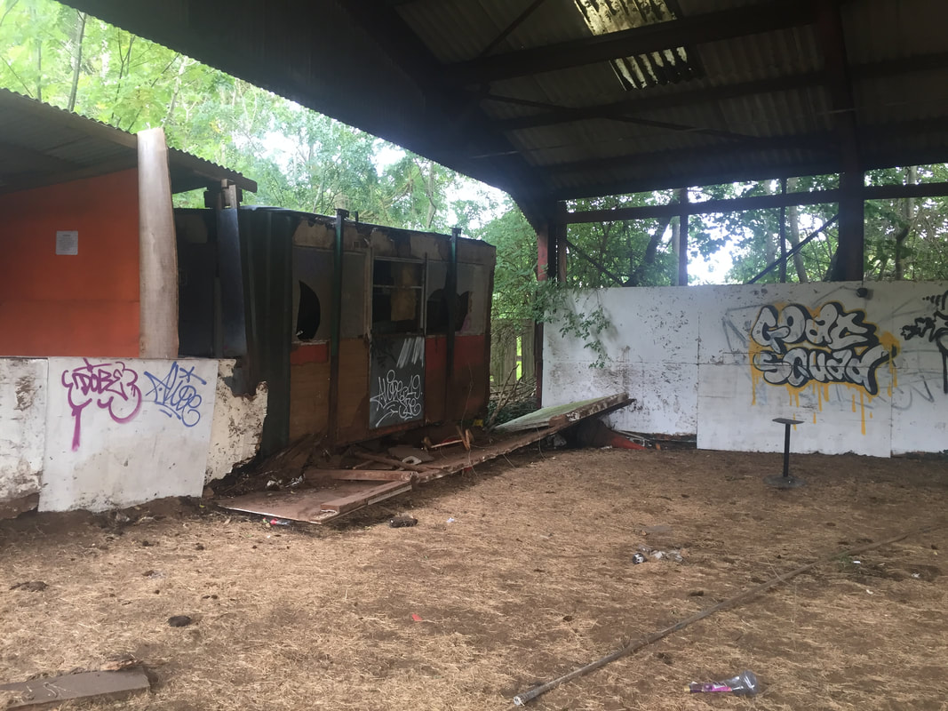
During the half term we had to complete 30 images of unusual images and uploaded the images on weebly. So during the half term Klaudia and I had the idea to adventure in to the abandoned farm/horse stable near by. We decided to go in the abandoned farm/horse stable and explore as its a very unusual location to see or be in general. Our task was to take 30 images however as this place was so unique, interesting and unusual i managed to take more than 30 images very easily.
what i think went well the choice of location and the amount of images i took
even better if i had experimented with angles and compositions more and taken images without people in them.
what i think went well the choice of location and the amount of images i took
even better if i had experimented with angles and compositions more and taken images without people in them.
