The reason why i had chosen this theme was because i have some interest in building in London and the way they are designed and why so i thought it it would make sense to me to take pictures of buildings and write about them. i was very inspired the architecture in London and around the world so when i had the opportunity to have the theme architecture as a personal project i instantly i wanted to choose it as my theme for my personal project.
My Mind Map.
in this lesson we had to draw a mindmap to explore what we are going to do before we start taking images so the mindmap consisted of very early ideas that i had.
Research the artists:
Candida Hofer.
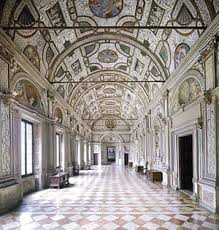

Candida Hofer takes a lot of images of religious buildings and some modern architecture but her theme was architechure with absence.
her photographs investigate the form and structure of spaces.she takes a insight to the contradictions between intention and actual use. as well as historical change. This approach leads her to portraits of spaces on a personal level. the image allows us to discover and reflect how some buildings that are historical or modern still have the same use. she also did a series of images where she took pictures of the architecture of the inside of buildings such as empty theatres.
her photographs investigate the form and structure of spaces.she takes a insight to the contradictions between intention and actual use. as well as historical change. This approach leads her to portraits of spaces on a personal level. the image allows us to discover and reflect how some buildings that are historical or modern still have the same use. she also did a series of images where she took pictures of the architecture of the inside of buildings such as empty theatres.
The reason why i chose this picture was because it was taken from a interesting clear angle and where the formal elements of line and pattern are clearly exhibited and it stands out to me the most compared to the artists and the other pictures
Berenice Abbortt
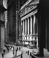
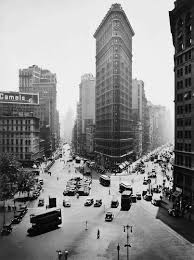
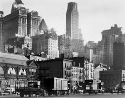
Berenice Abbott takes a lot of images of big cities in very interesting angles and they are taken in black and white.
she studied briefly at the Ohio State university before moving in 1918 to New York City, where she explored sculpture and drawing on her own for four years.
she had done many projects during her lifetime and from my further research i had found out that her photography projects mainly consists of buildings around New York or the construction of new buildings and documenting them via photographs as the progress.
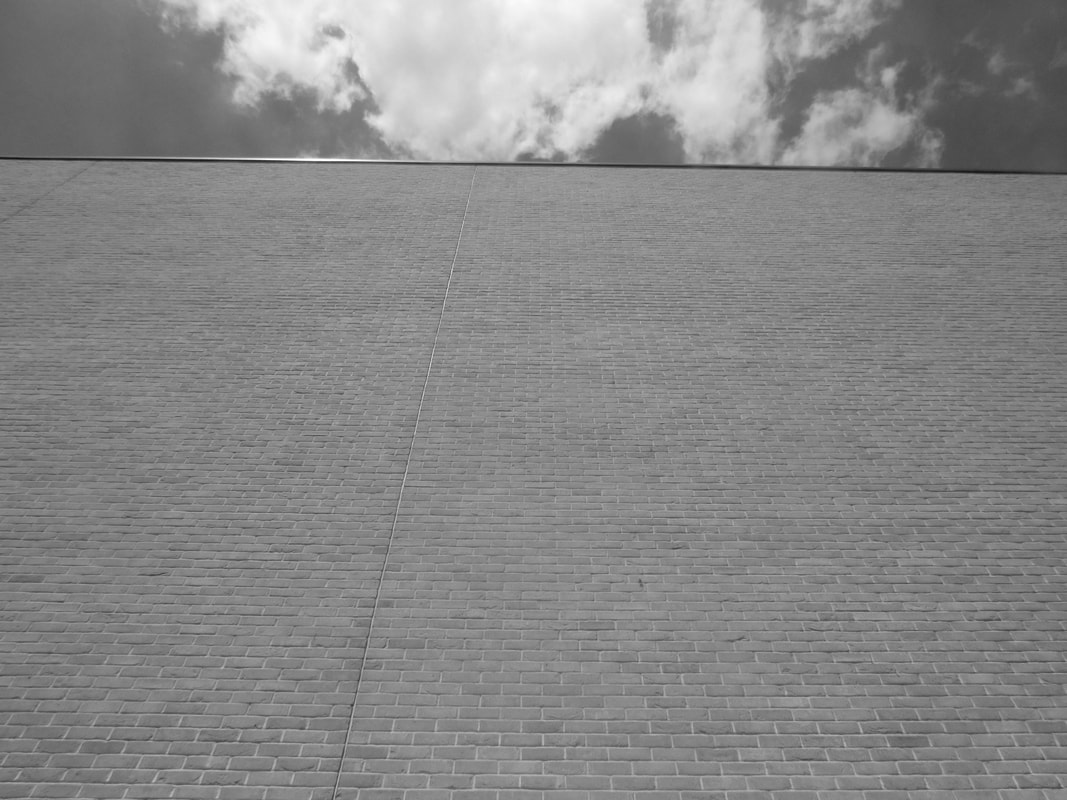
i like that it was taken from a high and interesting angle where most of the buildings in the background can also be seen you can see the formal element line from all of the building and it stood out to me due to how clear it is.
Ezra Stroller.

Ezra Stroller images are in black and white and he takes images of very modern buildings from a very close point of view.
Ezra Stoller, ]American photographer] captured the beauty of modern architecture through his black-and-white photography. Trained as an architect, Stoller would spend several days exploring the spaces and shadows of a building before taking any pictures. Architects revered his work, and he photographed buildings designed by such noted ones as Frank Lloyd Wright, Eero Saarinen, and Louis Kahn. Ezra Stroller seems to infuse the modern architecture of the 21st century and infuse it with black and white which was the filter of early motion and photography.
Ezra Stoller, ]American photographer] captured the beauty of modern architecture through his black-and-white photography. Trained as an architect, Stoller would spend several days exploring the spaces and shadows of a building before taking any pictures. Architects revered his work, and he photographed buildings designed by such noted ones as Frank Lloyd Wright, Eero Saarinen, and Louis Kahn. Ezra Stroller seems to infuse the modern architecture of the 21st century and infuse it with black and white which was the filter of early motion and photography.
i like this image as its very up close and personal with the building and we can clearly see the formal element line being shown off in the buildings architecture and the buildings design. it also has the element pattern as the building has kept to its pattern and another thing interesting was that its the fusion of modern and old as we can see that this building is quite new and modern however its taken in black and white which is very old school.
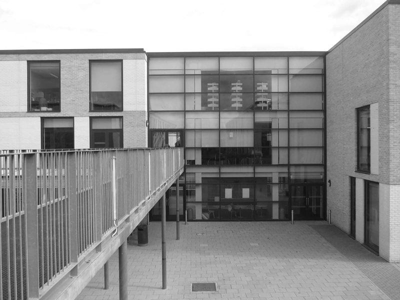
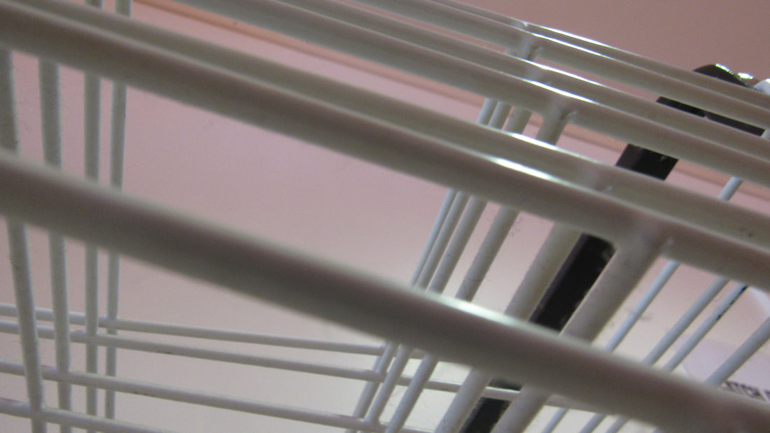
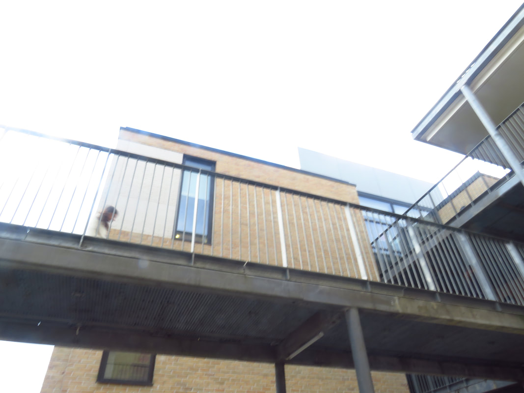
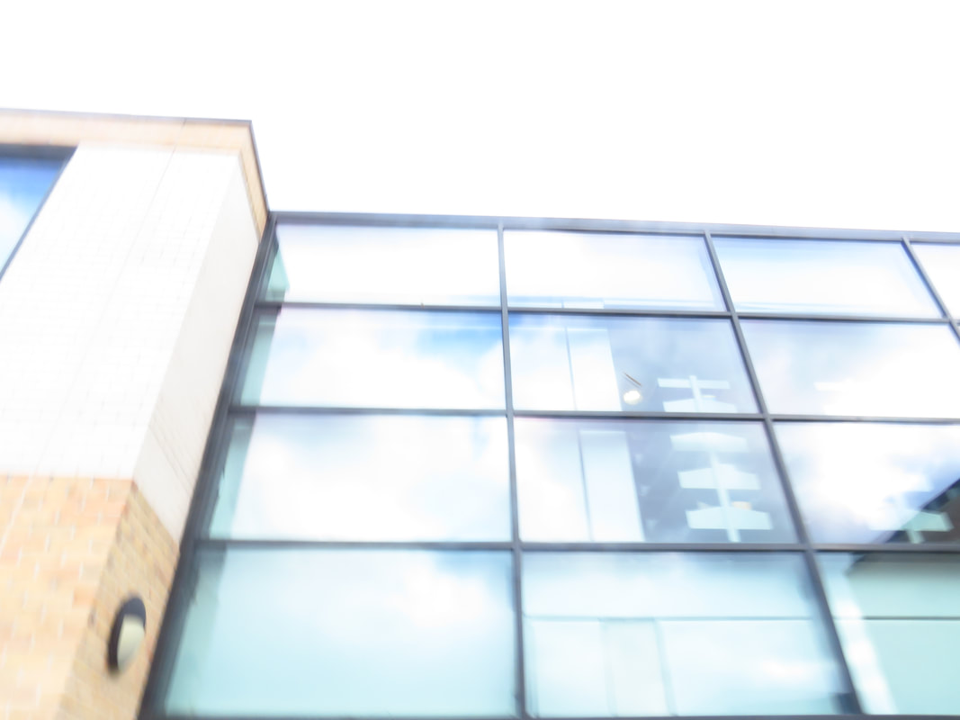
My pictures of buildings.
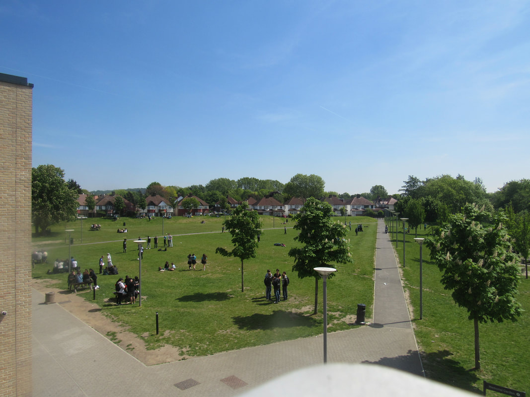
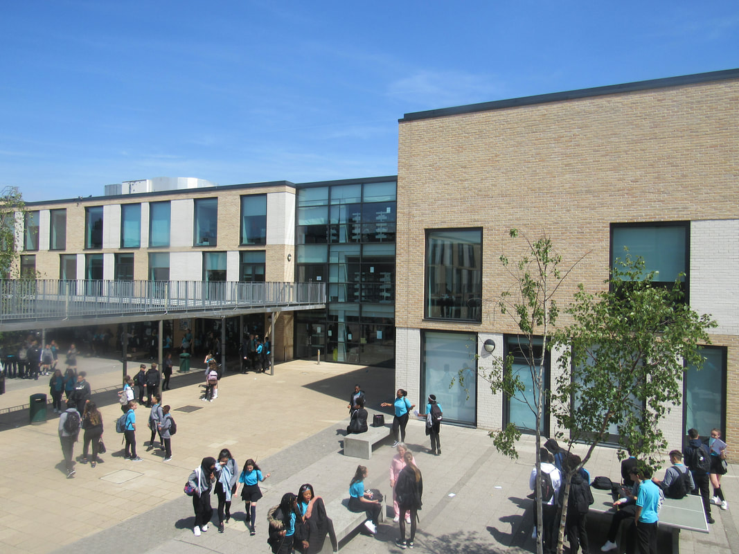
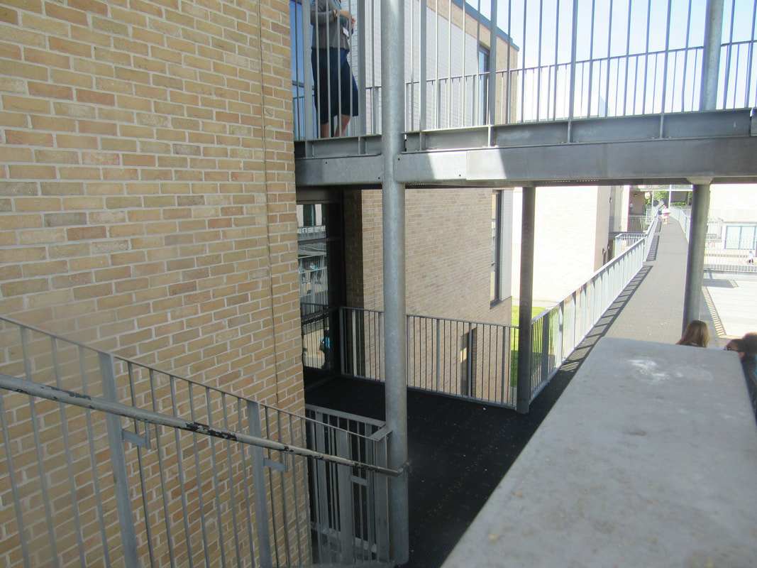
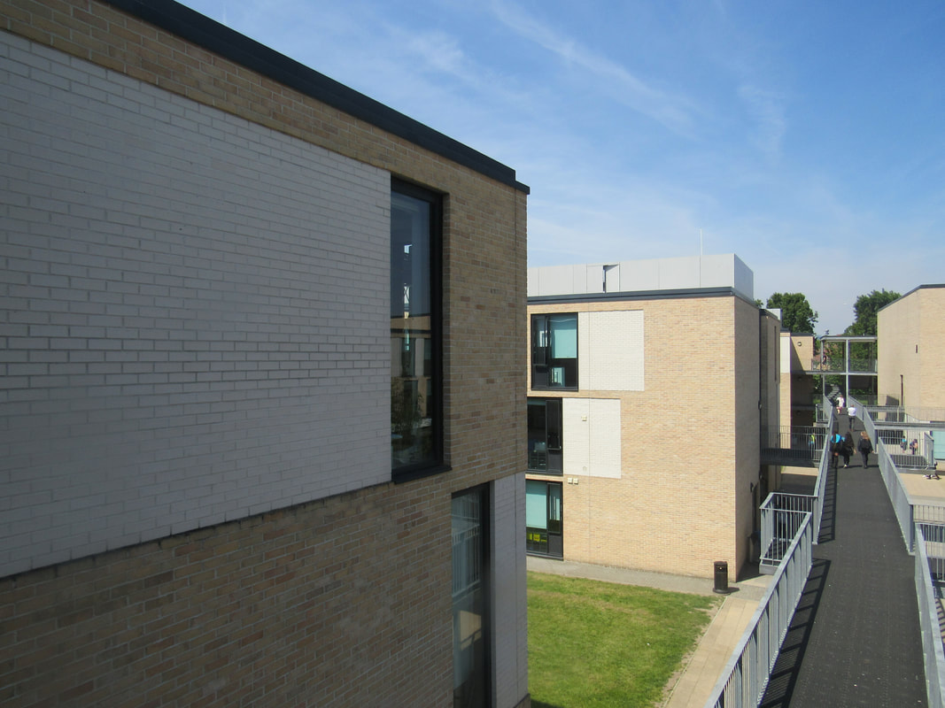
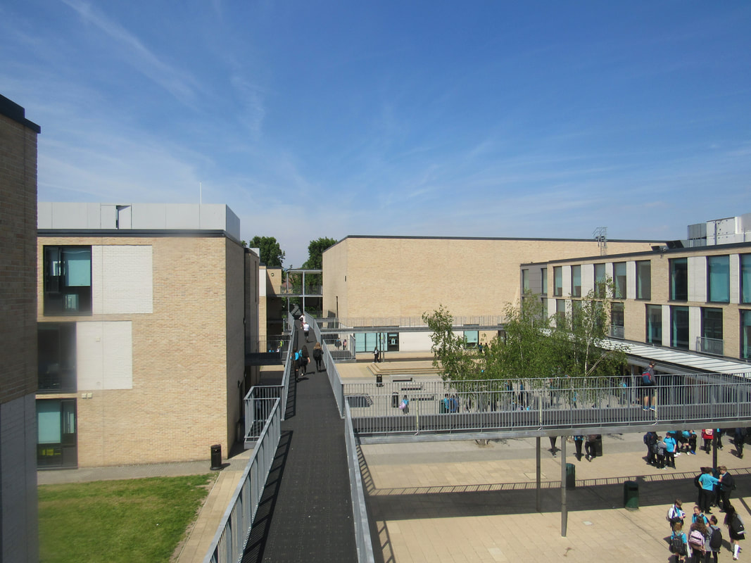
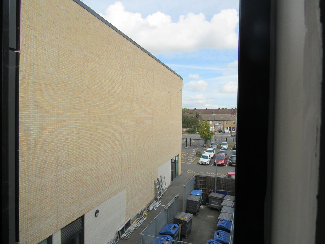
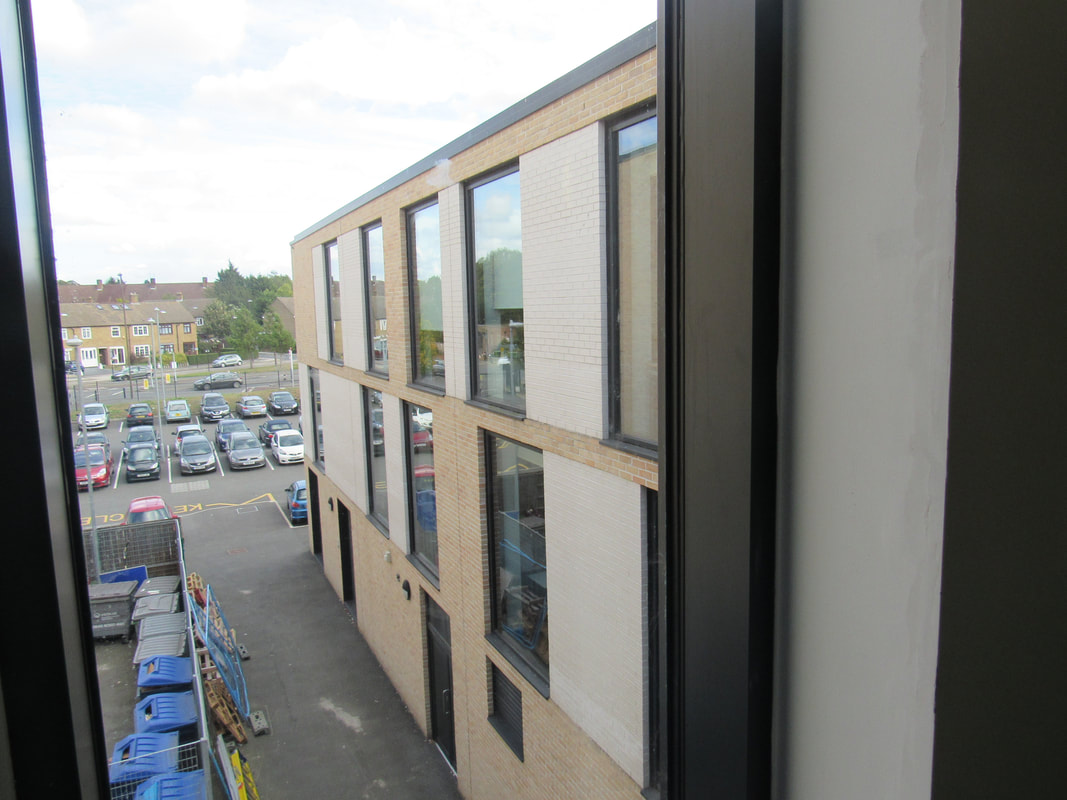
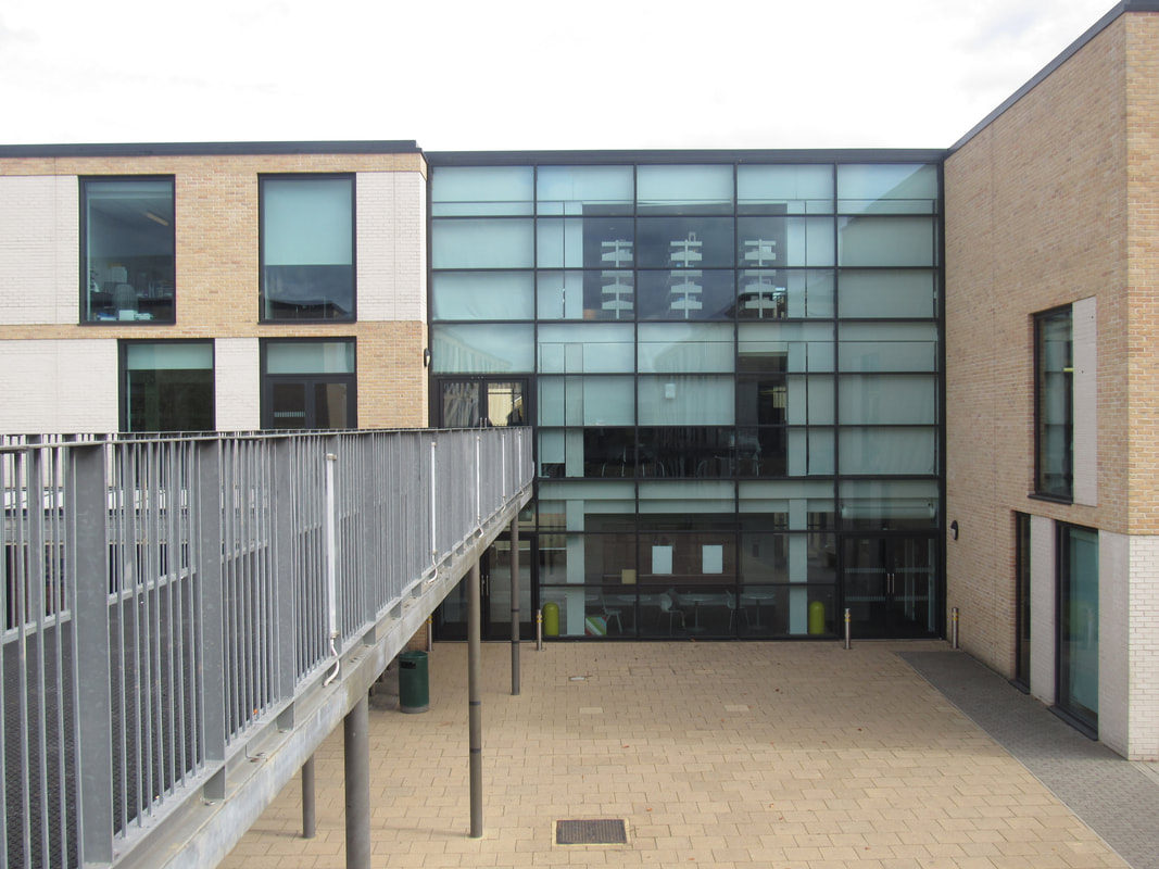
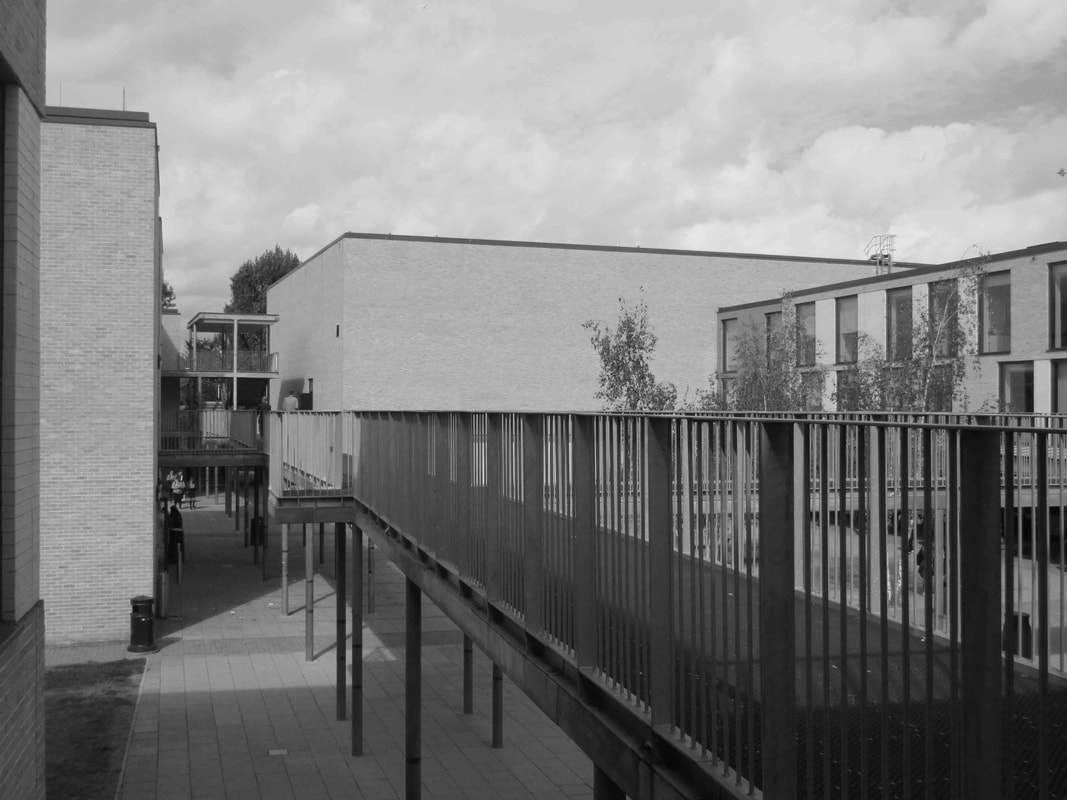
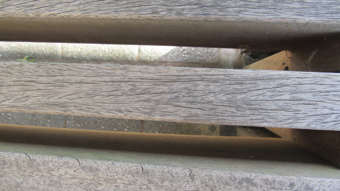
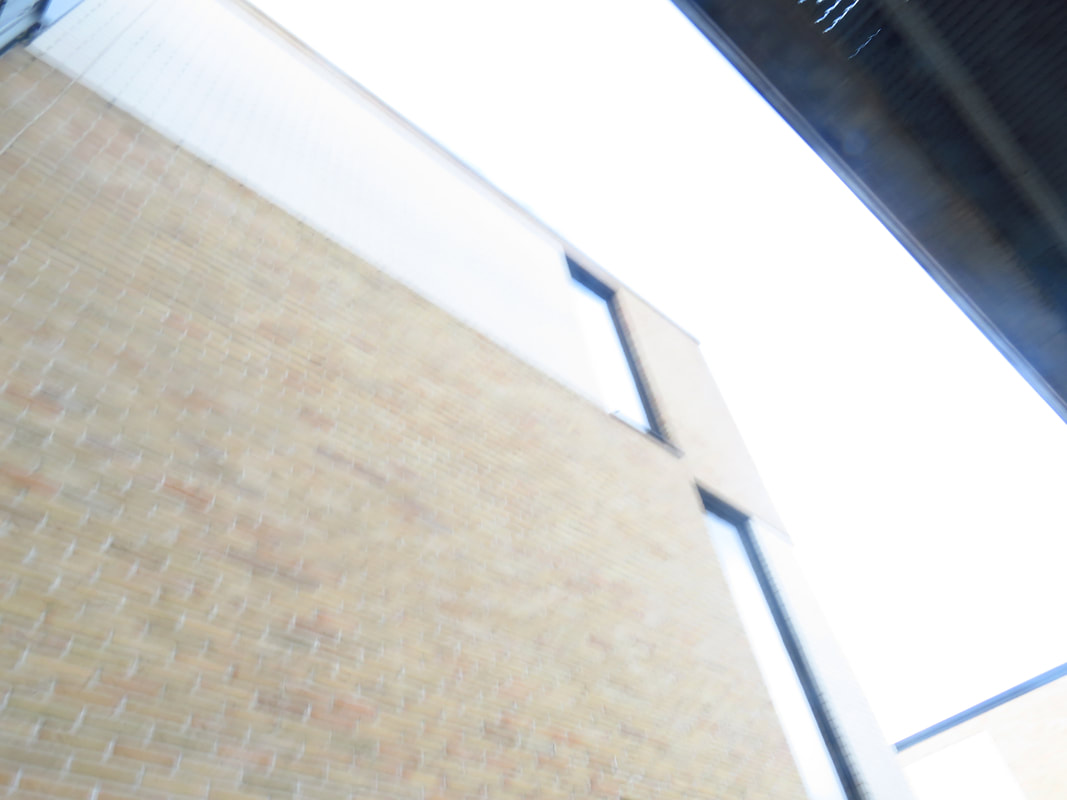
I decided to take images of buildings from interesting angles as there is not many different types of buildings around Thomas Tallis. What went well was that i managed to take a decent amount of images considering the lack of different type of buildings.
even better if there was more buildings around Tallis take i could take pictures of.
even better if there was more buildings around Tallis take i could take pictures of.
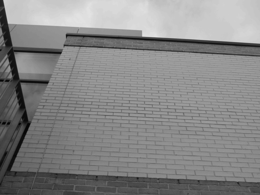
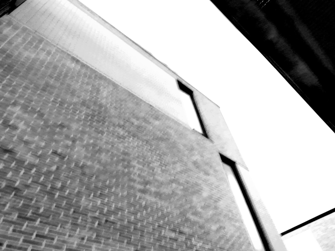
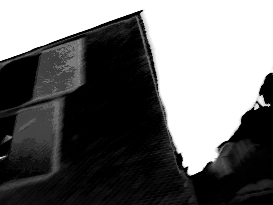
MY RESPONSE TO EZRA.
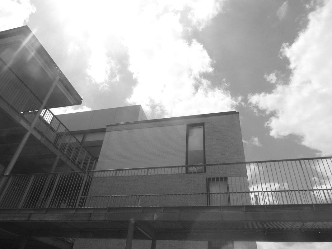
When doing my response to Ezra Stroller i decided i have to take the pictures of the school buildings from a very close perspective and angle and take a picture of it. I then went back to the classroom and edited it in to black and white format as Ezra Stroller took the images in the same style. She also mixed black and white with modern buildings and i had done the same with a modern buildings around Thomas Tallis school.
what i think went well: i managed to replicate Ezra Strollers style and implement it on my own.
even better if i could of taken more pictures.
what i think went well: i managed to replicate Ezra Strollers style and implement it on my own.
even better if i could of taken more pictures.
Lucien Herve - Architecture.
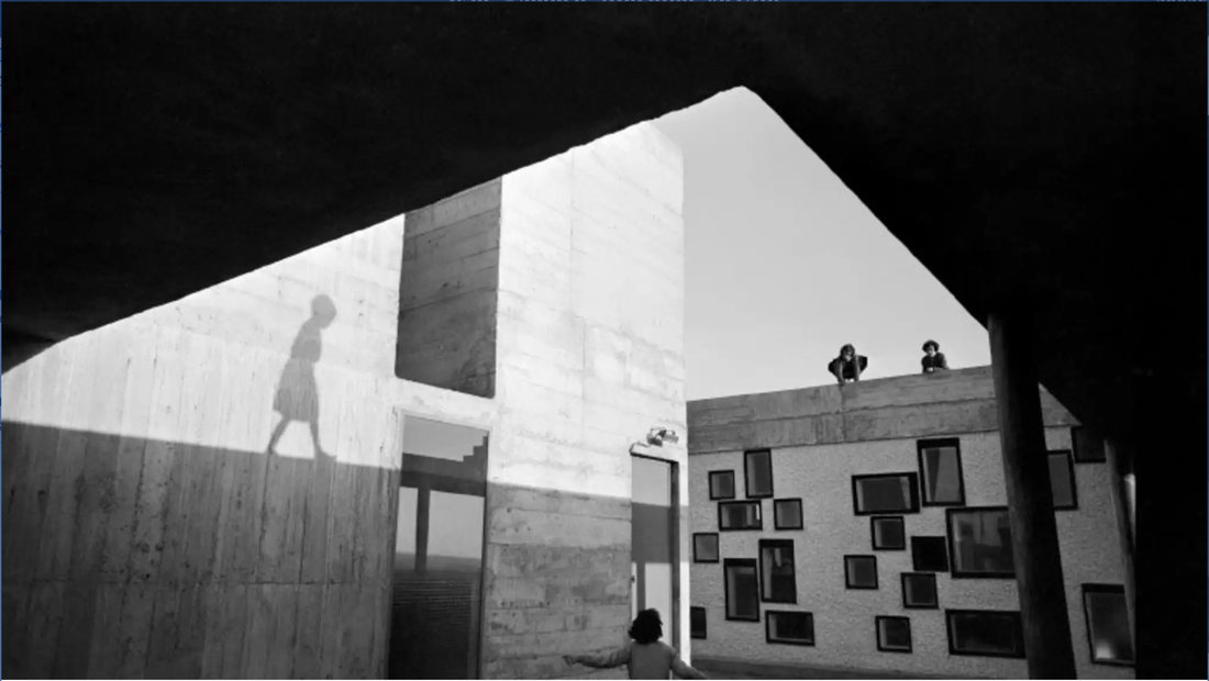
I see an image with a little girl and above a little girls shadow and I also see small shaped windows and above a see two adults.
What i recognise in this image is the use of shadow and perceptions and also the use of angles
what do seem new to me is the unusual shaped windows below to the two adults who can be seen as the little girls parents.
This image reminds me of Banksy the street artist because the little girls shadow reminds me of one of his art pieces of the little girl with the red balloon.
This image looks relatively abstract as you cant really tell whats going on seeing as there is a little girl on the bottom but her shadow is above her meaning i doesn't make sense.
In this image i see many important formal elements as i feel as it makes up the whole image the formal element shapes is represented in the window. the formal element of line can be observed very closely if you look at the walls you can see many lines.
The photographer had captured light very well as the image clearly shows off the lighting when the light is reflecting the little girls shadow.
Space can be shown off very clearly as the space between all the people in the image is very low to high as it almost looks like the little girl below is looking up to her parents above. There is also a lot of spacing between the shadow and the actual lighting itself as the space around the middle is very negative and dark almost fulfilled with shadows however the space in the middle is very bright and positive. The photographer had chosen a very good time as the lighting is very bright meaning it gives me the impression that it was taken around midday, when the light is shining the brightest and not before or after when the light is not bright enough and doesn't give a straight outline of shadows.
I feel like everything up close to my perception of the image is in focus but the objects and people furthest away are more out of focus like the two adults of the ledge above looking down at the child.
the view of subject has affected us from seeing who the shadow above is as it might be another little girl walking a long the ledge.
This image is different from real life because in real life i would be able to see who on the ledge and be able to see in colour and be able to understand the setting in more depth.
What i find puzzling in this image is the little girls shadow and the weirdly shaped windows and what i find interesting is the use of light and shadow in the image this is because i feel like the lighting really makes up the image and gives it its purpose.
The questions i would ask the photographer are things like "why did you take this image?" or "what did you find most interesting about this image?" i would ask more in depth questions as well for example "if You could take this image again would you change something?".
Unite d'Habitation, Nantes-Reze, France, Le Corbusier architect, 1954. From Lucien Herve: When do we cast off for happiness?, exhibition at the Lismore Regional Gallery.
This image was shown in gallery and the quote given gives me a whole new perspective on the image
I now think that the little girl represents happiness and the shadow above represents her sadness and dark thoughts that keeps on dwelling and dragging its feet behind her like a shadow trying to overcome her happiness.
What i think this photograph is about is a little girls happiness but she has a dark shadow who always lurks behind her. What made me decide this is the fact the quote given below the image was about how long until you cast off for happiness which made me think about a battle between happiness and freedom verses the shadows and sadness.
If i was to live in this photograph i feel like it would be very rubbish as it feels very inclosed and secluded it almost has a prison vibe as the perception of the image make its feel like there is no entry of no exit only light and the two adults above seem like cctv and is always watching over and overseeing the girl.
This image does not remind me of other photos as the photo is unique and no one can take an image like this.
I feel like most things in this image works well.
it looks good because it make the image up and i feel like all things in the image make it up and tells a certain story.
I think only some parts of this image remind me of other pieces for example the girls shadow reminds me of Banksy street art for example it reminds me of the girl with red balloon.
What i think is effective with this image is the use of lighting and shadows and i think the two people at the end doesn't work well as they do not contribute to the photo i just see them as just there.
Overall, what is worth remembering is the interesting play with light and shadow and perspective.
the way the person takes the picture and plays with light and shadow and perspective make the image unique and should be remembered as unique.
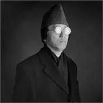
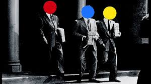
Ai Weiwei.
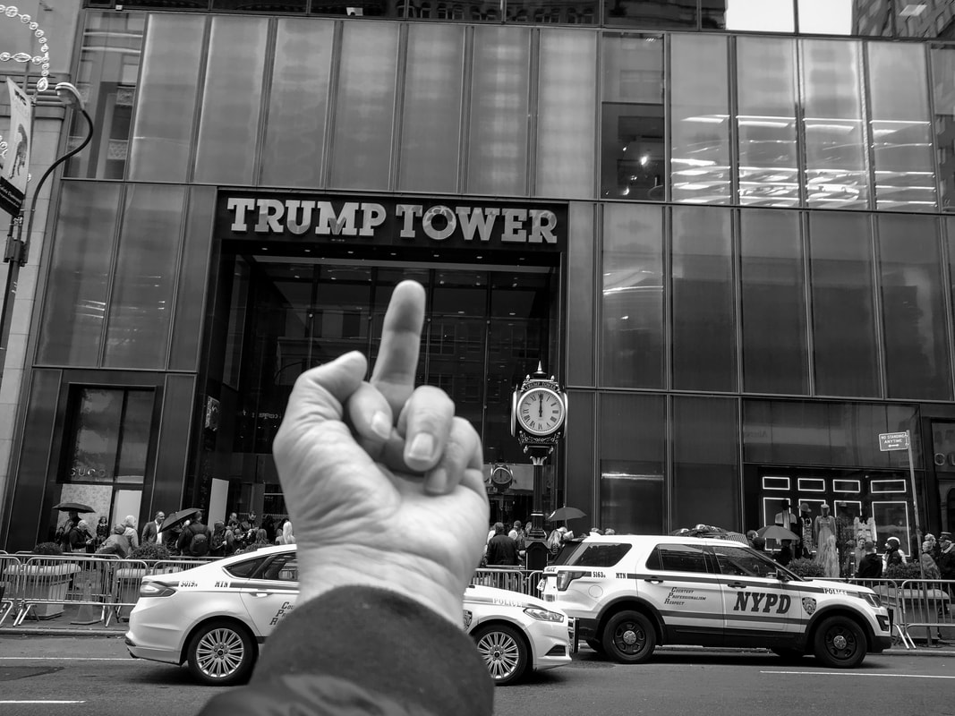
the reason why i chose this artist is because i like the way he takes the images from an interesting perspective and adds his own unique twists to it. what ai does is that he travels the world and takes pictures of very infamous buildings and puts his middle finger at them which i personally find very interesting as most photographers would not do this as it can be risky so him taking picture like this kind of makes his photos unique and he has his own style of taking pictures.
AI weiwei- Ai weiwei is a 62 year old (at time of research) activist and artist who comes from a Chinese background.
The image above is just one of his amazing works where he traveled all around the world and put his middle finger at many significant landmarks and structures and i intend to use this style of work as its unusual unique and daring.
IN SCHOOL RESPONSE
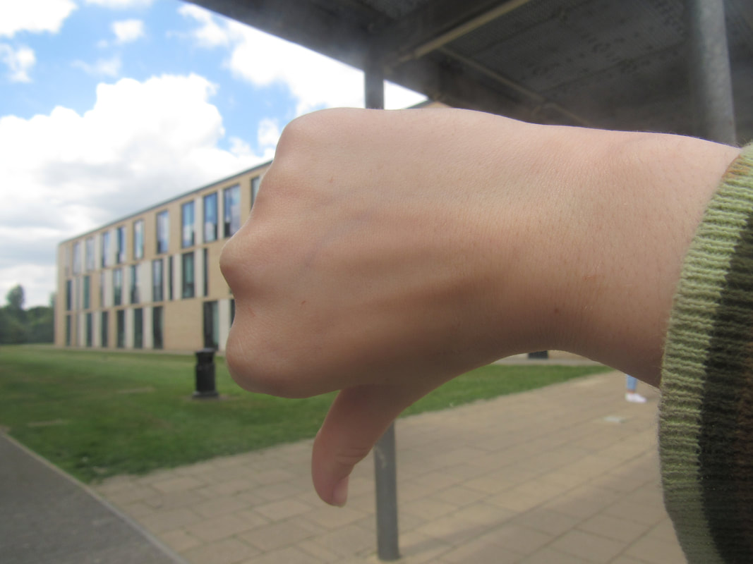
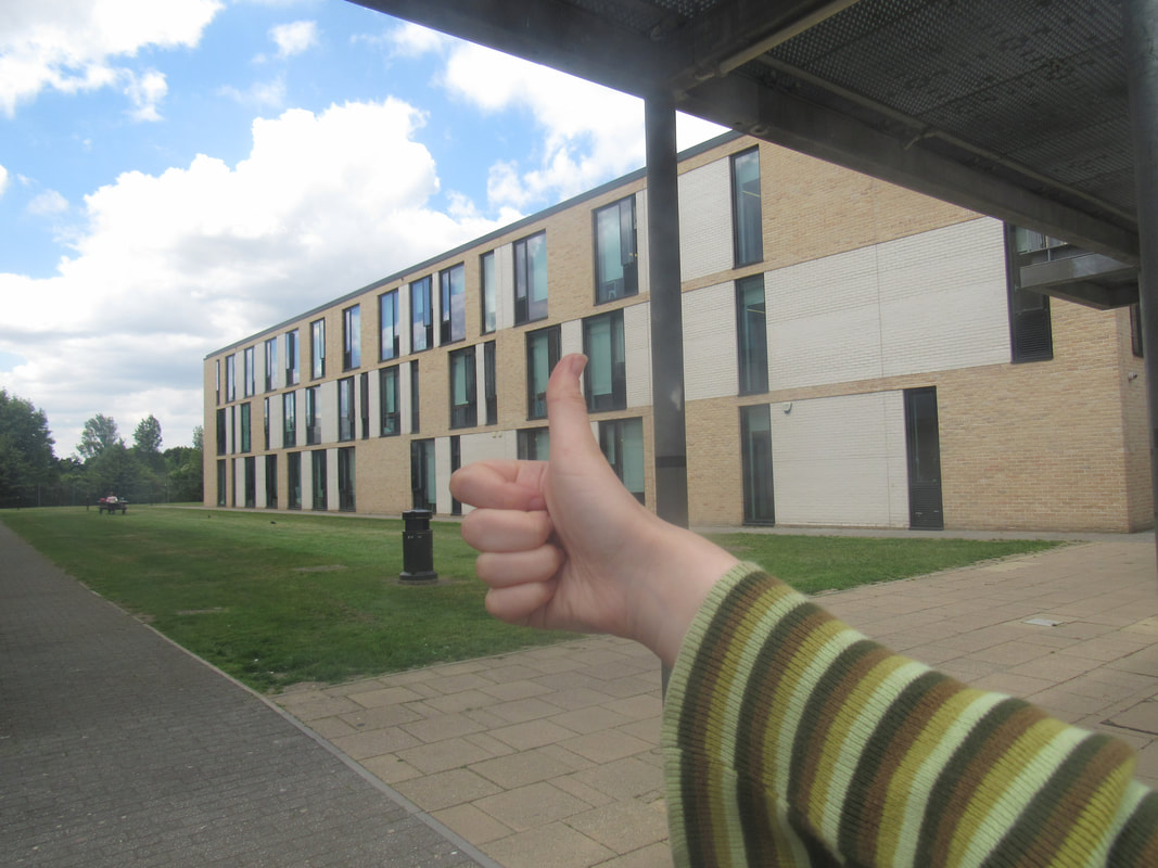
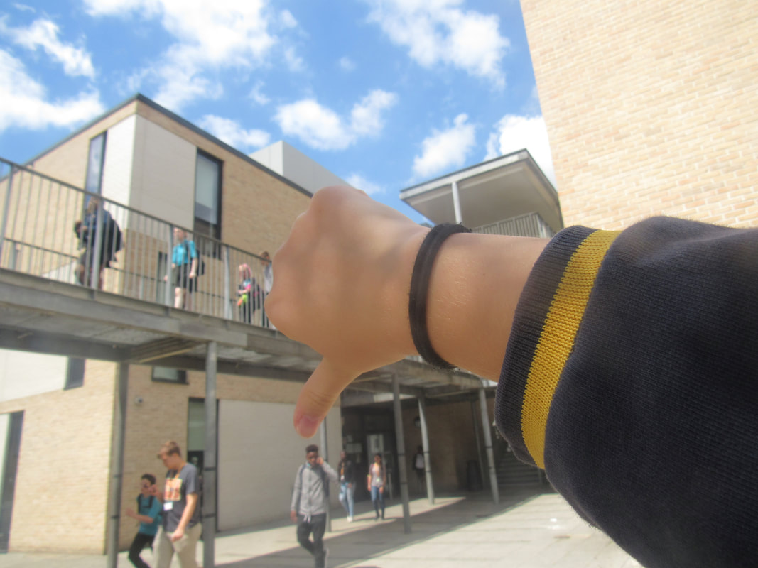
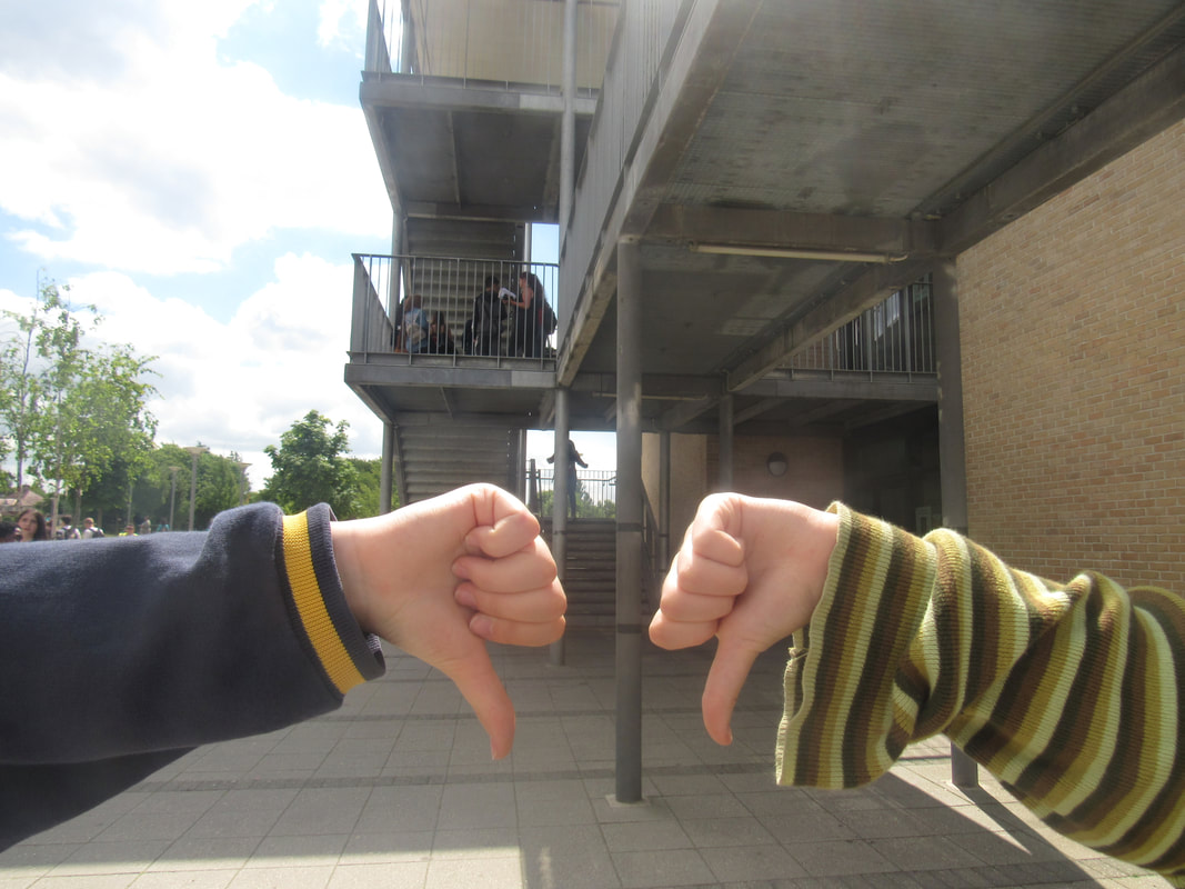
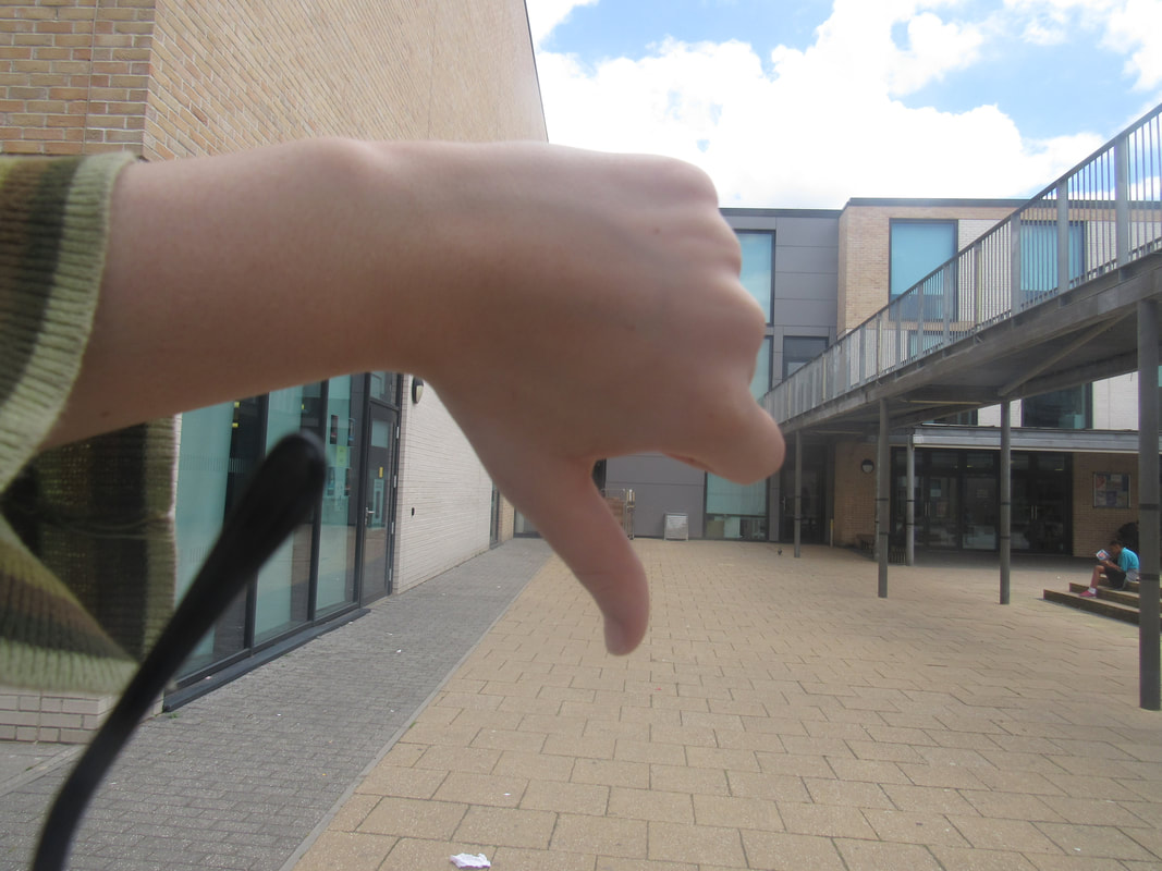
My response to Ai WeiWei was that i put my thumb down on various buildings on the school that i didn't like for example the maths building and put my thumbs up at buildings i did like or i did both thumbs up and down because some buildings and their subject give me mixed opinions on them.
so instead of swearing at the building i modified it by putting my thumbs up or down as a PG alternative than putting my middle finger at the building.
what i think went well: was the amount of pictures i took and how i managed to modify and adapt from instead of putting a middle finger at a building i would use a more PG friendly thumbs down.
even better if: if i experimented more with angle and composition.
Leap then look workshop.
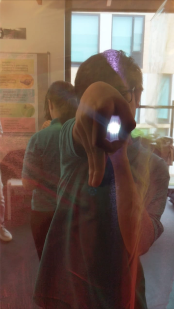
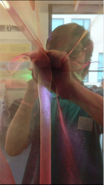
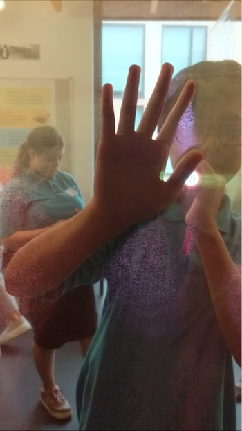
One of the first tasks we did with leap then look was to use a torch and a camera to take pictures with our hand in different positions with a partner for example, one person would do the hand gestures with the torch and the other would take a picture.
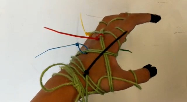
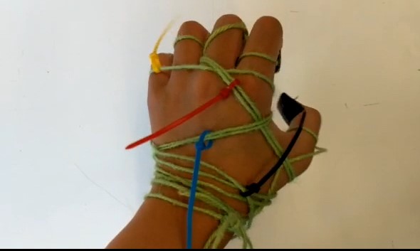
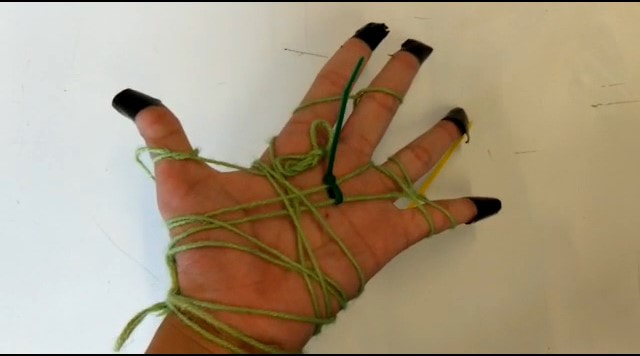
In one of our tasks we had to create an interesting sculpture with our hands and record ourselves making interesting gestures with them. I had the idea to make it interesting but at the same time not over doing it as it would look more messy than sculptured.
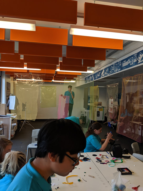
In one of our tasks we had to go around the room and take plain and simple images which would later be used to find interesting spots in the image.
when going around the room i decided to take images of the most busy areas possible as i would find it more interesting when looking for points of interest when i eventually put my paper with a hole over the images.
when going around the room i decided to take images of the most busy areas possible as i would find it more interesting when looking for points of interest when i eventually put my paper with a hole over the images.
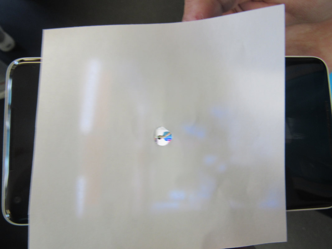
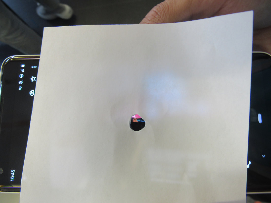
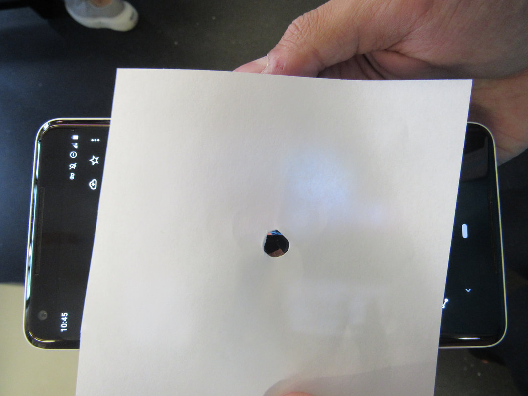
we then had to get a plain piece of square paper and cut a small hole in the middle and we put it over the plain images i have taken previously. We then had to navigate a certain point in the image that we found interesting and place the paper with the hole over it and take another image. when carrying out this task i used my partners phone to take the images of the busy places of the camera and i placed the paper over the phone and took a pictures of the phone and paper with a school camera.
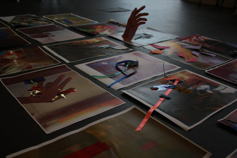
Our final task was to print out the best image that we had taken that day and create a 2D or 3D sculpture with it and we could cut it out or place tape or objects over them and once that was complete we had put all our final structures together in the middle and the whole class observed each others final work.
EVAULATION
WWW: That i finished my work on time and managed to do most tasks well using the materials that were given to us.
EBI: Use the techniques that i had learnt and incorporate it in to my architecture project more than i had done as i feel like it would make it more better.
EBI: Use the techniques that i had learnt and incorporate it in to my architecture project more than i had done as i feel like it would make it more better.
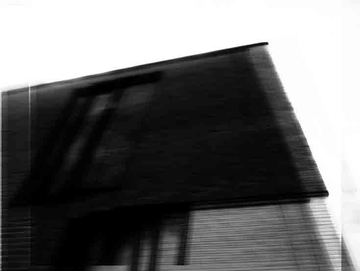
Unedited
Black and white.
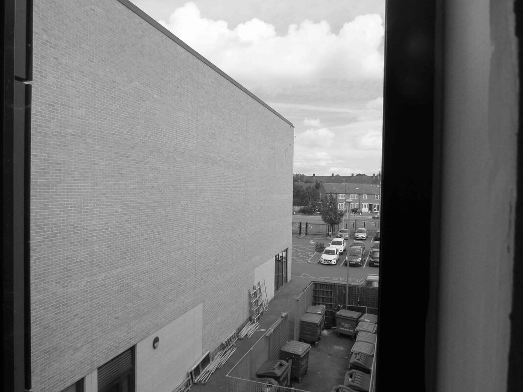
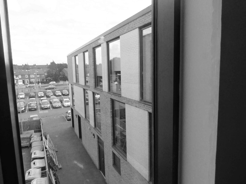
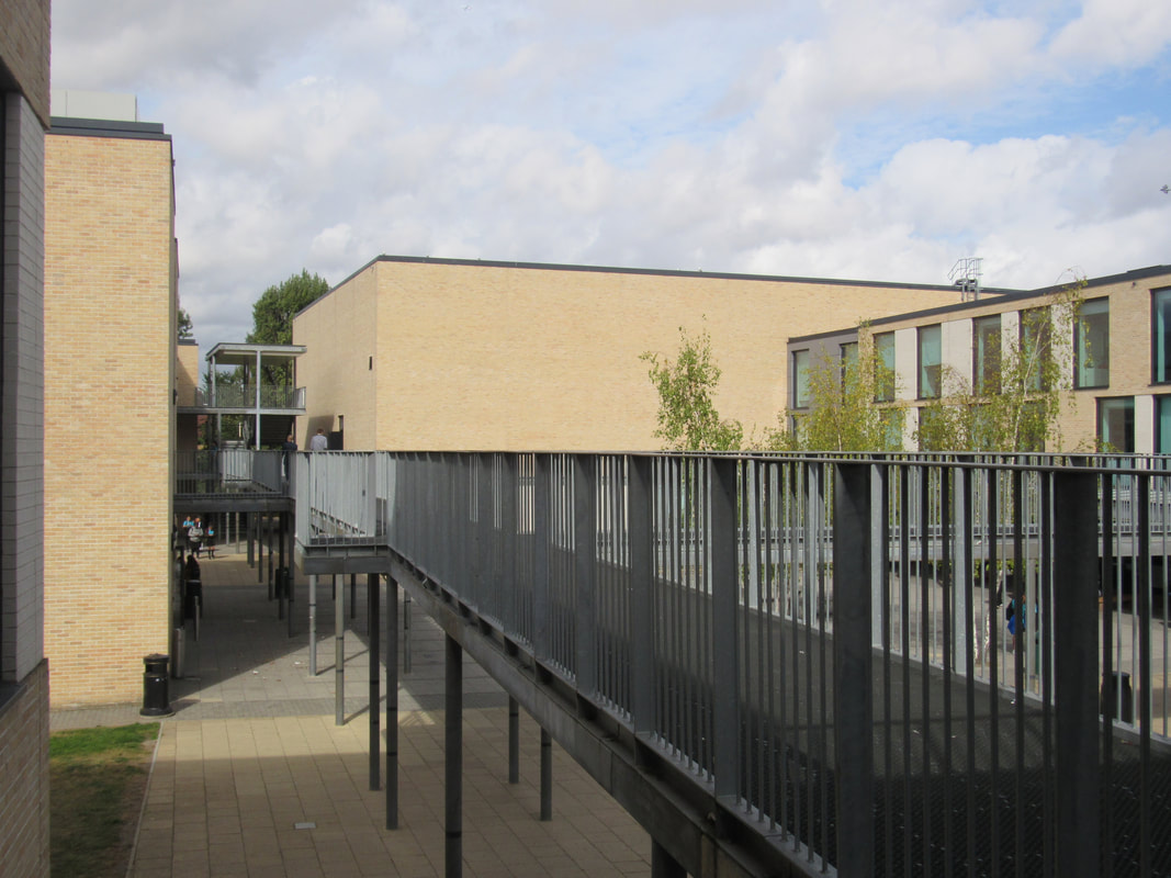
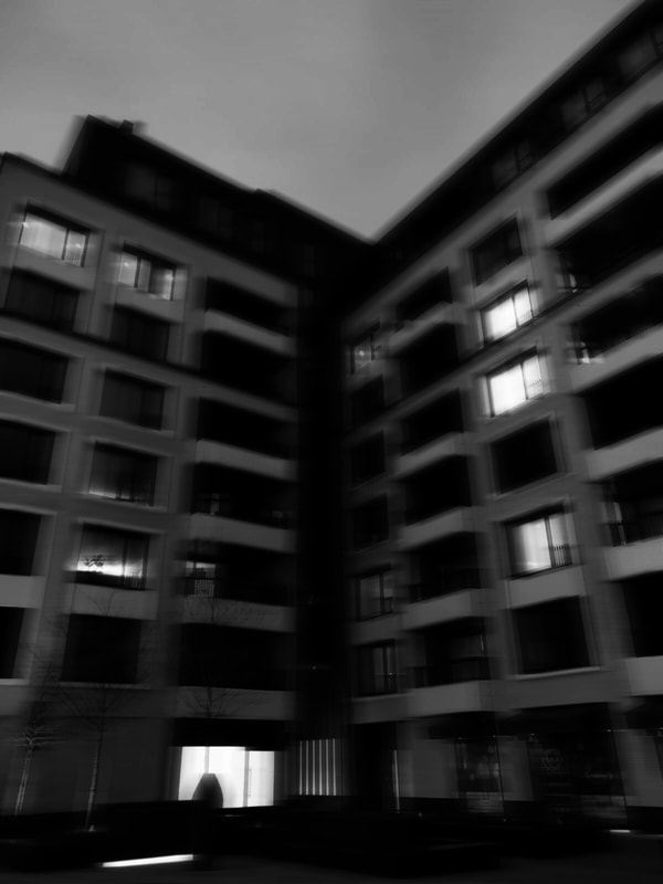
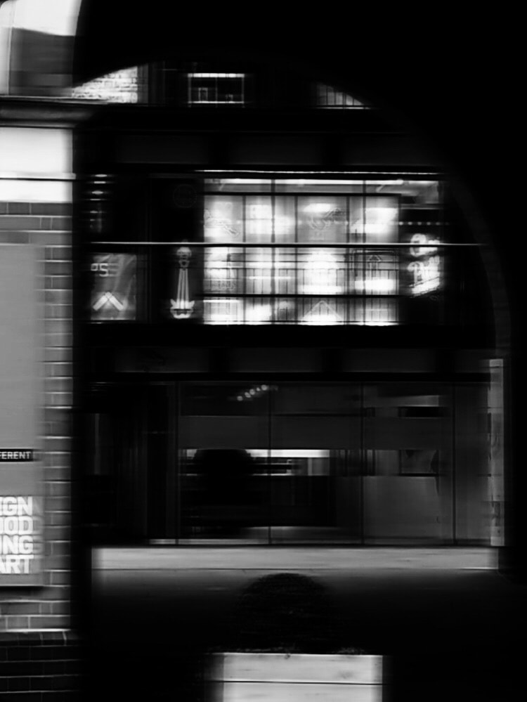
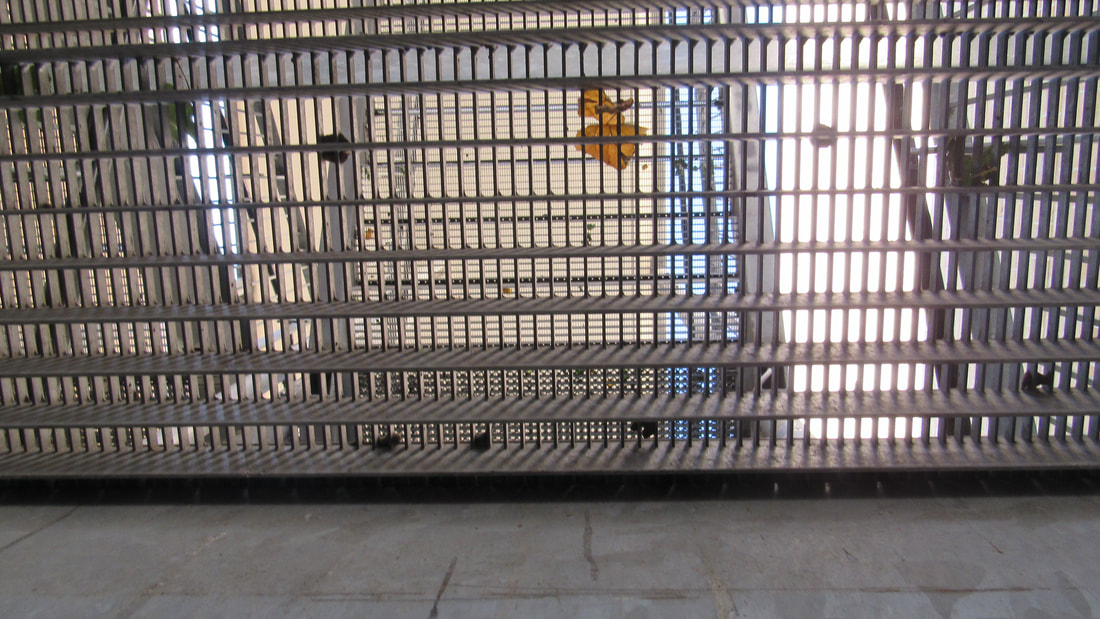
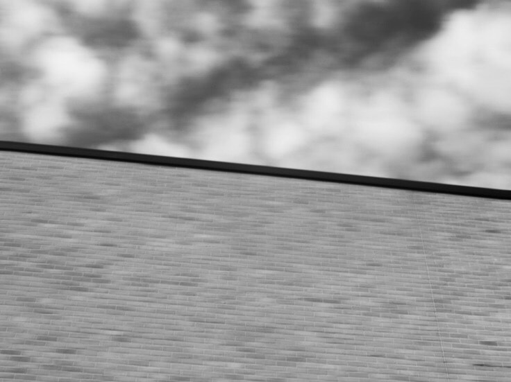
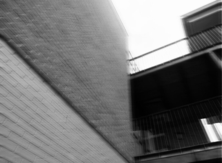
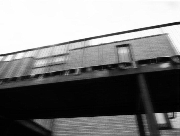
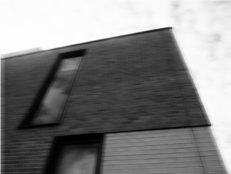
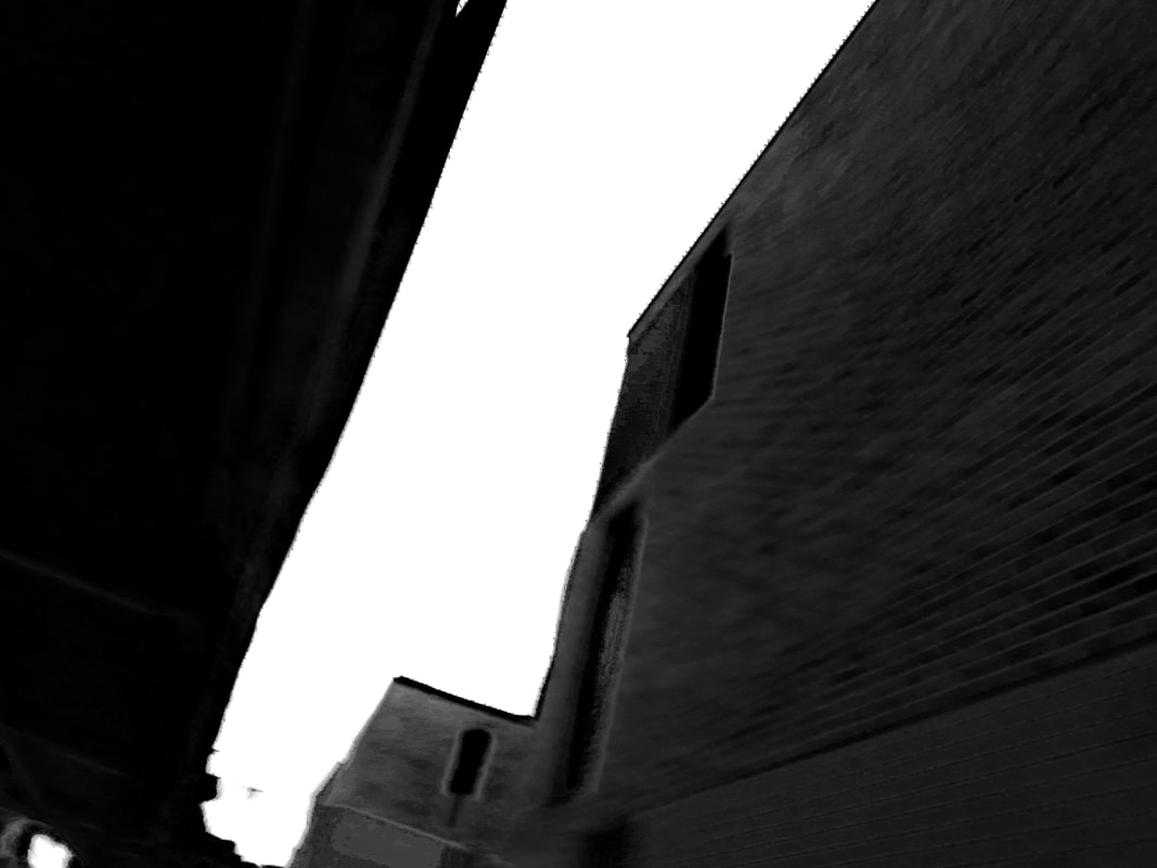
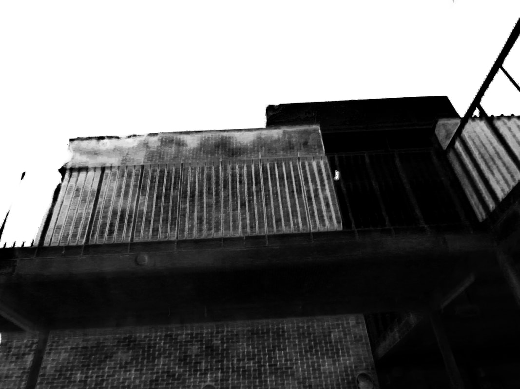
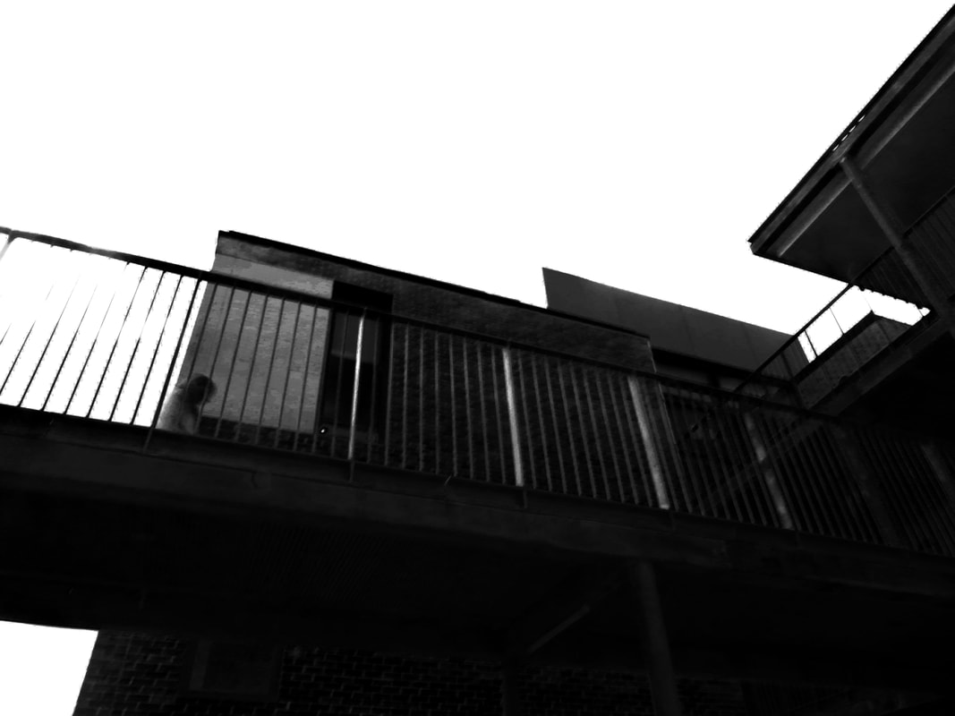
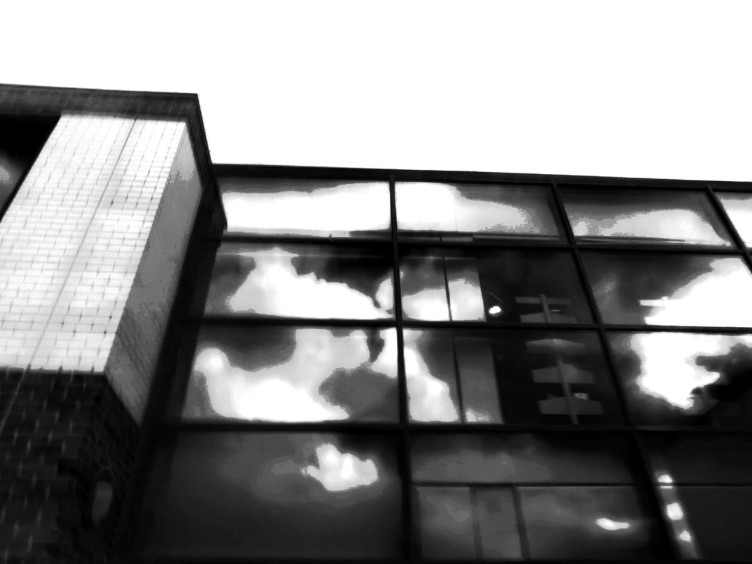
In todays lesson i decided to take more images of the buildings around but i would try to merge the photography methods of Ai Wei Wei and Ezra Stoller by taking some images up close to the building like Ezra Stoller and all the images edited or taken in black and white in the style of all of the researchers i had researched. What i think went well was the amount of pictures i had taken and how i experimented more with angle however i think the images would be even better if i took more images outside of school which i would properly decide to do in the future and during continuation of the project.
Hiroshi Sugimoto - Artist Research
|
The reason i chose this image to use this image as was because its very clear yet very abstract as you can still see the image but you cant really tell what it is. This is the style i intend to apply to my experimentation and images.
|
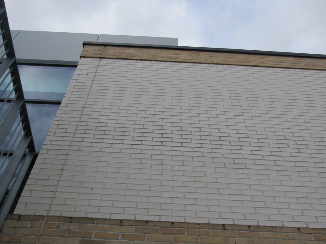
The reason i chose Hiroshi Sugimoto because his images and style caught my eye. Hiroshi Sugimoto is a photographer and architecture based in Tokyo Japan. I also noticed that Hiroshi Sugimoto has a style and technique towards architecture similar to my style and approach when taking pictures of architecture. I also noticed that most of his architecture images consists of many of the formal elements however the one that may stick out the most in his images is the formal element of line which clearly presented in my small gallery of his images as an exemplar.
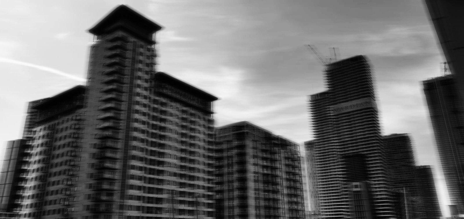
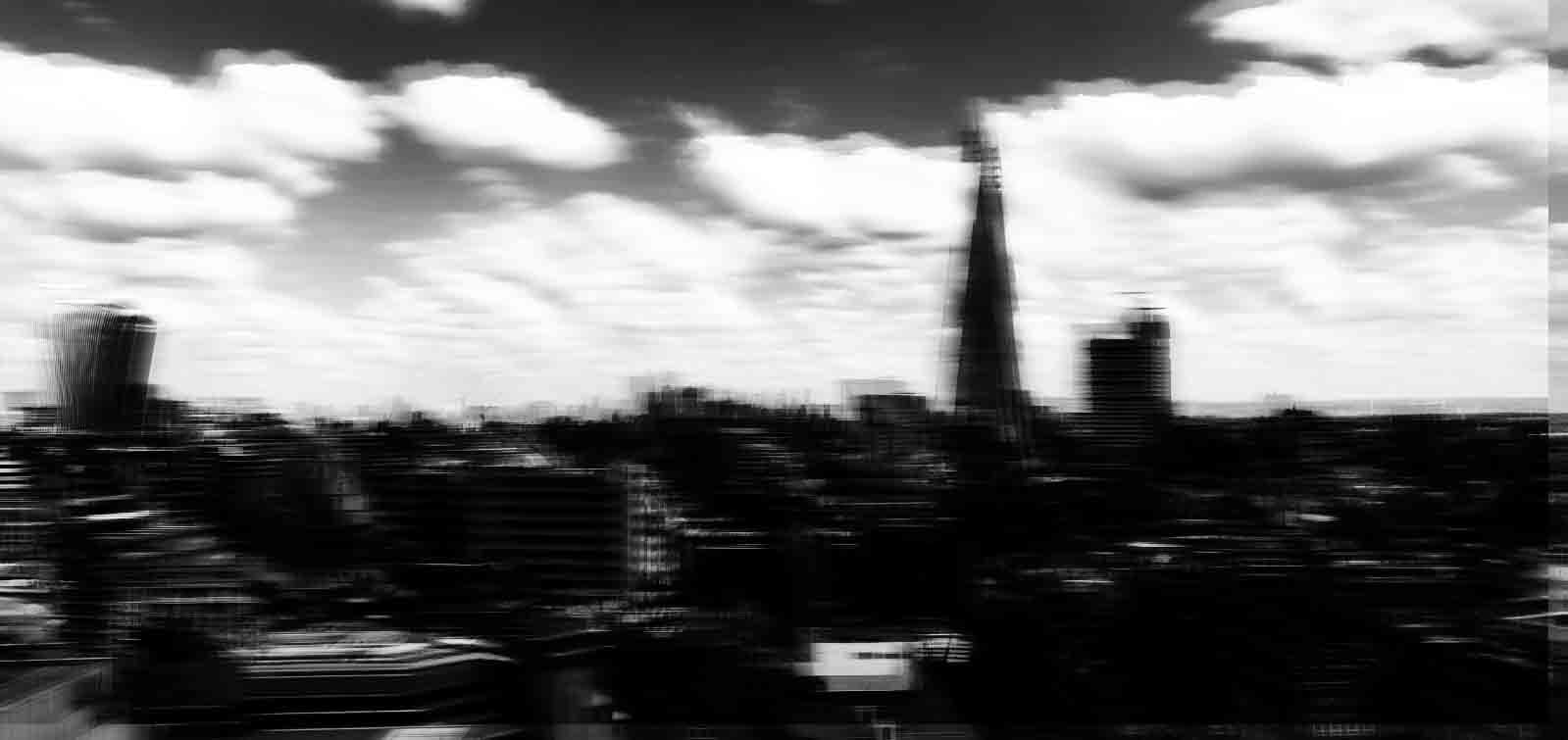
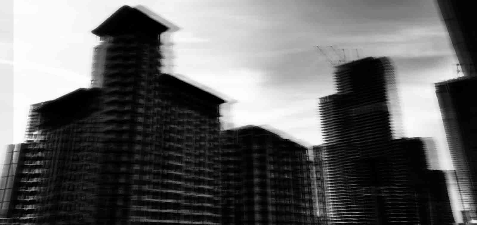
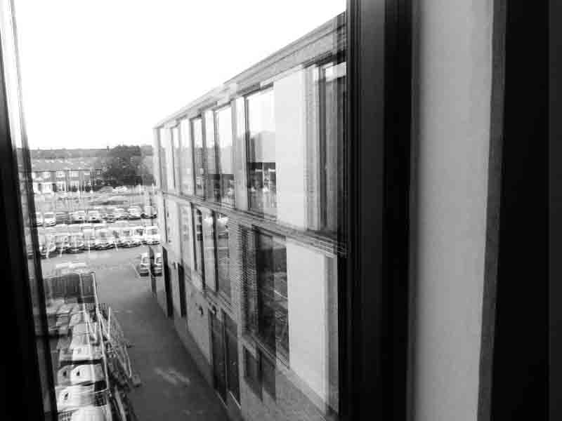
Unedited images influenced by Hiroshi Sugimoto (10)
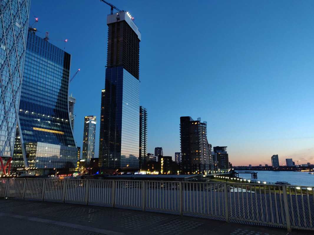

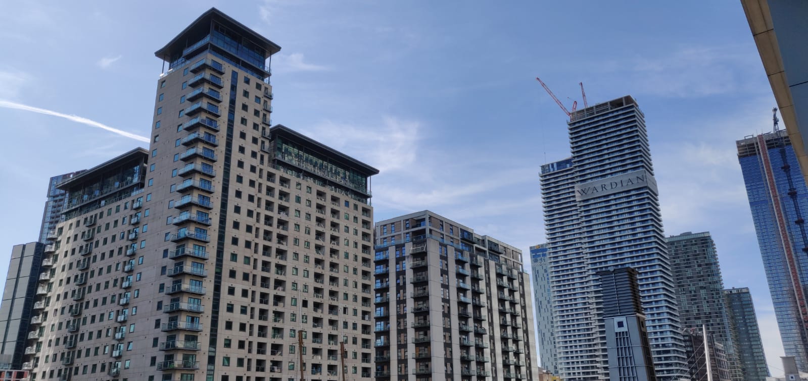
When completing this task i decided to take pictures of modern architecture around my city of London. Most of my images are based in Canary Whalf and some are taken in Central London and i was influenced by Hiroshi Sugimoto as most of his images where taken in his city in the community he may of grew up in. Also influenced by him i decided to look out for architecture which consisted of the formal element of line.
Edited images influenced by Hiroshi Sugimoto (10)
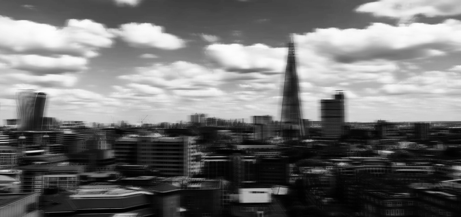
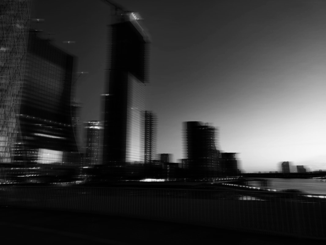
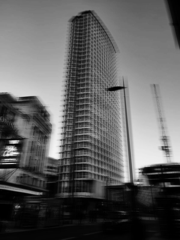
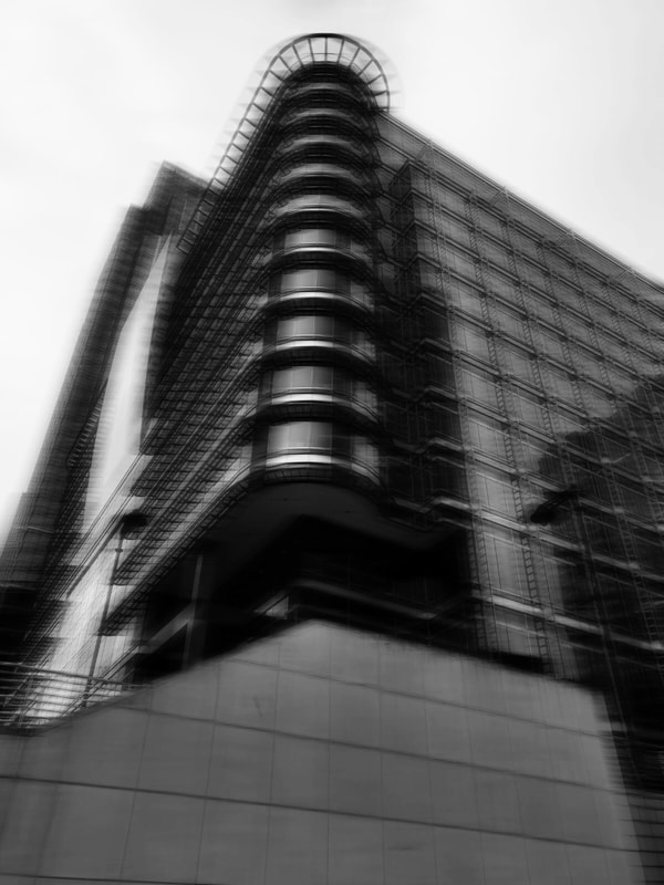
After the images were taken i set up Photoshop i decided to edit in my own way but keep Hiroshi Sugimoto in mind. What i did was that i added a motion blur effect and put a very abstract black and white filter over it so you can still understand that its influenced by Hiroshi Sugimoto but not copied directly from him as most of his images where taken in Tokyo but mine where taken in London. When editing the images i experimented with the fade of black and white filter and because of this i noticed that my images had a very abstract twist to some images. i feel like my images relate to Hiroshi Sugimoto as the style of my images are very similar to his however mine are taken in a different city and i feel like mine are more abstract.
Experimenting with Angles
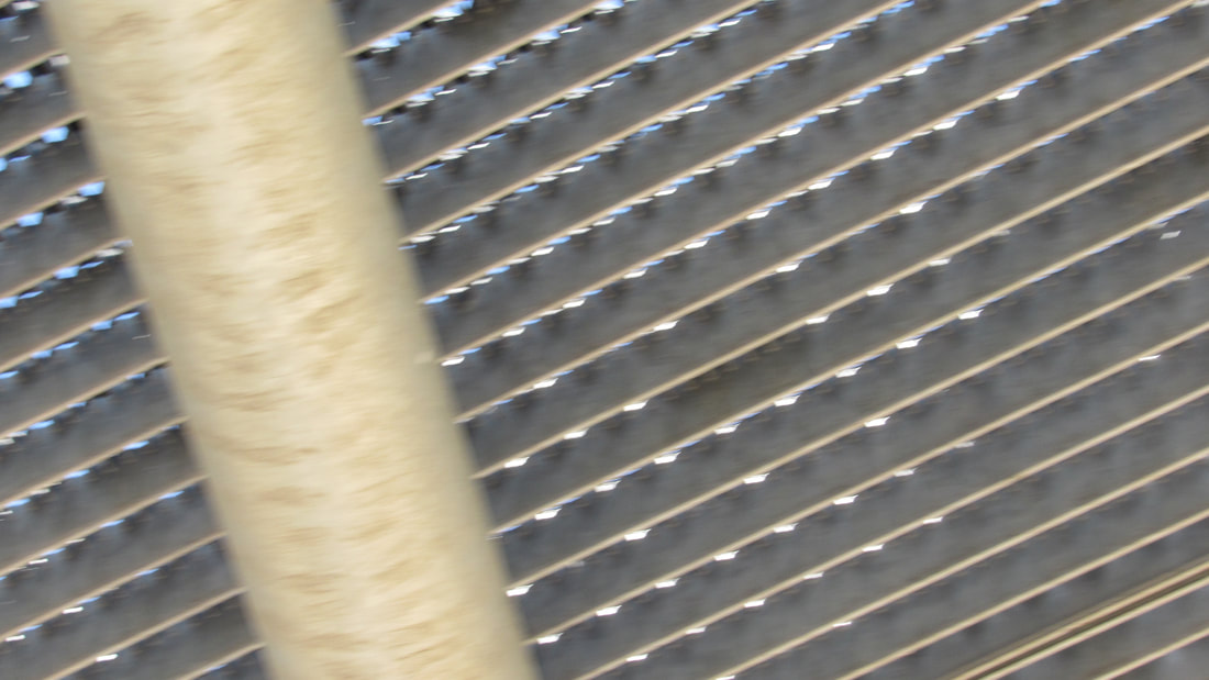
Due to some feedback i had i decided to experiment more with the way i took the images and experimented with the angle that took them at and i will edit them the same way i had edited the previous images.
what went well was the angle i took the images from.
even better if i had taken more images
what went well was the angle i took the images from.
even better if i had taken more images
Edited edges experimental images

after taking the images i decided to experiment furthermore and continue with the style of editing i did with the previous time i edited so it continues with the theme i started with.
my plan over the next 3 weeks
what i am planning to do over the next 3 weeks is to
- take more images
- edit them and refine
- experiment more.
Tate modern exhibition visit homework
During the weekend i went to the Tate modern gallery on my own and looked and documented my journey around the Tate and observed many interesting photographs and artwork. what i think went well was the amount of images i took and how much i could use this exhibition visit as a inspiration with my personal project however i feel like it would be even better i took the images from a wider angle so you can see the full perspective of the art instalments and framed photographs.
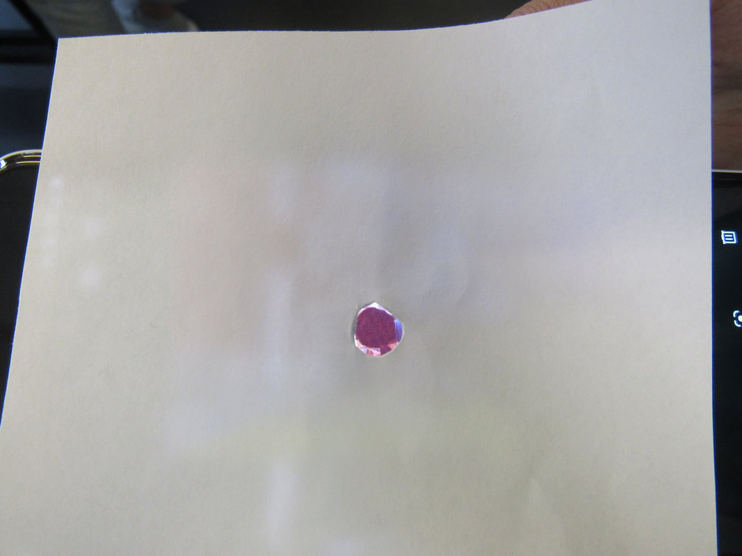
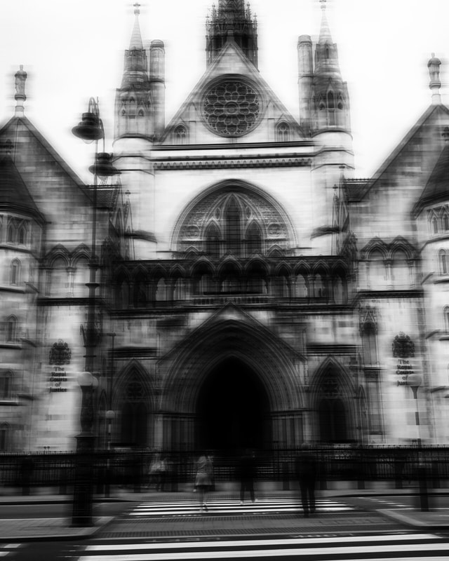
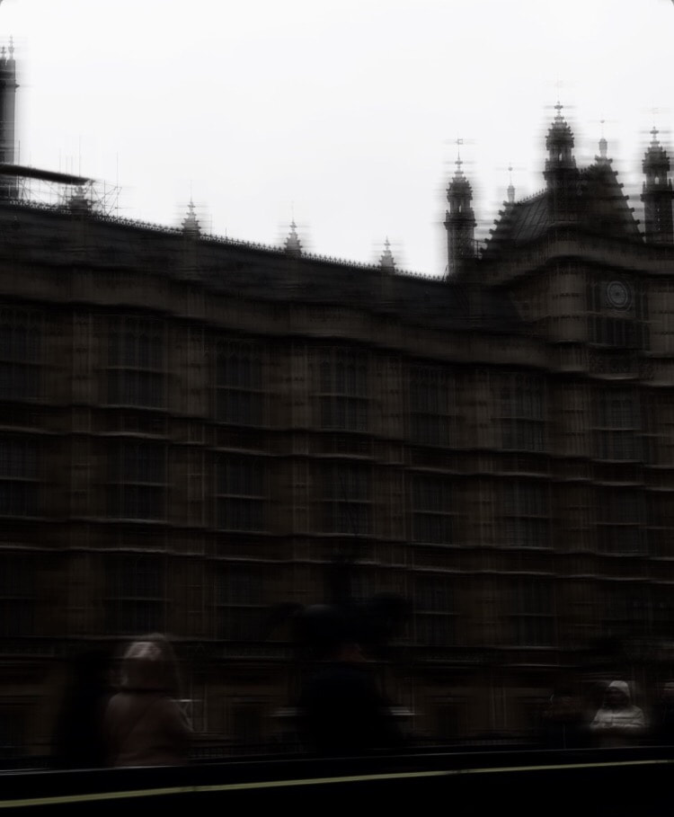
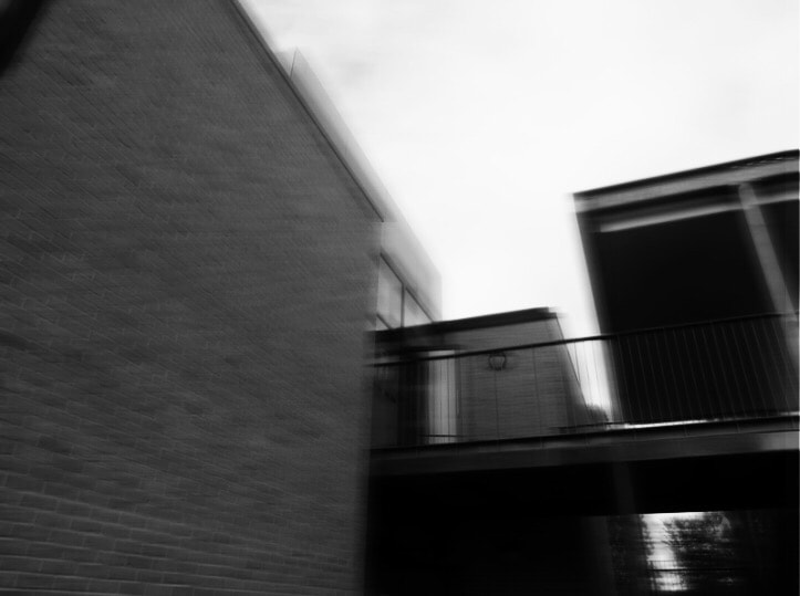
Unedited blurry images
edited blurry images
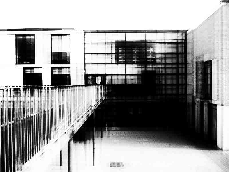
In todays lesson i went around the school and took more images however i changed the shutter speed on the camera so when i took the images they would have a blurry outcome and i then edited all of the images by changing the contrast and brightness and edited the experimented with the colours to black and white.
what i think went well was the editing that i preformed on to the images and it would be even better if i took more images which i will most likely do.
the final outcome of some of these images turned out with a pinhole effect on photoshop. This was not my first intention but it worked out very well.
Stephanie jung
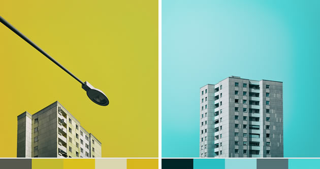
Stephanie Jung is a photographer based in Germany.
she had done many projects but the ones that pop up the most when you research her is her multilayered and double exposure images in places like Japan and New York.
In an interview she stated her favourite place to do these types of landscapes is japan.
i will use and take some inspiration from her images and apply it to my own images when experimenting.
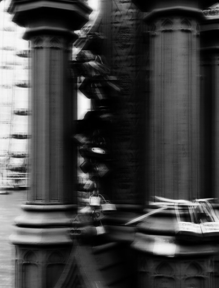
Overlay edited pictures.
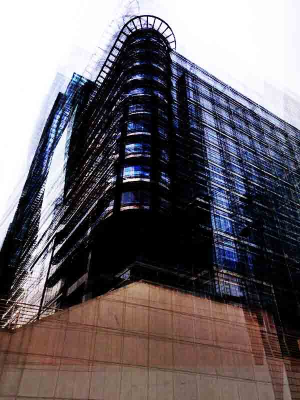
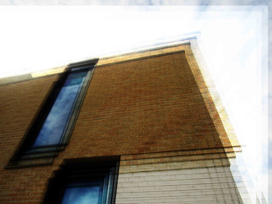
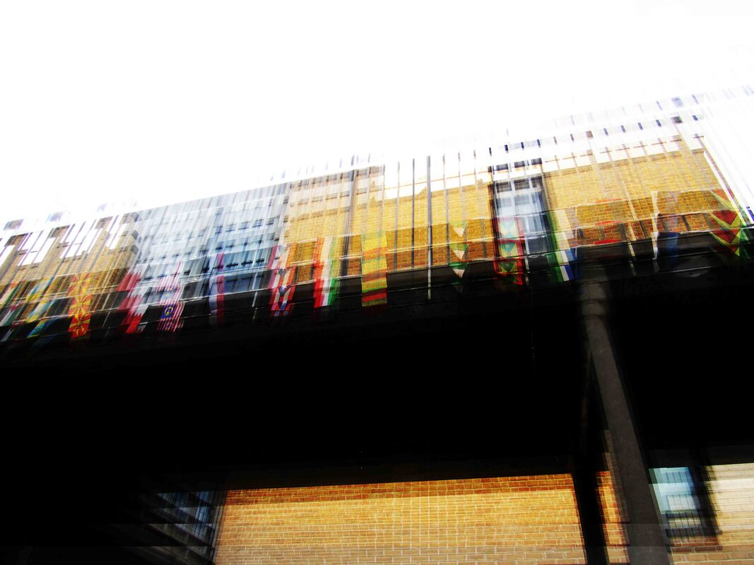
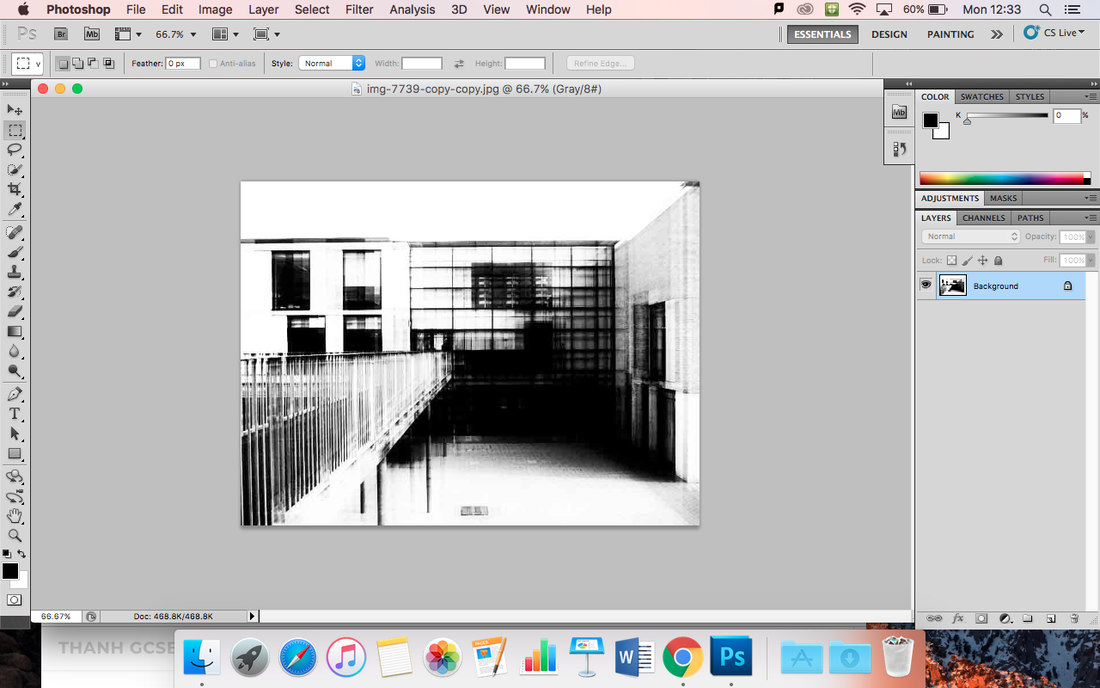
In this lesson i had taken many more images and experimented more with overlays and layering.
i used photoshop where i copied the image multiple time but every time i put a new layer i would move it slightly multiple times so it looks blurry.
what i wanted to create in this lesson and i managed to successfully do was edit my images in the style of Stephanie Jung using previous images and images around school. if i had more time to do this i would of taken more fresh images from London or my local area and take images from very close angle and from far as well.
WWW: how the images turned out
EBI: if one of the images didn't look very messy.
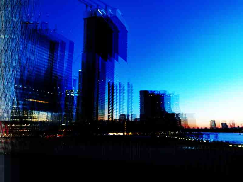
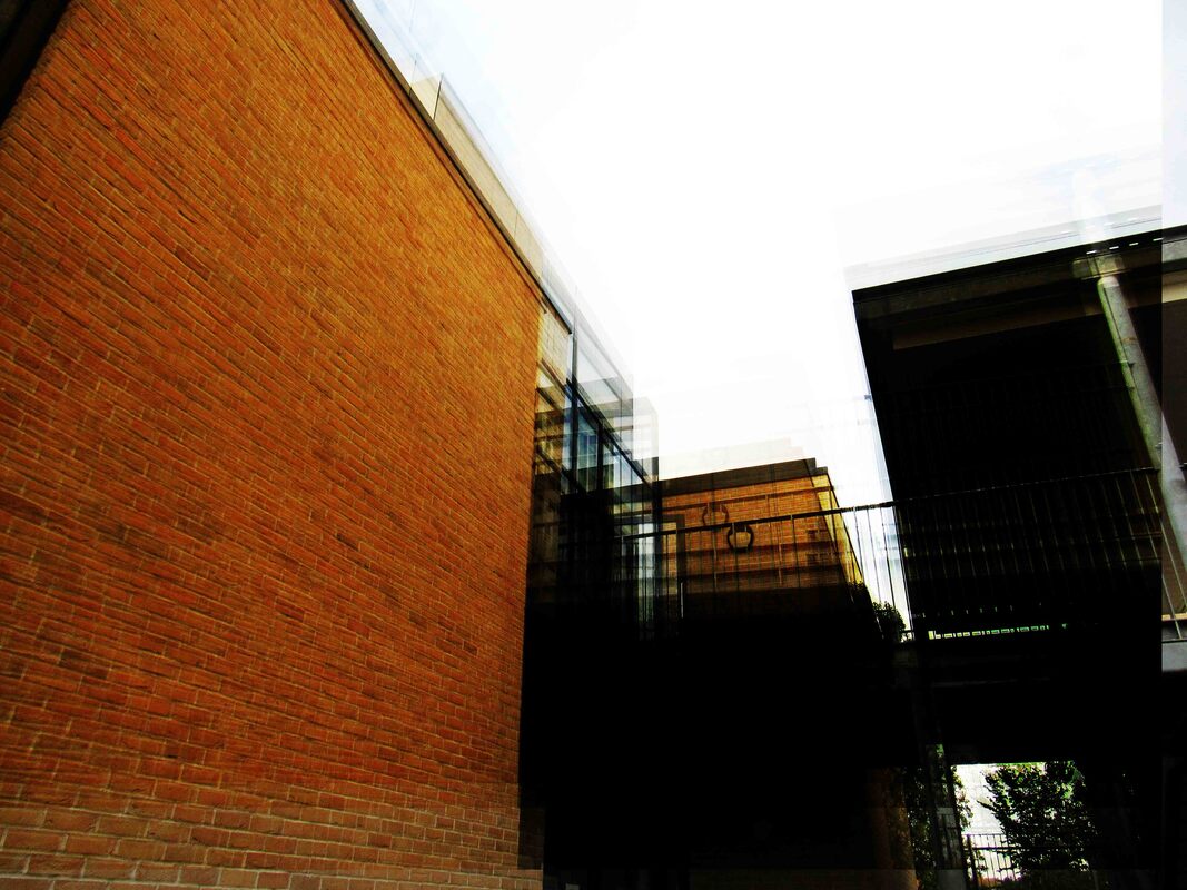
black and white overlay
In the same lesson i took the original edited layer images and edited them black and white and i feel like they turned out very well.
when editing theses images i had to experiment with the the contrast of the black and white filter as i felt like every time i was editing and adding new layers the images as a whole was getting darker and less clearer and more busy and because of this i had to be very mindful on how many layers i added and the way i placed the layer on to the building and i had to be very mindful that you can still see the image and its not engulfed by black.
WWW: some of the images was very clear and some small detail was visible.
EBI: some of the images was very dark in some places in the image making it look very dark and unclear.
Nick frank research
Nick Frank shoots industrial, architecture and FineArt and is based in Germany.
i intend to take inspiration from these images and experiment on photoshop as a reply to the artist.
i noticed that Nick Frank takes a very plain solid colour as a background and crops out a single building and puts it against a solid background which i will do in my experimentation but i may change the tone of the colours in the background or the positioning the building.
Nick Frank Response:
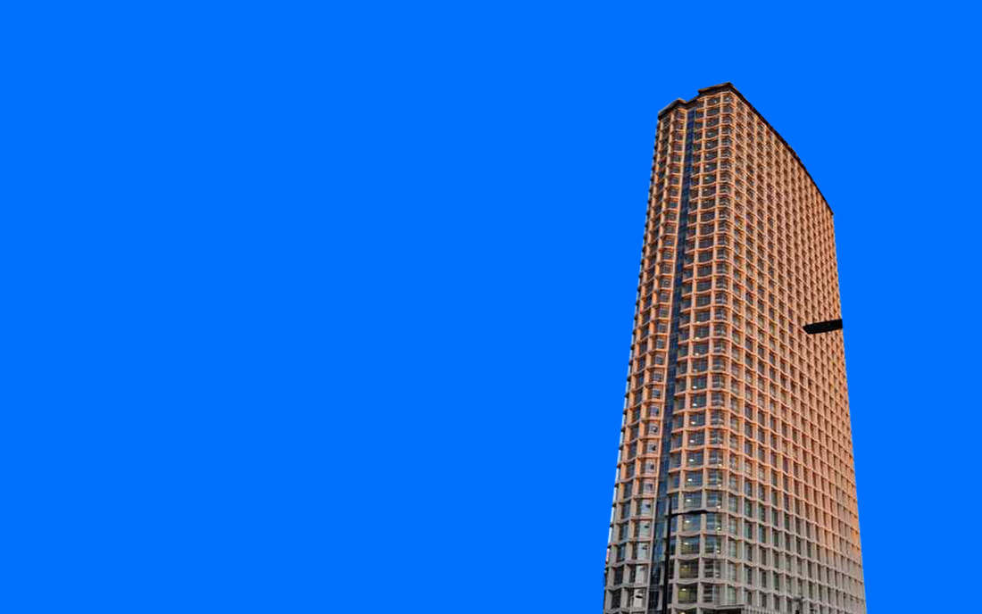
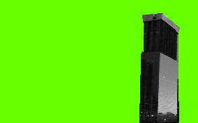
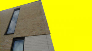
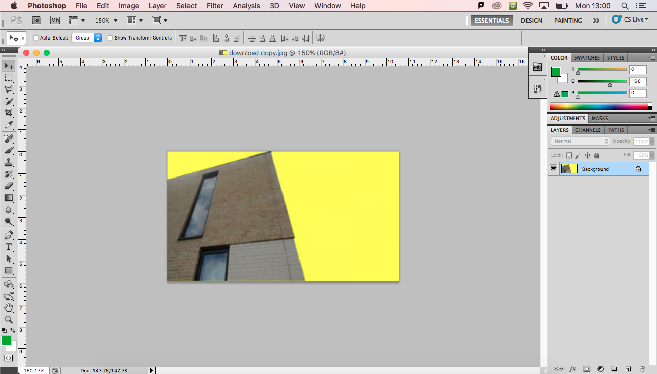
In todays lesson i used photoshop and cut one of the buildings from an image and i put it on top of a bright solid colour.
what went well: what i think went well was my choice of colour and buildings that i picked and cut out however it would be even better if the building on the green image was more clear and less blurry.
The reason why i used more bright solid colours rather than more muted tones used by Nick Frank because i wanted to still take inspiration from his work but modify and change it. I feel like having more brighter solid colour makes the isolated building in the image stand out more.
photoshop evidence
Project Evaluation
At the beginning of the project, we had to choose what theme we wanted to do before we started the project so I decided to do architecture as I felt it would be the most interesting theme to experiment and research about. So after I have chosen my theme I decided to put all of my original ideas and thoughts about what I can do and how far I can experiment on the theme architecture on to a mind map. My next strep of research what to find out photographers who experimented with architectural themes in photography before me and decided to research 3 artists. The first artist I researched was Candida Hofer and I found out that she is a German photographer who experimented with architecture but her style was “architecture of absence” meaning empty architectural spaces and she also uses some formal elements such as space and pattern and I discovered most of the artists on google. The reason I chose her as one of my research artists is that I liked how busy some of her images looked but empty the image has to be like most of her images are without any people in it but full of objects. Another artist I researched was Berenice Abbott. She took images of big cities from interesting angles and perspectives some even of big buildings under construction and she travelled to many places and cities like New York and took many images of the many architectural landmarks and occasional bridges and her images are taken in black and white. The reason why I chose to research her was that I liked how she took the photos and the angles she used so I planned to experiment with the angles I will use in my images and experimentation in my project. In her images, the formal element lines and they are presented in the buildings of the images. Another artist I researched was Ezra Stroller, the reason why I had chosen to do Ezra Stroller as one of the artists to research was that I liked how she took pictures of modern architecture but did them in black and white which I found interesting and would like to try in my project. Later in my project, I also researched Ai Weiwei, Hiroshi Sugimoto, Stephane Jung and Nick frank and I had done a response to all of them and trying out their take on architectural photography for example when I saw Stephanie Jung’s photos I liked how she overplayed the same image multiple times and it gave a blurry effect so I did a response trying her style. Another style I liked was Nick Frank as he isolated on or two buildings and edited them on a coloured background so I decided to do a response in his style and edit them using Photoshop but also alter it into my own version, for example, Nick Frank used more neutral colours so I used more bright solid colours. My final outcome is all of my ideas and experimentation outcomes on a mounted board. I did this because I felt like if it is mounted on to a board it is clearer and bigger making it easier for people to view and admire. During this project, I was going to create a more abstract insight on architecture from my images and I feel like in some aspects I managed to do this quite successfully. If I had more time I would have liked to try making abstract booklet or experimented with acetate paper or experimented with projecting images. What I feel is personal about my work is how my personal opinion and how I enjoy taking pictures of buildings outside of school is involved with architecture. I personally enjoy taking pictures of buildings as I feel like most architectural buildings have a meaning, for example, every historical or old architectural piece has a story behind them and every modern piece of architecture is indication of new styles and ideas and I enjoy how styles of architecture change as the human race continues and how we adapt and develop and I find it interesting. What I hope viewers understand about from looking at my work is my progress and ideas on the board I also hope they understand my attempt to turn familiar building like the school and give it a more abstract effect in my images.
